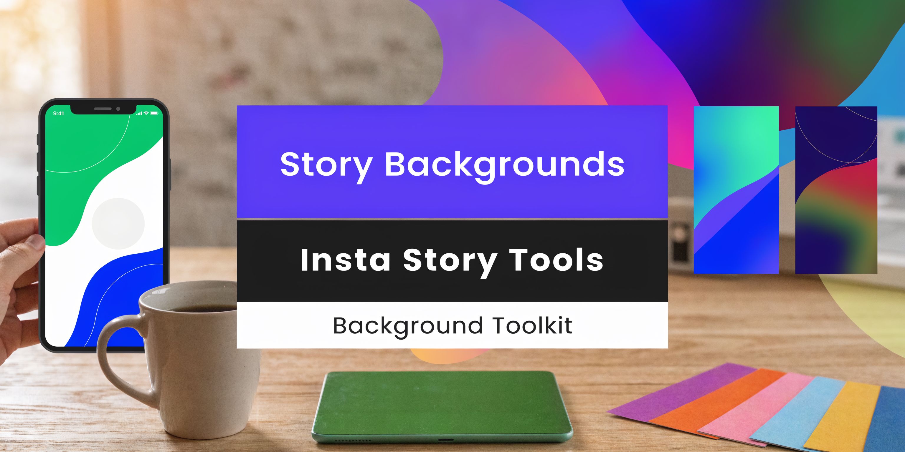


An Instagram grid maker is simply a tool that lets you plan, arrange, and preview your posts before they go live. It’s the secret sauce behind those stunning puzzle feeds, satisfying checkerboard layouts, and perfectly consistent color themes.
These apps help you turn your profile from a random collection of images into a deliberate, branded statement.
Why a Cohesive Instagram Grid Is Your Digital Handshake

Think of your Instagram grid as the digital storefront for your brand. When someone new lands on your profile, you have just a few seconds to make an impression. A messy, inconsistent grid can scream disorganization, but a well-planned, cohesive one? That builds immediate trust and signals you're a pro.
This first impression is your digital handshake—it’s what decides if they scroll past or stick around to see what you're all about.
This visual story is more critical than ever. Instagram’s profile grid is a powerful canvas for storytelling, and it's being used to captivate over 2 billion monthly active users worldwide as of 2024. A huge chunk of that audience—63%, to be exact—is aged 18-34, and they expect a polished look. You can get the latest breakdown of these numbers in this report from Buffer.
It’s this demand for a strong aesthetic that made tools like an instagram grid maker an essential part of the social media manager's toolkit.
Popular Instagram Grid Layouts and Their Strategic Use
To help you get started, here's a quick look at some popular grid styles and what they're best for. This should give you an idea of which visual strategy might click with your brand's goals.
| Grid Layout Style | Description | Best For |
|---|---|---|
| Checkerboard | Alternating between two post types (e.g., a photo and a quote graphic). | Brands with distinct content pillars, influencers, and service-based businesses looking for visual rhythm. |
| Puzzle Feed | Each individual post is part of a larger, single image. | Creative campaigns, product launches, and artists who want to create an immersive, high-impact experience. |
| Rows or Columns | Each row or column follows a specific theme or color. | Storytellers, fashion bloggers, and lifestyle brands who want to guide the viewer's eye horizontally or vertically. |
| Consistent Filter | All photos use the same (or a very similar) filter or editing style. | Almost any brand. It's the easiest way to achieve a cohesive, professional look without complex planning. |
| Color Block | Posts are grouped by color, creating blocks of 3, 6, or 9. | E-commerce brands showcasing product lines, designers, and anyone with a strong brand color palette. |
Choosing one of these styles is the first step toward creating a grid that doesn't just look good but actively works to support your brand's narrative.
Building Trust Through Visual Consistency
Consistency is the absolute bedrock of brand recognition. When your grid follows a clear visual strategy—whether it’s a specific color palette, a recurring filter, or a content pattern—you create a predictable and genuinely pleasant experience for your audience.
This isn’t just about looking pretty; it’s about follower psychology. A predictable rhythm makes your content instantly recognizable in a crowded feed, reinforcing who you are with every single post. For a deeper dive, check out our guide on building a strong social media brand identity.
A strong grid tells a visitor what to expect from your brand without them having to read a single caption. It’s a silent promise of quality and consistency.
From Casual Visitor to Loyal Follower
A compelling grid doesn't just attract eyeballs; it converts visitors into followers. Imagine a consultant using a color-block grid where each color represents a content pillar—blue for client tips, yellow for success stories, and green for personal insights. A visitor immediately gets a feel for the value you offer.
Or think about an e-commerce brand using a checkerboard layout, alternating sleek product shots with vibrant user-generated content. This creates visual pop while providing powerful social proof, giving people a reason to hit "Follow."
Your grid isn’t just a gallery. It’s a strategic tool designed to guide a user's journey from discovery to loyalty.
Define Your Visual Strategy Before You Start

Before you even think about opening an Instagram grid maker, the real work happens offline. A jaw-dropping grid isn’t just a happy accident of arranging pretty pictures; it’s the result of a solid, well-thought-out plan.
Think of it this way: skipping this part is like trying to build a house without a blueprint. You might get a wall up, but the whole thing is likely to come crashing down.
First things first, you need a core color palette. These colors aren't just ones you happen to like—they need to be an extension of your brand’s personality. Are you calming and minimalist, or are you all about bold, high-energy vibes?
Nailing down just 3-5 complementary colors is enough to create an instant feeling of cohesion. This palette becomes your north star, guiding everything from your photography and graphic design to the props you use in a photoshoot.
Establish Your Content Pillars
Once your colors are locked in, it's time to define your content pillars. In simple terms, these are the handful of core themes you’ll talk about over and over again. Having clear pillars stops your feed from turning into a random jumble and ensures you're always delivering the kind of value your audience expects.
A few tried-and-true content pillars include:
- Educational: Sharing how-tos, tips, and industry secrets.
- Behind-the-Scenes: Pulling back the curtain to show your process or team.
- User-Generated Content (UGC): Featuring happy customers using your products.
- Inspirational: Posting quotes or success stories that resonate with your brand.
By deciding on these pillars ahead of time, you can start to intentionally map out how they'll flow together in your grid. For example, you might plan to alternate an educational post with a behind-the-scenes shot to create a nice, balanced rhythm. To take it a step further and add a truly unique touch, you could incorporate original designs; learning how to create effortless digital art on your iPad can be a real game-changer here.
Batch Your Content Creation
Alright, you have your strategy. Now you need a library of content to pull from. This is where batch creation comes in—and trust me, it’s a lifesaver. It’s the simple practice of creating a ton of content in one focused session.
Instead of scrambling every single day to find something to post, you can block off one afternoon to shoot weeks' worth of visuals.
Plan a single photoshoot built around your brand’s color palette. Get shots of your products, some team headshots, and lifestyle images that all look and feel like they belong to the same visual family. This way, you know every single image in your content bank already fits your aesthetic.
Pro Tip: When you're batching content, always create more than you think you’ll need. Having a surplus of photos and video clips gives you so much more flexibility when you finally sit down to arrange your feed in a visual planner.
This proactive approach will save you an unbelievable amount of time and stress down the road. When your content is pre-made and on-brand, using an Instagram grid maker becomes the fun part—like putting together a puzzle where you know every piece is a perfect fit.
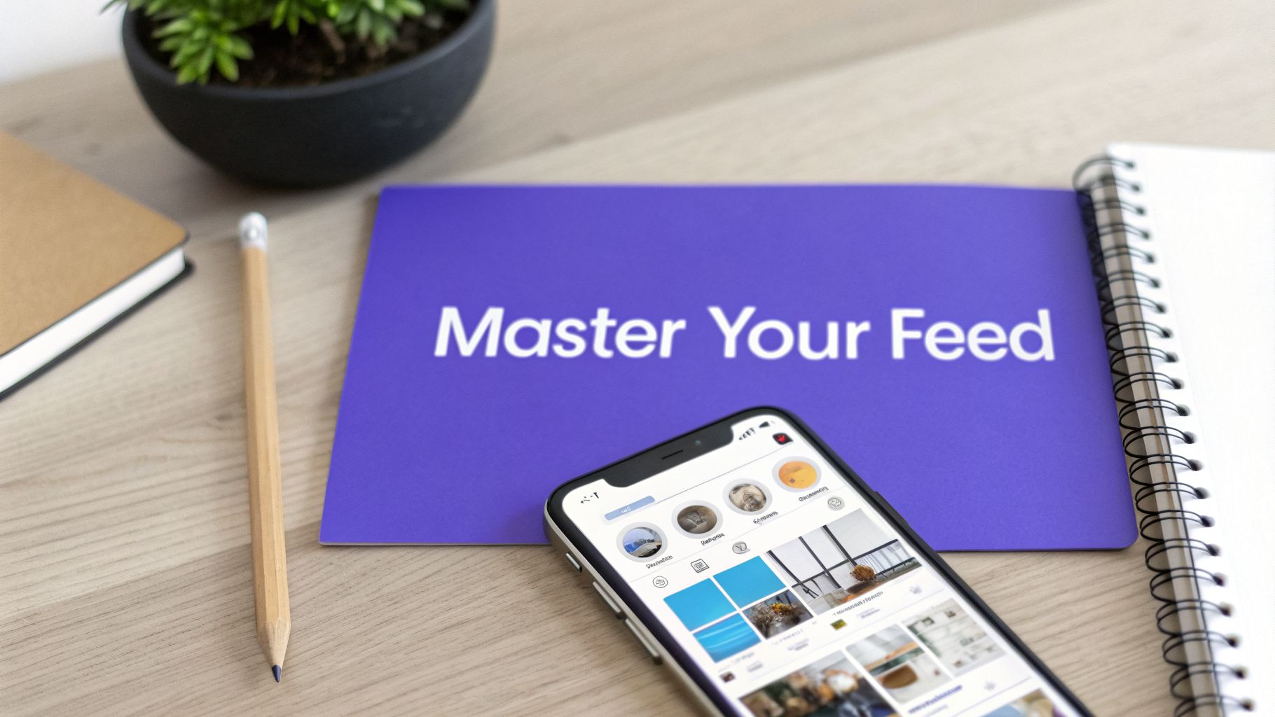
Building and Previewing Your Grid With a Visual Planner
Alright, you've nailed down your visual strategy and have a folder full of on-brand content. Now for the fun part: bringing that vision to life with an Instagram grid maker. Think of this tool as your personal design studio, where you can drag, drop, and shuffle your posts around until you’ve created the perfect visual story.
First things first, get all your creative assets—photos, graphics, video thumbnails—uploaded into the visual planner. Dumping everything in one place gives you a fantastic bird's-eye view of your entire content library. This is often where I spot unexpected pairings and cool patterns that I would have missed otherwise.
Arranging Your Posts With Drag and Drop
With all your media loaded, the real magic starts. You can begin arranging your posts by simply dragging and dropping them onto a mock grid that looks just like your Instagram profile. It’s a completely hands-on process that takes all the guesswork out of planning.
Curious how that new product shot looks next to a piece of user-generated content? Just slide it over and see for yourself.
This is an absolute lifesaver for more complex layouts. If you're going for a puzzle feed, you can place each split image tile in the right spot to make sure the final picture comes together without a hitch. For a checkerboard look, you can easily alternate between two types of posts—say, a quote graphic and a team photo—to build that satisfying, rhythmic pattern.
The Importance of the Mobile Preview
Here’s a pro tip that has saved me from some serious design blunders: always check the mobile preview. Your grid might look absolutely stunning on a big desktop monitor, but the vast majority of your audience will see it on their phones. A good visual planner, like the one built into PostSyncer, will show you exactly how your grid is going to look on a smaller screen.
A classic mistake is forgetting that every single image in your grid also has to work as a standalone post. A photo that looks amazing as a tiny piece of a larger puzzle can feel awkward or just plain confusing when someone sees it by itself in their home feed.
This preview step helps you catch those potential problems before you go live. You can make sure no important details are getting awkwardly cropped and that each individual post is strong enough to grab attention on its own. While planning your grid's big picture, don't sleep on the individual posts; using the best Instagram collage apps can help you create stunning visuals that look great alone and as part of your feed.
This is exactly what makes an Instagram grid maker so powerful. The visual calendar below shows how you can map out content for weeks, making sure every post contributes to a cohesive, eye-catching grid.
See how each post is clearly laid out? This lets you see the interplay between colors, subjects, and layouts before you even think about hitting "publish."
In the end, using a planner like PostSyncer’s Instagram feed planner shifts you from hoping your grid looks good to knowing it will. It's the difference between guessing and having a strategy.
Getting Your Grid Scheduled and Published
You've planned your visual masterpiece, and now it's time for the final, most critical step: execution. This is where a good Instagram grid maker with a built-in scheduler, like PostSyncer, becomes your best friend. It’s one thing to design a stunning grid, but getting every piece published in the right order and at the perfect time is a whole different ball game.
The actual workflow really depends on your grid's layout. For standard grids where each post is a standalone image, it's mostly about sequencing. But for more intricate designs like puzzle feeds, there's an extra step involved—splitting the main image into individual tiles.
Nailing Puzzle Feeds and Photo Splits
Let's start with the trickiest one: the puzzle feed. The single biggest mistake people make here is uploading their split image tiles in the wrong order. One slip-up, and your beautiful, cohesive panorama turns into a jumbled mess on your live profile. It's a common mistake, and it's a painful one.
Here’s the foolproof way to get it right, every single time:
- Slice Your Image: First, use a dedicated photo splitter tool to dice your large image into 3, 6, 9, or 12 square tiles. These apps usually number the output files for you (e.g.,
image_01.jpg,image_02.jpg), which is super helpful. - Upload in Reverse: This is the secret sauce. Since Instagram's grid reads from top-left to bottom-right, you have to post in the opposite direction. Schedule the last tile to go live first. So, for a 9-tile grid, you'd schedule tile #9, then #8, then #7, and so on, all the way back to #1.
- Label Everything: Inside your scheduler, give each post a clear label (like "Puzzle A - 9 of 9"). This simple organizational habit lets you quickly double-check the entire sequence before it goes live. It’s a small step that prevents that gut-wrenching feeling of seeing a post publish out of order.
This basic flow of uploading, arranging, and previewing is the foundation of a solid grid strategy.

The preview step, as shown here, is your final quality check. It’s your chance to ensure what you planned is exactly what your audience will see.
Weaving in Reels and Carousels Seamlessly
Your grid doesn't have to be a static-image-only zone. In fact, it absolutely shouldn't be. Reels now account for a staggering 50% of the time people spend on the app, so integrating video is no longer optional—it's essential for engagement.
With users spending an average of 73 minutes a day scrolling, a dynamic grid that mixes images, Reels, and carousels is your best bet for capturing and holding their attention. You can dig into more of these numbers in this breakdown of Instagram Reels statistics.
When you're planning your grid, just treat Reels and carousels like any other post tile.
The trick is to choose a killer cover photo (or the first slide of your carousel) that fits perfectly with your grid’s aesthetic. This cover is what everyone sees on your profile, so it has to match your color palette and overall vibe just like any other photo.
When you use an advanced Instagram scheduler, you can upload your Reel or carousel, pick a custom cover image, and then simply drag it into place on your planned grid. This lets you maintain that beautiful, cohesive look while still cashing in on the massive engagement that video and multi-slide content brings. It’s truly the best of both worlds: a grid that looks amazing and performs even better.
Using Analytics to Refine Your Grid Strategy
A beautiful grid is a great start, but let's be real—what we're all after is a grid that actually performs. It’s time to move beyond what just looks good and dig into what truly works. The secret is connecting your visual planning inside an instagram grid maker to real-world performance data. This is how you turn your profile from a pretty picture into a data-driven growth engine.
Think of your grid not as a single piece of art, but as a collection of tiny experiments. Every single post is a chance to learn something new about what makes your audience tick. The goal here is to stop guessing what resonates and start knowing, using hard numbers to back up your creative choices.
Key Metrics to Monitor for Grid Performance
When you peek at your analytics, it's easy to get fixated on likes. But the deeper engagement metrics are where the real story is.
Here are a few specific things I always track for each post within a grid:
- Saves: This is gold. A high save rate is one of the strongest signals that you’ve created something genuinely valuable—content your audience wants to come back to. Are posts in a certain row or with a particular color palette getting saved more? Pay attention.
- Shares: When someone shares your post, they're basically giving it a personal recommendation. Track if certain visual formats, like a clever infographic or a behind-the-scenes carousel, are getting passed around more than others.
- Comments: Likes are passive, but comments mean you’ve sparked a real conversation. Look for patterns here. Do posts featuring faces get more comments than your product-only shots?
Tracking these metrics in your social media analytics tool lets you draw a direct line between specific visual elements and the actions that actually grow your account.
The most successful Instagram grids aren't static; they're always evolving. Your analytics are the feedback loop telling you exactly how to tweak your visual strategy for maximum impact.
Connecting Data Back to Your Visual Plan
Okay, so you've got some data. Now what? The next step is translating those insights back into your planning process. This is where the magic happens.
For instance, if you notice your educational carousels consistently crush your single-image quote graphics in engagement, you might want to adjust your checkerboard pattern to feature more carousels. It’s a simple, data-backed tweak.
Or maybe your analytics show that posts featuring your secondary brand color get way more saves. You can then make a point to weave that color more prominently into your next batch of content. This cycle of plan, publish, measure, and refine is what separates the good grids from the truly great ones. It ensures every tile you place has a purpose, backed by data, not just a hunch.
Common Questions About Instagram Grid Makers
Diving into a structured grid plan can bring up a lot of "what if" scenarios. It's smart to think through these potential bumps in the road before you commit. Getting these common questions answered upfront will give you the confidence to build an amazing feed without feeling creatively boxed in.
Let’s clear up some of the most frequent things people ask when they start using an Instagram grid maker.
Can I Still Post Spontaneously Without Ruining My Grid?
Absolutely, but you need a plan for it. A rigid grid doesn't mean you can never share in-the-moment content again. The real pro move is to build that flexibility right into your strategy from the get-go.
One of the easiest ways to do this is to designate "flexible" spots in your grid plan. You might decide that every fifth post is a wildcard slot, perfect for a spontaneous photo or an unexpected update. Another great option is to keep most of your off-the-cuff content on your Instagram Stories, which are designed for less polished, timely shares anyway.
If you absolutely have to post something to the feed that wasn't planned, just try to make sure it at least fits your general color palette or editing style. This is where a visual planner is a lifesaver—you can quickly drag the new post into your mockup to see how it looks and rearrange upcoming content if needed.
How Far in Advance Should I Plan My Instagram Grid?
For most creators and small businesses, planning one to two weeks in advance is the sweet spot. This gives you a comfortable content buffer so you're never scrambling for a post, but it's not so far ahead that you can't adapt to new trends or conversations. It's a sustainable rhythm that just works.
Of course, larger brands or agencies managing multiple clients often plan a full month or even a quarter at a time. That's usually necessary to get all the approvals needed for big campaigns.
A great starting point for anyone is to simply plan your next nine posts. This fills a complete 3x3 square on your profile, giving you a clear, achievable goal that immediately makes your feed look more cohesive.
Do I Need a Special App to Split Images for a Puzzle?
While there are tons of photo-splitting apps out there, the most important tool you need is actually your scheduler. After you've used an app to slice up your main image, you absolutely need a scheduler that lets you upload the numbered tiles and publish them in the correct sequence without fail.
This is the most critical step, and where many people go wrong. Without a reliable scheduler, you run the very real risk of posting a jumbled, nonsensical puzzle on your live feed. The splitting is the easy part; flawless execution is what really matters.
Will Using an Instagram Grid Maker Hurt My Engagement?
Not at all—in fact, it's usually the opposite. A grid maker is purely a planning tool; it has zero direct effect on the Instagram algorithm. By helping you post more consistently and create a more visually appealing profile, it can actually give your engagement a serious boost.
A well-designed grid encourages people to spend more time on your profile, scroll through your content, and hit that follow button. Just remember that while the grid creates the first impression, each individual post still needs to offer value on its own. That's what users see in their main feed, and that's what ultimately drives the likes, comments, and saves that matter.
Ready to stop guessing and start building a grid that grows your brand? PostSyncer gives you the visual planner, scheduler, and analytics you need to execute a flawless Instagram strategy. Start your free trial and design your perfect feed today.