


If you want your Facebook posts to truly stand out, forget the old square format. The best size for a standard Facebook post is now 1080 x 1350 pixels, which is a 4:5 aspect ratio. This taller, vertical format is a game-changer for mobile viewing, grabbing more screen real estate and stopping users mid-scroll.
Getting these dimensions right means your images look crisp and professional every time, without any weird, automatic cropping from Facebook.
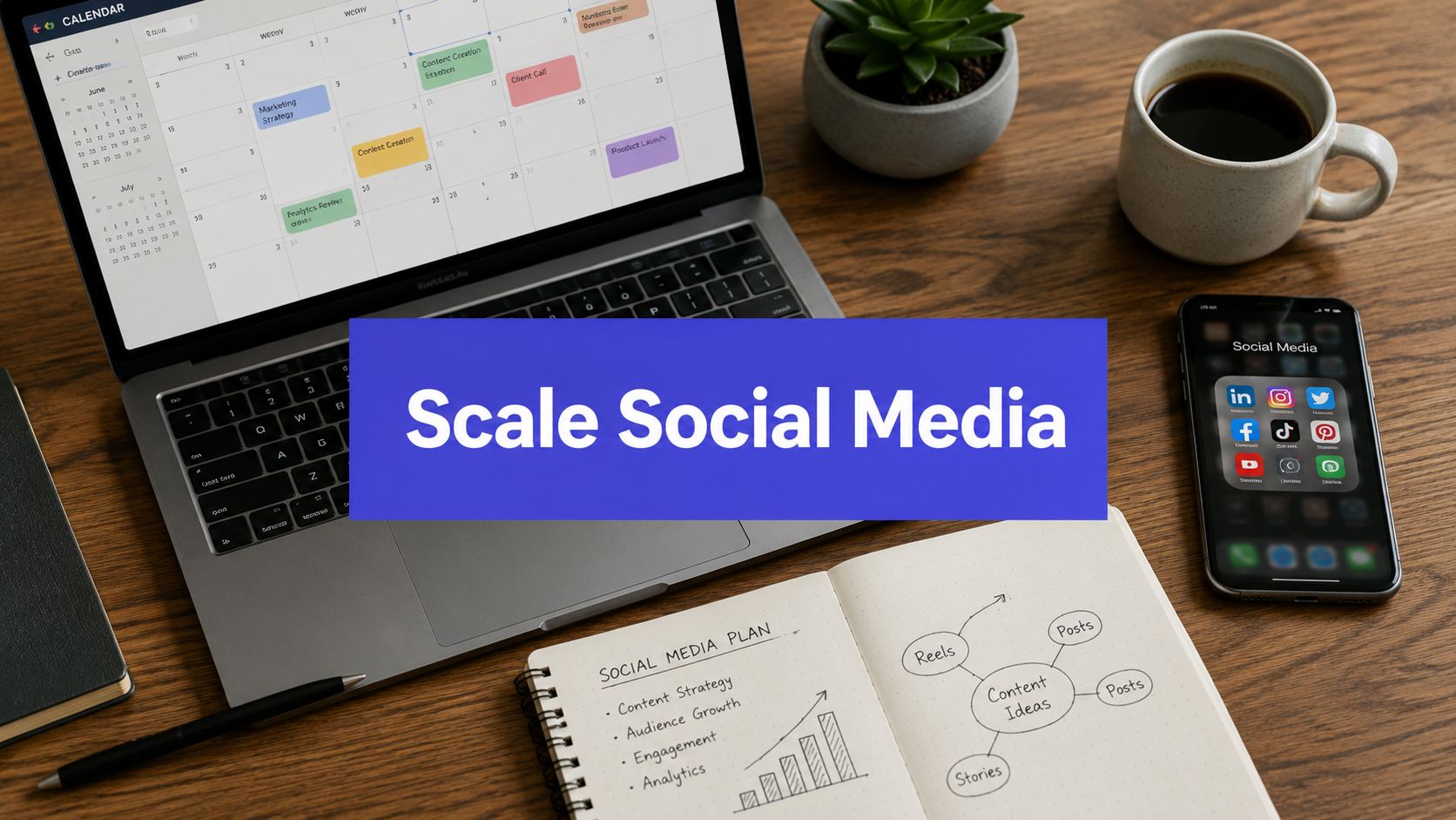
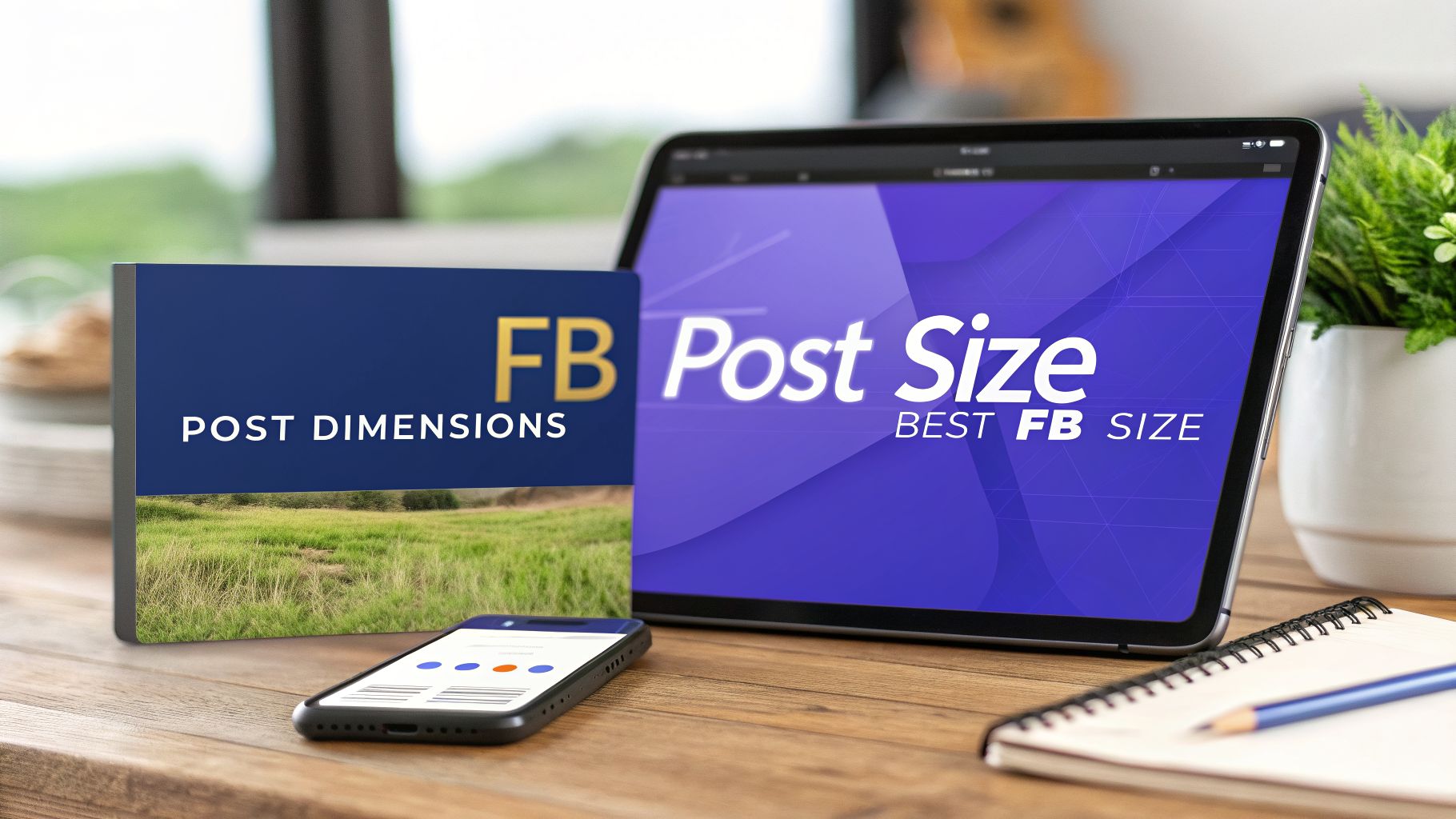
Your Quick Guide to 2026 Facebook Post Dimensions
Choosing the right size for a Facebook post used to be simple, but those days are gone. For 2026, the 1080 x 1350 pixels format (4:5 aspect ratio) has become the undisputed champion for driving engagement. This isn't just a random trend; it's a direct response to how we all use the platform now. With nearly 98% of users browsing on their phones, vertical images that fill the screen simply perform better.
Straying from these updated specs is a recipe for disaster. When you upload images with the wrong dimensions, you're likely to run into a few common, frustrating problems:
- Awkward Cropping: Facebook will chop off parts of your image, often cutting out the most important text or visual elements and completely diluting your message.
- Quality Loss: The platform's compression algorithm can be brutal on incorrectly sized images, leaving them pixelated, blurry, and unprofessional.
- Reduced Engagement: Let's be honest—small or poorly formatted images get ignored in a busy feed. This leads to less reach, fewer clicks, and lower interaction overall.
Key Dimensions at a Glance
To make things easier, this guide breaks down the most critical formats you'll need. Each dimension is specifically chosen to ensure your content looks great on both mobile and desktop, giving everyone a consistent, high-quality experience.
This handy graphic shows the ideal sizes for the two most common post types you'll be creating: standard feed images and link shares.

As you can see, there’s a clear difference between a tall feed post designed to stop the scroll and a wider link share image built to drive traffic.
Getting your dimensions right on Facebook is just one piece of the puzzle. To maintain brand consistency across all your channels, it's worth learning about optimizing dimensions for other social media platforms like LinkedIn too.
Pro-Tip: Always design with the mobile "safe zone" in mind. This means keeping your crucial text, logos, and CTAs near the center of your creative. Stay away from the extreme edges to avoid having them obscured by Facebook's profile icons, buttons, or other interface elements.
Facebook Post Dimensions Quick Reference Chart 2026
For a quick lookup, here’s a summary table with the optimal dimensions and aspect ratios for all the major Facebook post types you'll need.
| Post Type | Recommended Pixels (Width x Height) | Aspect Ratio | Primary Use Case |
|---|---|---|---|
| Feed Post (Vertical) | 1080 x 1350 | 4:5 | Maximizing engagement on mobile feeds. |
| Feed Post (Square) | 1080 x 1080 | 1:1 | Classic post format, good for cross-posting. |
| Link Share | 1200 x 628 | 1.91:1 | Driving clicks to external websites. |
| Stories & Reels | 1080 x 1920 | 9:16 | Full-screen, immersive video and images. |
| Profile Picture | 720 x 720 (displays at 176x176) | 1:1 | Your personal or brand avatar. |
| Cover Photo (Desktop) | 851 x 315 | ~2.7:1 | Brand banner for desktop Page view. |
| Cover Photo (Mobile) | 640 x 360 | 16:9 | Brand banner for mobile Page view. |
Bookmark this table so you can quickly find the right specs without having to hunt them down every time you create a new post.
Ultimately, mastering these dimensions is your first step toward creating content that looks more polished and performs better. If you’re looking to make this process even smoother, a good scheduling tool is a lifesaver. Take a look at our guide on the PostSyncer Facebook scheduler to see how you can automate your posts with perfect dimensions every single time.
Optimizing Feed Images for Maximum Engagement
Let's get straight to it. When you're posting an image to the Facebook feed, you've got options, but only a couple truly matter if you want to grab attention. Your two heavy hitters are the tall vertical post (a 4:5 ratio) and the classic square post (a 1:1 ratio). Knowing when to use each one is what separates okay content from great content.
If you want to win the battle for eyeballs on mobile, you need to take up as much screen space as possible. This is where the tall, 1080 x 1350 pixel image shines. With its 4:5 aspect ratio, this format absolutely dominates a user's screen as they scroll. It's immersive, it’s commanding, and it’s just plain harder to ignore. Think of it as giving your post a louder voice in a very crowded room.

When your main goal is to stop the scroll and hook mobile users instantly, this is the size you want.
The Versatile Square Post
While the vertical format is a mobile-first powerhouse, don't discount the trusty 1080 x 1080 pixel square. The 1:1 aspect ratio is still a workhorse for a reason: it’s incredibly versatile. It displays cleanly and predictably on just about every device and platform, including both mobile and desktop Facebook feeds.
This reliability makes it the perfect go-to in a few key situations:
- Carousel Posts: The 1:1 ratio is the standard for images inside a Facebook carousel. Using it ensures every slide looks clean and consistent as users swipe through.
- Cross-Platform Consistency: Creating content for both Facebook and Instagram? Starting with a 1:1 square is a huge time-saver, as it works perfectly on both platforms without any awkward cropping or resizing.
- Ad Creative: Many ad placements, especially in Facebook’s right column, are built for a square format. Designing for it from the start saves you headaches later.
Even in 2026, the 1080 x 1080 pixel square image is a fundamental part of the content ecosystem. It’s the reliable, safe bet for creators and agencies who need content that travels well across different social channels.
Technical File Specifications
Getting the dimensions right is half the battle. The other half is about the technical details of the file itself, which can make or break how your image looks on Facebook.
File Type (JPG vs. PNG) For most photos, a high-quality JPG is your best bet. It does a great job of balancing image quality with a smaller file size for faster loading. However, if your image has a lot of sharp lines, text, or your logo, use a PNG. It’ll keep everything looking crisp and clear without any fuzzy artifacts. You can also pair your visuals with perfectly crafted captions—check out our guide on the AI image describer to see how.
Compression and File Size Facebook is going to compress any image you upload, no matter what. To give it the best possible starting point, export your image using the high-quality settings I mentioned above. Try to keep your file size under 30MB, but honestly, getting it closer to 1MB is even better for a snappy user experience.
The 20% Text Rule: Facebook officially dropped the hard penalty for the "20% text" rule in ads, but you should still treat it as a solid guideline. Ads with less text on the image almost always perform better and cost less. Use the image to grab attention, and save the story for your caption.
So, should you go with a 4:5 vertical post or a 1:1 square? It all comes down to your goals for that specific piece of content. And once you have the perfect image, knowing the best time to post on Facebook is the final step to maximize its impact.
Getting Your Link Share Images Right for More Clicks
When you drop a link to your blog, a product, or a news story on Facebook, the image that pops up is your one shot to earn that click. It’s not like a regular feed post. This image has a singular job: to be an irresistible visual preview that gets people to stop scrolling and click through.
To make that happen, you have to play by Facebook's rules—specifically, its Open Graph protocol. This is the system Facebook uses to scan your webpage for a designated preview image. Get the size right, and you get a beautiful, clickable link preview. Get it wrong, and you're stuck with an awkward, unprofessional crop that screams "don't click me."

This is exactly why nailing the best size for a FB post with a link is so critical.
The Ideal Link Share Dimensions
Let's cut to the chase. For a perfect link share image, you need to be using 1200 x 630 pixels. This gives you a 1.91:1 aspect ratio, the wide rectangular format that’s become the gold standard. It ensures your preview looks fantastic on both desktop and mobile feeds without any weird cropping.
This size is different from your standard feed post images, and for 2026, 1200 x 630 pixels is what works. It's built specifically for how Facebook's Open Graph protocol pulls and displays images for shared URLs. For bonus points and faster loading, make sure your file size stays under 100KB. You can get more insights on Facebook post dimensions to see how it all fits together.
Think of this image as a mini-billboard for your content. It needs to be eye-catching and give a clear idea of what’s on the other side of that click.
- Example 1 (Done Right): A travel blog shares a link to "10 Best Beaches in Costa Rica." The preview is a gorgeous, crisp 1200 x 630 photo of a beach, with the blog's logo tucked neatly in the corner. It's compelling and professional.
- Example 2 (Done Wrong): The same blog shares the link, but their website's featured image is a tall infographic. Facebook grabs it and mangles it, showing only a confusing slice from the middle. The title is gone, the key info is gone, and so is the user's interest.
Don't Forget the Safe Zone
Even when you use the perfect dimensions, you still have to account for Facebook's own interface. The platform will overlay the headline, domain name, and a short description right on top of the bottom part of your image.
To keep your important visuals from getting covered up, always treat the bottom 20-25% of your 1200 x 630 image as a "caution area." Don't put your main logo, text, or any must-see elements there.
By keeping the good stuff centered or in the top half of the image, you guarantee your message gets across. It's a simple habit that keeps your visuals clean, maximizes your click-through potential, and makes your link shares work a whole lot harder for you.
Sizing Up Facebook Stories, Reels, and Vertical Video
When you're dealing with short-form content like Facebook Stories and Reels, you have to throw the old rules out the window. Landscape and even square formats just don't cut it here. The name of the game is full-screen, vertical immersion. This content is built for phones, and the dimensions are all about that mobile-first experience.
The most important number you need to burn into your brain for both Stories and Reels is 1080 x 1920 pixels. This gives you that perfect 9:16 aspect ratio—the tall, rectangular format that completely fills a modern smartphone screen. Getting this right is the first step to creating a professional-looking post that avoids those ugly black bars or awkward, unintentional cropping.

Honestly, this full-screen takeover is a huge part of why Stories and Reels are so good at grabbing and holding someone's attention.
Staying Within the Safe Zones
Just because your canvas is 1080 x 1920 pixels doesn't mean every single pixel is prime real estate. Facebook's interface—things like your profile picture, the "X" button, and reaction options—gets layered right on top of your beautiful creative. If you put your main text or logo there, it’s going to get covered up.
To avoid this headache, you need to design within the "safe zone." While Facebook doesn't give official pixel counts, a solid rule of thumb I always follow is to keep anything critical away from the absolute top and bottom edges.
Expert Tip: Leave a buffer of about 15% at the top and a more generous 25% at the bottom of your 9:16 design. This central area is your sweet spot. Keep your text, stickers, and the main action here to make sure everyone sees it, no matter what.
For Reels, you also have to remember that the caption and your profile info sit in the lower third when the video is seen in the main feed. This just reinforces why keeping that bottom area clear is so important.
Video Specs for Stories and Reels
Beyond just the dimensions, getting your video file's technical details right is crucial for a smooth upload and playback. Sticking to these specs will give you the best performance and quality.
Here’s the essential spec sheet:
- File Format: Your best bets are MP4 and MOV. They are universally accepted and provide a great balance between high quality and manageable file size.
- Video Length:
- Facebook Stories: You get up to 60 seconds for each individual Story.
- Facebook Reels: The limit is a bit longer, at 90 seconds.
- File Size: The maximum for both Stories and Reels is a hefty 4GB. But let's be real—a smaller file will always upload faster and give your viewers a better experience.
Getting comfortable with this vertical format is non-negotiable for any social strategy today. And if you're looking for ways to manage your video content, a Facebook Reels downloader can be a handy tool for saving and repurposing your top-performing clips.
A Strategic Guide to Facebook Ad Dimensions
Navigating the world of Facebook advertising is a whole different ballgame compared to organic posting. Each ad placement has its own unique creative requirements, and if you’ve ever run a campaign, you know these specs can feel like a moving target.
A common and costly mistake is thinking you can get away with a one-size-fits-all image. Trust me, it doesn't work. Using the wrong dimensions leads to awkward cropping, blurry visuals, and ultimately, wasted ad spend. This guide is your definitive cheat sheet for the most common Facebook ad placements, giving you the pixel-perfect specs you need to get results.
Feed Ads: The Mobile-First Powerhouse
The Feed is Facebook’s prime real estate. It's where your audience is scrolling, and it's your best shot at grabbing their attention. To make the most of it, you absolutely have to design for a mobile-first experience.
Here are the two formats that consistently perform the best:
- Vertical (4:5): Go with 1080 x 1350 pixels. This size takes up more vertical screen space on mobile, making your ad impossible to ignore as users scroll.
- Square (1:1): A 1080 x 1080 pixels ad is a solid, versatile option that looks great on both mobile and desktop. It’s also the minimum size you’ll want to use for most feed-based ad formats.
For either option, keep your file size under 30MB. Whether you're using a static image or a video, sticking to these dimensions ensures your ad looks immersive and professional where it matters most.
Right Column Ads: For Desktop Reach
Don't sleep on the Right Column placement, especially if your campaign targets desktop users. These ads are smaller and less in-your-face than feed posts, but they can be incredibly effective for retargeting campaigns or driving direct website traffic.
The creative specs here are simple and non-negotiable: you need a square 1:1 aspect ratio. The recommended size is at least 1080 x 1080 pixels. Because the ad itself is displayed much smaller, your visual needs to be clean and simple. Avoid clutter and use minimal text to make sure your message is legible at a quick glance.
Key Insight: I see this all the time: marketers try to cram a creative designed for the Feed into a Right Column slot. The different aspect ratio causes awkward cropping that cuts off key parts of your image or text, killing your ad's performance before it even has a chance.
In-Stream Video Ads: Capturing Attention Mid-Roll
In-Stream ads pop up during video breaks on Facebook Watch, giving you a chance to reach a highly engaged audience. Since you're interrupting a video they chose to watch, your ad needs to feel as seamless as possible—not like a jarring disruption.
The only format that works here is a standard landscape 16:9 aspect ratio. Your video should be high-resolution, and while the exact pixel count can vary, sticking to the 16:9 ratio is critical. These ads are mobile-only and must be between 5 and 15 seconds long, so get straight to the point.
Facebook Ad Placement Creative Specifications 2026
To help you plan your campaigns, I've put together this quick-reference table. It breaks down the essential creative specs for the most important ad placements we've covered.
| Ad Placement | Recommended Pixels | Aspect Ratio | Key Considerations |
|---|---|---|---|
| Feed Ad (Image/Video) | 1080 x 1350 | 4:5 | Best for mobile engagement; takes up more screen space. |
| Feed Ad (Carousel) | 1080 x 1080 | 1:1 | Versatile and displays consistently across devices. |
| Right Column Ad | 1080 x 1080 | 1:1 | Desktop only; requires a simple, clean visual. |
| In-Stream Video Ad | 1920 x 1080 | 16:9 | For video content only; must be concise and engaging. |
Bookmark this table and refer back to it whenever you're building out a new campaign. Getting these specs right from the start saves you time, money, and a lot of headaches down the road.
Your Top Facebook Post Size Questions, Answered
Even with the perfect guide, you're bound to run into a few tricky situations when sizing your Facebook content. As someone who’s seen it all, I’ve put together answers to the most common questions that pop up for marketers and creators. Let's clear things up so you can post with total confidence.
What Happens If I Upload a Post with the Wrong Size?
We’ve all been there. You upload a great-looking graphic, and Facebook immediately butchers it. If your image or video doesn’t have the right dimensions, Facebook's system will try to "fix" it by automatically cropping, resizing, or compressing it. While it stops your post from breaking the feed, the result is almost never what you wanted.
This automated process usually leads to a few predictable headaches:
- Awkward Cropping: The most important parts of your image—like a person's face, a product, or a headline—can get chopped right off. A beautiful 16:9 landscape photo uploaded to the feed will have its sides completely cut, ruining the entire shot.
- Blurry or Pixelated Graphics: Facebook’s compression is aggressive, especially on files that aren't sized correctly to begin with. Your crisp, professional graphics can end up looking fuzzy, pixelated, or just plain low-quality.
- Ugly Black Bars: This is a classic video mistake. If you upload a video with the wrong aspect ratio, Facebook will often slap black bars on the top and bottom (or sides) to make it fit. It instantly makes your video look smaller and less professional.
Using the right specs from the start is the only way to make sure what you create is exactly what your audience sees.
Should I Use a Vertical Post or a Square Post?
The short answer is: it completely depends on your goal for that specific post. There’s a time and a place for both vertical (1080 x 1350 pixels, 4:5 ratio) and square (1080 x 1080 pixels, 1:1 ratio) formats.
If you’re aiming for maximum impact in the mobile feed, the 4:5 vertical format is your best friend. It takes up more screen real estate, making it a powerful scroll-stopper. On the other hand, the 1:1 square format is the most versatile option. It’s the go-to for carousel posts and ads, and it transfers perfectly to other platforms like Instagram without any extra work.
My Rule of Thumb: Go with 4:5 vertical for standalone feed posts where you want to grab as much attention as possible on mobile. Stick with 1:1 square for carousel slides, ads, or any content you plan on cross-posting to other social networks.
Why Does My Cover Photo Look So Different on Mobile?
This is a classic source of frustration for so many people. Your cover photo gets displayed in two completely different ways: a wide, panoramic 820 x 312 pixels on desktop, and a taller, cropped 640 x 360 pixels on mobile.
Here's the problem: to create the mobile version, Facebook essentially just crops the sides off your desktop image. If you’ve placed your logo, text, or any key visual elements near the edges, they'll be completely cut off for the huge majority of users who see your page on their phones.
The trick is to design for both. Create your cover photo at 820 x 360 pixels, but treat the central 640 x 312 pixel area as your "safe zone." Keep everything important—logos, text, faces—inside that middle section to guarantee it’s always visible, no matter the device.
Does File Size Really Matter for Facebook Posts?
Yes, it absolutely matters. While Facebook lets you upload some pretty big files, it’s always better to optimize them yourself before you hit "publish." For most images, try to keep the file size under 1MB. This helps your posts load faster, especially for people on slower mobile data, which makes for a much better user experience.
Here’s the irony: large files often get hit with heavier compression by Facebook’s algorithm, which can actually make them look worse than a smaller, optimized file. For link share images, getting your file under 100KB is even more important for quick loading. Always use the "Export for Web" or "Save for Web" setting in your design software to get that perfect balance between quality and file size.
Creating perfectly sized posts for every format can be a lot of work. With PostSyncer, you can manage all your social media content from one place, ensuring every image and video is optimized for maximum impact. Plan, schedule, and publish with our powerful AI tools to save time and grow faster. Try PostSyncer for free today!