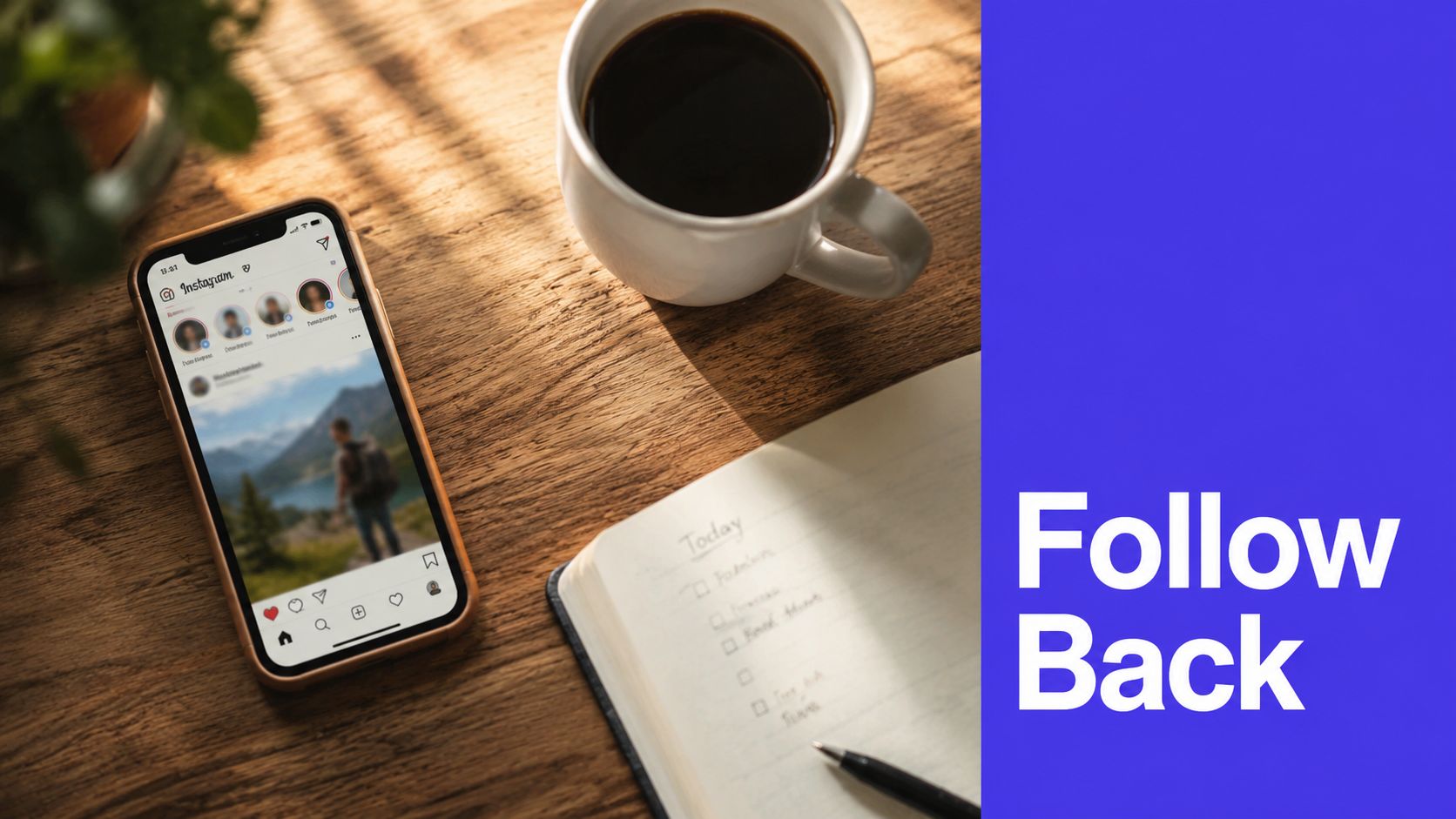


Is your Instagram profile picture helping people recognize you, trust you, and remember you in less than a second?
A PFP is not a decorative extra. It is the visual shortcut that shows up in search, comments, DMs, Story replies, follower lists, and suggested accounts. If it fails at thumbnail size, the rest of your profile has to work harder.
That is the strategic lens for the ideas in this guide. A strong PFP should match a job. Some styles build trust fast. Some signal creativity. Some make a brand feel bigger than one person. Others strengthen community by showing that real customers or team members are part of the story.
The trade-off is clarity versus personality. A detailed logo may look polished on desktop and turn muddy on mobile. A casual selfie may feel human and still weaken authority if your business sells expertise. An illustrated avatar can stand out, but it also asks followers to learn a symbol instead of recognizing a face. Good profile choices are usually simple, repeatable, and easy to carry across platforms.
Consistency matters too. Your Instagram PFP should not feel disconnected from your TikTok, LinkedIn, YouTube, or X account. Use the same visual core, then adapt the crop and file to each platform's requirements. If you are updating assets, this guide to Instagram profile photo and post dimensions will help you avoid blurry exports and awkward crops.
If your brand depends on personal trust, start with a polished portrait. For examples of headshot photography for Atlanta professionals, study how lighting, crop, and background simplify the image without making it feel generic.
If you also want the rest of your profile to support the same positioning, these Rebus organic Instagram insights pair well with a PFP refresh.
1. Professional Headshot with Brand Colors
For consultants, founders, coaches, and solo operators, a polished headshot is still the safest high-performing option. People follow people faster than they follow abstractions, especially when your business depends on expertise or trust.
The part most accounts miss is the brand-color layer. A strong headshot doesn't just show your face. It subtly reinforces your identity through wardrobe, background, or color grading. Neil Patel does this well with portraits that stay recognizable even when the crop changes. Gary Vaynerchuk has used the same broad visual logic for years. The face is the focal point, but the branding stays consistent.

What makes it work
Instagram still behaves like a photo-first environment. Photo posts account for 64.9% of published content on the platform in 2026, according to EmbedSocial's Instagram statistics overview. That matters because users are trained to scan static visuals quickly. A clear face with simple contrast reads faster than a clever but busy concept.
Use a close crop. Keep your eyes visible. Avoid full-body portraits, event photos, and anything with detailed scenery behind you.
Practical rule: If your face disappears when the image is shrunk, the shot is wrong for a PFP, even if it's great everywhere else.
A few technical habits save a lot of frustration:
- Choose a plain backdrop: Neutral walls, soft studio backgrounds, or lightly blurred office settings keep attention on the face.
- Tie in one brand cue: Use your primary color in a jacket, shirt, background accent, or subtle edit.
- Prep for cropping: Test it inside a circle before uploading. Instagram is less forgiving than a rectangular website avatar.
You should also check sizing before you export. This Instagram image sizes complete guide helps avoid soft edges and awkward crops.
If your current PFP is a candid shot from three years ago, replace it. You don't need a dramatic rebrand. You need a clearer signal.
For photographers who specialize in polished business portraits, this gallery of headshot photography for Atlanta professionals shows the level of simplicity that works.
2. Logo or Brand Mark
If you're running a company rather than a personality-led account, a logo often beats a face. That's especially true for SaaS tools, agencies, ecommerce brands, and media accounts where the brand itself needs to become the memory shortcut.
The key is simplification. Apple's apple works because it doesn't ask the viewer to decode anything. Nike's swoosh works for the same reason. Coca-Cola's broader identity is complex, but its avatar treatment tends to reduce the brand to one unmistakable visual cue.
Where brands get this wrong
They upload the full logo lockup. That usually includes small type, a tagline, and spacing designed for a website header. Inside a tiny circle, it turns into blur.
A better approach is to build a dedicated avatar version. That might be a monogram, symbol, or cropped brand mark on a solid background. Buffer has handled this cleanly across platforms by leaning on a recognizable simplified mark rather than trying to squeeze too much into a small frame.
Use this style when the account voice is collective, not personal. If your content comes from a team and your customer relationship is with the company rather than one spokesperson, the logo earns its place.
A few design rules hold up across most industries:
- Remove small text: If a tagline matters, put it in your bio or pinned post, not your PFP.
- Increase padding: Logos often need more breathing room in circles than they do in square brand files.
- Pick one background: A stable brand color helps recognition much faster than rotating gradients or seasonal textures.
This style also works well when you're posting frequently across networks and want one visual anchor everywhere. Consistency matters because users often encounter your account in fragments. They see a comment, a reel share, a Story mention, or a DM before they ever visit the profile.
When the logo is distinctive, keep it. When it isn't, force-fitting it into the avatar slot usually weakens the account.
3. Animated or GIF Profile Picture
Animation can work, but only for the right brand personality. If you run a design studio, creator brand, gaming account, or trend-aware media page, a subtle moving avatar can feel current. If you're a lawyer, accountant, or clinic, it can feel unserious fast.
That trade-off matters more than novelty. Motion gets attention, but attention without fit creates friction.
Early in the process, I usually tell teams to think of animation as an accent, not the main idea. A pulsing ring, rotating symbol, blinking detail, or light texture shift can add energy. A chaotic loop usually looks amateur.
To experiment with motion concepts, this AI animation video generator is a practical starting point.
Keep the loop subtle
The strongest animated avatars do one thing well. They repeat smoothly, stay readable at small size, and preserve the core shape of the brand. Wired-style motion treatments and creator avatars with minimal rotational movement tend to age better than flashy gimmicks.
Here's a simple walkthrough if you want to turn a still into motion:
The technical side matters more than people expect.
- Short loops win: The movement should feel intentional, not distracting.
- Design for first frame clarity: Many surfaces show a static preview first.
- Test dark and light backgrounds: Edge contrast shifts a lot across apps and devices.
Motion should support recognition, not compete with it.
If you want examples of how still images can be turned into cleaner animated assets, this Seedance AI video guide is useful inspiration.
One caution. Not every platform treats moving profile images the same way, and support can change. Build the static version first. If the static image isn't strong, animation won't rescue it.
4. Aesthetic Flat Design or Illustration
Want a profile picture that feels creative without sacrificing recognition? Flat design and illustration can do that well, but only if the image is built for a tiny circular crop rather than a full-size portfolio view.
This style serves a clear strategic purpose. It helps brands show personality, creativity, or warmth when a headshot feels too formal and a logo feels too distant. That makes it useful for designers, creative founders, media brands, educators, and startups that want to look approachable across Instagram, TikTok, LinkedIn, and YouTube at the same time.
Mailchimp and Duolingo are useful reference points because their visual identities stay recognizable at very small sizes. That is the standard to use. If the account is not instantly identifiable in a comment thread, the illustration is too complex.
![]()
Best use cases
Illustration works best when photography sends the wrong signal. A founder may want personality without the polished corporate look. A creator may want privacy without becoming anonymous. A small team may need something friendlier and more flexible than a strict brand mark.
It also solves a maintenance problem. Photos date quickly. A well-built illustration system can stay consistent for years, and it is usually easier to adapt across channels, campaign graphics, and highlight covers.
The trade-off is clarity. Custom art often fails because the designer adds too much detail. Fine line work, layered shading, textured backgrounds, and full scenes usually collapse at avatar size.
A stronger approach is simpler:
- Choose one focal subject: A face, mascot, object, or bust portrait.
- Keep the color system tight: Two to four dominant colors hold up better than broad gradients.
- Create strong separation: The subject and background need clear contrast in both light and dark app interfaces.
- Test the crop early: What looks balanced on a square canvas can break inside a small circle.
Instagram is a crowded visual environment, so recognizability usually matters more than artistic detail. The best illustrated PFPs are not the most intricate. They are the ones people can identify in under a second.
Use this style if your goal is to build a creative brand with consistent visual identity across platforms. Skip it if your audience needs immediate human trust from a real face, especially in coaching, consulting, or high-ticket service businesses.
5. Niche-Specific or Industry Icon
Sometimes the fastest way to make your account legible is to signal the niche immediately. A camera for a photographer. Code brackets for a developer. A barbell for a trainer. A mixing bowl for a baker. It isn't always glamorous, but it can be effective.
This style works especially well for smaller creator accounts still building recognition. When people don't know your name yet, the icon can do early sorting work for them.
Clarity over cleverness
The problem with niche icons is that people often choose symbols that only make sense to them. A nutrition coach might pick an abstract leaf mark that's aesthetically nice but too generic to say anything useful. A tech founder might use a complex geometric symbol that reads as wallpaper.
Use symbols that your audience can decode instantly. If you need to explain the icon, it isn't doing the job.
A good version usually includes one of three approaches:
- A direct tool: Camera, pen, microphone, whisk, keyboard.
- A simple trade symbol: Brackets, waveform, dumbbell, palette.
- A personalized hybrid: Initials paired with one clear icon.
This approach also pairs well with a strong background color. The icon does the category work. The color does the brand work.
The downside is ceiling. An icon can help with relevance, but it rarely builds emotional connection the way a face or community image can. For many accounts, it's a stepping-stone PFP. Useful early on, then replaceable later once the brand has stronger recognition.
If your content is educational and niche-led, though, direct beats artistic almost every time.
6. User-Generated Content or Community Photo
What should your profile picture signal first: polish or participation?
If community is part of the product, participation usually wins. A user-generated or community photo tells people they are looking at a brand with real customers, real members, or real fans at the center of it. That matters for ecommerce brands, fitness communities, event brands, nonprofits, and creator-led businesses that grow through identity and belonging.
This style works because it carries social proof inside the smallest visual asset on your profile. A logo says who you are. A community photo shows who shows up.
Brands such as Glossier, GoPro, and Airbnb have all built trust by making customers, hosts, and users visible in the brand story. The strategic upside is clear. A community-led PFP can make discovery feel warmer and less corporate, especially on Instagram where people often judge an account in seconds before deciding to follow, click, or shop.
The trade-off is control. You gain authenticity, but you lose some polish and consistency unless you set standards.
Use it when community is the product signal
A community photo works best when the audience wants to see themselves in the brand. If customers wear your product, attend your events, join your challenges, travel through your service, or create outcomes with your offer, this PFP style can outperform a brand mark on trust.
It is less effective for brands that sell precision, exclusivity, or high-end design language. In those cases, a random customer photo can make the account feel less intentional than it should.
Use three guardrails:
- Get clear permission: Customer content is not automatically brand-owned.
- Choose readable images: Strong light, one subject, clear facial expression or action, and enough contrast to survive Instagram's tiny crop.
- Keep the brand frame consistent: Rotate photos only if the color feel, mood, and composition still match the rest of your channels.
One practical test helps here. Shrink the image to thumbnail size and ask whether it still communicates "people like me are part of this." If it turns into visual noise, reject it.
A light text treatment can help unify rotated community photos across platforms. If you need a clean way to add initials or a short brand marker over approved images, test a few options with this Instagram font generator for profile text treatments.
This style is strongest for brands trying to build trust, community, and participation. It is weaker for brands that need instant recognition from a static mark. Choose it for the signal it sends, not because the photo feels nice in isolation.
7. Minimalist Text-Based Profile with Name or Initials
Can a profile picture made of just letters outperform a face, a logo, or a product shot? Yes, but only when the account already has enough brand context to support that restraint.
A minimalist text-based PFP works best for brands selling clarity, taste, authorship, or recognition. That includes editorial brands, design studios, architects, founders with a known name, and luxury businesses that benefit from looking selective rather than busy. In those cases, initials or a short name can strengthen the signal you want to send across Instagram, LinkedIn, and other social profiles. The trade-off is obvious. You gain polish, but you lose instant visual storytelling.

Typography carries the entire load here.
With no face, object, or scene doing the work, small design choices become the brand. Letter spacing, weight, case, and contrast all affect whether the avatar reads as intentional or unfinished. One or two initials usually perform better than a full name because Instagram crops tightly and displays the image at a very small size in comments, DMs, and story viewers.
Start with three decisions:
- Character count: One letter is bold. Two initials are usually the safest option. Full names only work if the word is very short.
- Contrast: Black on white, white on black, or a strong brand color paired with a clear opposite gives you the best chance of staying legible.
- Type style: Clean serif or sans serif fonts hold up better than decorative scripts or novelty styles.
If you want to test a few treatments before handing the concept to a designer, this Instagram font generator for profile text styling is useful for exploration. Treat it as a draft tool, not the final decision-maker. Readability still beats flair.
This style also needs support from the rest of the profile. If the PFP is only initials, the bio, name field, pinned posts, and feed design should explain what the account does within a second or two. That is the strategic part many brands miss. Minimal text avatars are strong at signaling confidence and consistency, but weak at explaining an offer on their own.
Use a simple test before you commit. Shrink the image to thumbnail size, place it next to three competitor profiles, and check whether the letters still read cleanly. If the initials blur, the spacing looks awkward, or the mark could belong to any business in any category, revise it.
Choose this style when the goal is recognition, restraint, and a premium feel. Skip it if you still need the PFP to introduce the brand.
8. Behind-the-Scenes or Team Member Rotation
Want your Instagram profile to feel more personal without giving up brand structure?
A behind-the-scenes PFP or team member rotation works best for brands that sell trust before they sell anything else. Agencies, studios, consultants, clinics, coaches, and early-stage startups often benefit here because the audience is judging the people behind the offer as much as the offer itself. A polished logo can signal professionalism. A real person can shorten the distance between curiosity and contact.
This style serves a clear strategic job. It signals accessibility, credibility, and team depth. If your brand goal is community or relationship-building, showing the founder, a lead specialist, or a candid work moment can do more than a static mark alone. As noted earlier, audiences often respond well to more human, less staged content, so the profile image can support that expectation before anyone taps into the feed.
It also solves a specific branding problem. Some service businesses look interchangeable at thumbnail size because every competitor uses a flat logo on a colored background. A consistent team rotation gives you a recognizable face while still keeping the account inside a defined visual system.
The trade-off is real. Recognition can drop if you change the image too often or rotate between photos that do not look related.
Use a rotation only if you can control it well:
- Set one visual template: Keep the same crop, background treatment, lighting direction, and color grade for every image.
- Choose who appears: Feature client-facing team members, founders, or specialists tied to current campaigns. Random staff changes usually confuse more than they help.
- Pick a fixed schedule: Monthly or campaign-based updates are easier for followers to track than frequent swaps.
- Support the change elsewhere: Update the bio, Story highlights, or pinned posts so the featured person or scene makes sense in context.
- Keep one fallback version: Maintain a default logo or core brand PFP for launches, press moments, or paid traffic periods where recognition matters more than personality.
One practical rule helps here. The account should still look like the same brand after the swap. The face can change. The system should not.
I usually recommend this approach for relationship-driven brands with smaller or mid-sized audiences, especially when the account is used for DMs, lead generation, hiring, or community building. I would skip it for brands that depend on instant logo recall across ads, packaging, retail shelves, or multiple country accounts. In that case, consistency usually beats warmth.
9. Seasonal or Trend-Responsive Profile Pictures
What happens when someone taps your profile during a holiday campaign and barely recognizes your account?
That is the risk with seasonal or trend-based PFP changes. They can signal relevance, timeliness, and cultural awareness, but they can also weaken recall if the update replaces the visual cue your audience already knows. The strategic goal is not to look festive for its own sake. It is to tie your avatar to a campaign moment while preserving recognition across Instagram and your other social channels.
Seasonal updates work best as controlled edits to a stable base image. Keep the same face, logo, or illustration. Then introduce one timely layer, such as a winter palette shift, a pride-month ring, a playoff accent, or a back-to-school prop. Your crop, silhouette, and primary identifier should stay intact.
That consistency matters.
If people recognize you by a coral background and white symbol, keep those assets in play. A seasonal version should feel like the same brand in a different context, not a different brand borrowing a holiday costume. Many teams, however, misfire. They swap in a crowded graphic, a meme-based treatment, or a trend reference that makes sense for one week and looks dated the next.
The strongest use cases are tied to a real business objective. Retail brands can align the avatar with gift seasons or limited drops. Event and sports accounts can mirror the current moment without rebuilding the identity system. Media brands and creators can use trend-responsive treatments to show cultural fluency, especially when the same campaign theme appears in Stories, Reels covers, pinned posts, and headers on other platforms.
A random holiday hat rarely does much. A coordinated campaign signal can.
Use a simple operating system:
- Create seasonal variants before you need them: Start with one master file, then build approved versions for key campaigns and annual moments.
- Change one element at a time: Border, accent color, or small overlay. One cue is usually enough for a tiny circular image.
- Match the broader campaign: The avatar should connect to current posts, highlight covers, landing pages, or other social profile images.
- Set an end date: Remove the seasonal version as soon as the campaign closes. An outdated avatar makes the account feel neglected.
- Protect your default version: Keep the core PFP ready for paid traffic, press mentions, or any period where brand recognition matters more than timeliness.
The trade-off is maintenance. This style rewards teams with a campaign calendar and a clear design system. If updates are ad hoc, trend-responsive PFPs quickly turn into visual clutter.
10. Achievement Badge or Milestone Indicator
An achievement-based PFP can add credibility fast, especially for coaches, educators, consultants, and creators selling expertise. But it's one of the easiest styles to overdo.
The line is simple. Recognition markers should support trust, not replace substance.
The right way to show status
Use this style when the achievement is both real and relevant. A certification that matters in your field. An award your audience recognizes. A milestone that directly reflects brand maturity. If the badge only impresses peers and means nothing to customers, it probably belongs in a post, not in the avatar.
The visual treatment also matters. Don't slap a gold sticker over your face or logo. Integrate the badge into the border, corner, or background so the original identity remains visible.
This style works for examples like:
- Certified experts: Nutrition, coaching, finance, or technical consultants with meaningful credentials.
- Milestone-driven creators: Significant audience or publication markers that your audience already associates with authority.
- Awarded brands: Recognizable industry honors that strengthen trust in a crowded category.
There is also a privacy-related variation worth noting. Some creators want authority and recognition without using their face. The available guidance here is thin, but one cited trend summary claims that creators are increasingly adopting non-facial PFPs while trying to preserve recognizability through color, symbols, and typography, as discussed in this privacy-focused creator identity post on Lemon8. Treat that as directional, not a full framework.
The risk with badge-heavy avatars is obvious. They can make the account feel defensive, self-congratulatory, or cluttered. If you use one, keep it temporary or tightly designed. The proof should continue in your content, highlights, and social behavior.
Top 10 Instagram PFP Ideas Comparison
| Profile Option | 🔄 Implementation Complexity | ⚡ Resource Requirements | 📊 Expected Outcomes | Ideal Use Cases | ⭐ Key Advantages | 💡 Quick Tips |
|---|---|---|---|---|---|---|
| Professional Headshot with Brand Colors | Moderate, professional shoot & editing | High, photographer, studio, retouching | High credibility & engagement (⭐⭐⭐⭐) | Personal brands, LinkedIn, B2B profiles | Builds trust while reinforcing brand consistency | Ensure good lighting; update annually; use same photo across platforms |
| Logo or Brand Mark | Low, prepare optimized logo versions | Low–Medium, designer + export assets | High brand recognition (⭐⭐⭐⭐) | Corporates, SaaS, agencies managing many accounts | Scalable, consistent brand recall across platforms | Optimize for thumbnails; keep consistent logo version |
| Animated or GIF Profile Picture | High, animation creation + testing | Medium–High, motion designer, file optimization | High attention & memorability (⭐⭐⭐⭐) | Creators, agencies, innovative startups | Stands out; conveys energy and creativity | Keep motion subtle; optimize size; test across platforms |
| Aesthetic Flat Design or Illustration | Medium, custom illustration process | Medium, illustrator, multiple format exports | Distinctive visual identity (⭐⭐⭐⭐) | Design studios, startups, creative professionals | Highly memorable and flexible stylistically | Align style with brand palette; test thumbnail visibility |
| Niche-Specific or Industry Icon | Low, icon selection or simple design | Low, icon design + background color | Clear niche signaling (⭐⭐⭐) | Freelancers, consultants, specialized service providers | Immediately communicates expertise and focus | Use high-quality icons; add initials for uniqueness |
| User-Generated Content (UGC) or Community Photo | Medium, curation, rotation & permissions | Medium, UGC program, moderation, rights management | Strong community trust & engagement (⭐⭐⭐) | E‑commerce, community-driven brands, SaaS with active users | Authentic social proof; fosters engagement | Establish submission guidelines; verify permissions |
| Minimalist Text-Based Profile (Name or Initials) | Low, typography selection & export | Low, designer for type treatment | Premium, clear identity (⭐⭐⭐) | Luxury brands, creatives, minimalist-focused accounts | Timeless, highly legible and easy to update | Choose readable font; test at smallest sizes |
| Behind-the-Scenes or Team Member Rotation | Medium, scheduling & coordination | Medium, ongoing photo production, consent | Increased team visibility & authenticity (⭐⭐⭐) | Agencies, studios, team-based businesses | Humanizes brand; highlights people behind work | Use consistent photo style; schedule rotations; obtain releases |
| Seasonal or Trend-Responsive Profile Pictures | Medium, recurring design updates & planning | Medium, designer + calendar coordination | Timely engagement boosts (⭐⭐) | Retail, consumer brands, campaign-driven accounts | Shows cultural awareness; refreshes profile periodically | Plan seasonal versions in advance; keep core elements consistent |
| Achievement Badge or Milestone Indicator | Low, badge design and placement | Low, graphic design; verification where needed | Authority and credibility boost (⭐⭐⭐) | Personal brands, coaches, industry experts | Visible social proof; builds professional trust | Ensure achievements are authentic; update badges when needed |
Your Turn: Choose a PFP That Tells Your Story
What should someone understand about your account in the first second they see it?
That question usually settles the PFP decision faster than debating styles in a vacuum. If the goal is trust, a clear headshot often does the job. If the goal is recognition across platforms, a simplified logo or monogram is usually the stronger choice. If the goal is warmth, creativity, or community participation, an illustration, team photo, or customer image can communicate that faster than a polished studio portrait.
The mistake I see most often is choosing a profile picture based on internal preference instead of audience signal. A founder picks the photo they personally like. A designer prefers the cleanest mark. A social team wants something current. None of those filters are enough on their own. The better filter is function. What should the viewer feel or assume right away: credibility, personality, originality, belonging, authority?
On Instagram, attention is fast and highly visual, as noted earlier. Your PFP gets only a moment to read clearly in the feed, comments, DMs, and search results. That is why the best option is rarely the most detailed one. It is the one that stays recognizable at a tiny size and still matches the account's broader brand goal.
Test your shortlist in real conditions. Put each version in a small circle preview. Check it on light mode and dark mode. View it beside your username, bio, Story highlights, and recent posts. If the avatar says polished expert but the content feels casual and unstructured, the profile creates friction. If the PFP signals community but the feed feels distant, people notice the mismatch even if they cannot name it.
Consistency matters beyond Instagram too. A PFP should not work only on one platform. It should carry the same core identity across TikTok, LinkedIn, YouTube, X, and anywhere else your audience finds you. This is the core strategic value here. Each style in this guide serves a different purpose, and the right choice depends on the brand outcome you want to create, then repeat everywhere your profile appears.
Choose the version that supports that outcome. Build it for small-size clarity. Use it consistently. A strong PFP does not just decorate the account. It sets expectations before a single post gets opened.
If you're managing Instagram alongside other channels, PostSyncer makes it much easier to keep your branding consistent. You can plan content, manage multiple workspaces, generate creative assets with AI, and keep your profile visuals aligned across the networks that matter without juggling separate tools.