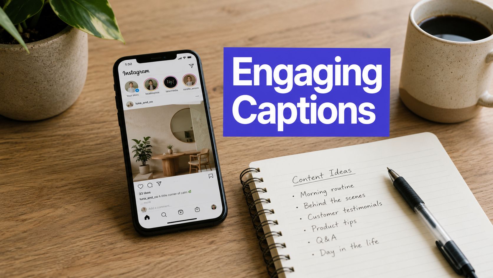


You write a caption, tighten the hook, add a CTA, and then Instagram turns it into a flat chunk of text. The line breaks look off. The emphasis disappears. A key phrase that should stand out gets buried halfway through the paragraph.
That’s why an instagram text formatter matters in real workflows. It’s not just a cosmetic add-on for bios and captions. It’s a practical way to control hierarchy, make posts easier to scan, and keep your copy readable when people are moving fast.
For solo creators, that might mean making one CTA stand out. For agencies and in-house teams, it usually means something bigger: formatting text consistently, previewing how it renders, and making sure the scheduled version looks the same when it publishes.
Why Formatted Instagram Text Wins More Engagement
Instagram is a visual platform, but the caption still does real work. It frames the post, pushes the next action, and helps turn a casual viewer into a saver, commenter, or profile visitor. If the text is hard to scan, readers won’t fight through it.
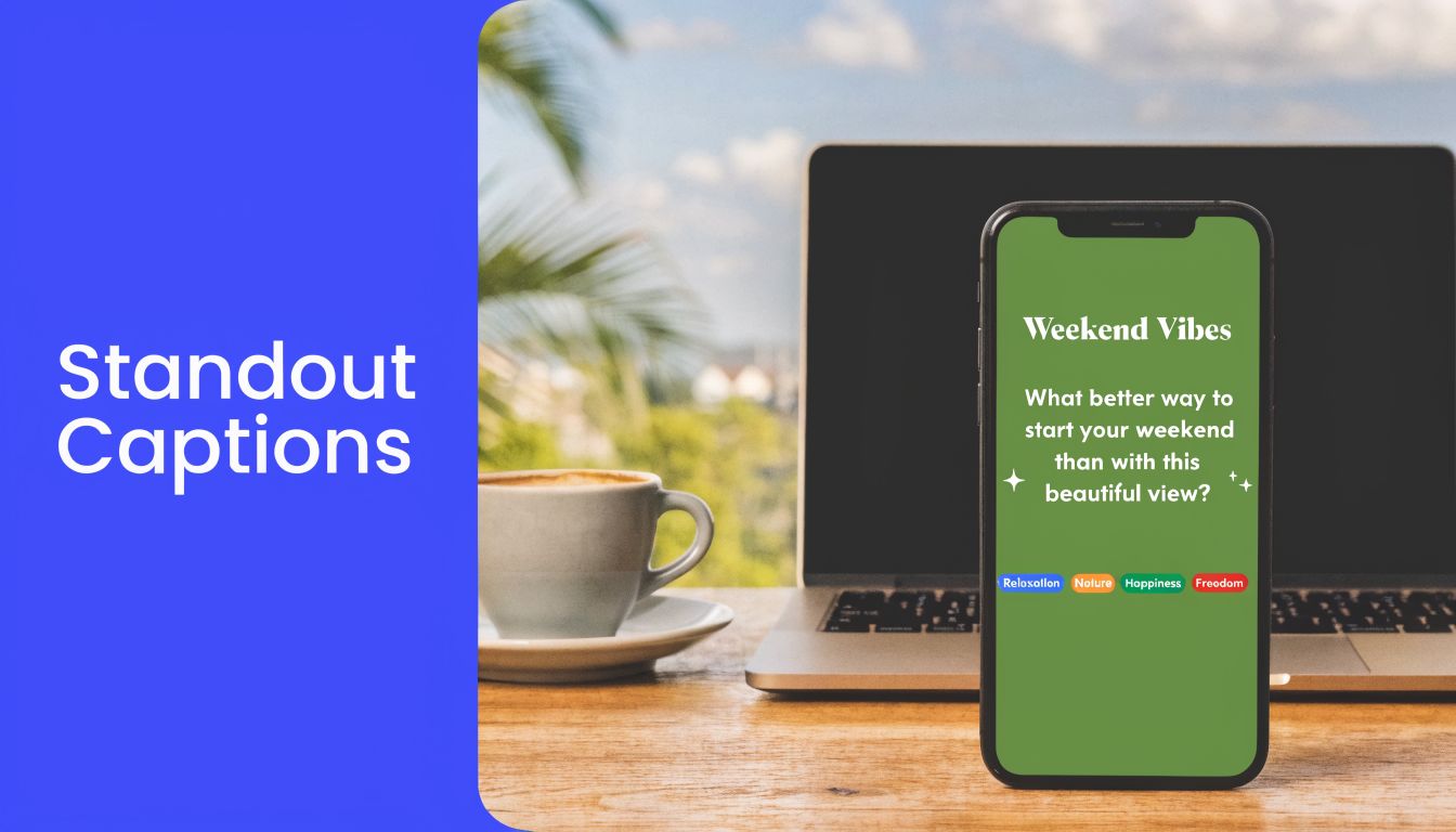
That matters even more on mobile. Research highlighted by PostNitro’s Instagram text format analysis shows that vertical posts at 1080x1350 achieve 15% higher engagement than square posts, largely because they take up more screen space and make visual elements, including text, easier to take in. The same analysis notes that captions perform best around 138 to 150 characters, with only the first 125 characters visible before truncation, so visual hierarchy inside a tight space matters.
Scannability beats clever writing
A good caption doesn’t read like a wall of copy. It gives the eye places to land.
That usually means using formatting to separate:
- The hook at the top
- The proof or context in the middle
- The action at the end
When teams ignore this, even strong copy underperforms because the structure does no work. One bold phrase, a clean break, or a styled keyword can make the difference between “skimmed past” and “read through.”
Practical rule: If your first line can’t be understood in a quick glance, formatting won’t save the caption. But strong formatting will help a strong first line do its job.
What formatted text actually improves
Formatted text helps most when you use it to support intent, not decorate everything.
| Use case | What formatting helps with |
|---|---|
| CTA-heavy captions | Pulls attention to the action line |
| Educational carousels | Separates ideas and improves scan speed |
| Bio optimization | Creates hierarchy between role, proof, and offer |
| Comment strategies | Makes short replies easier to notice |
If you’re already working on broader caption strategy, this guide on how to improve social media engagement is a useful companion because it focuses on the bigger levers around interaction, not just formatting.
Formatted Instagram text wins because it respects how people consume content. Fast. On small screens. With limited patience.
Native Tricks vs Formatter Tools
Instagram text is handled either through simple native workarounds or by using an external formatter and pasting the result into Instagram.
The difference is control.

What native tricks are good for
Native tricks are basic formatting habits you can manage without a dedicated tool. Most social media managers use some version of this in Notes first, then paste into Instagram.
Typical native methods include:
- Manual line breaks by drafting outside the app first
- Spacing for rhythm so every sentence doesn’t run together
- Selective ALL CAPS for emphasis when you need reliability
- Invisible characters when you need stubborn line breaks to hold
This approach is fine when you only need cleaner spacing and a little emphasis. It’s also the safer option for captions where readability matters more than style.
The downside is obvious once you need nuance. Native tricks don’t give you bold, italic, circled, script, or other variations at the text-character level. They also get tedious fast if you’re handling multiple posts, multiple brands, or repeat templates.
What formatter tools actually do
Instagram text formatter tools aren’t changing Instagram’s font system. They’re converting standard text into Unicode characters that look styled when pasted into Instagram. As explained in CreatorFlow’s breakdown of Instagram bold and italic formatting, Unicode is the underlying standard, and that’s why these tools can offer bold, italic, underline, decorative styles, and other variants through simple copy and paste.
That also explains why so many tools feel similar. The core workflow is usually:
- Type or paste plain text.
- Choose a style such as bold, italic, script, or circled.
- Copy the converted version.
- Paste it into Instagram.
Many are free and don’t require login. The primary difference is interface, speed, and how usable they are inside an actual content workflow.
For a quick browser-based option that keeps the process simple, PostSyncer’s format text online tool is the kind of utility that helps when you want fast conversion without overcomplicating the job.
Use native tricks when clarity is the goal. Use formatter tools when you need visual hierarchy that Instagram doesn’t provide on its own.
The trade-off most guides skip
Tools give you more freedom, but more freedom creates more ways to make captions worse. Decorative text can look sharp in a bio line or CTA. It can also make a caption harder to read if you style too much of it.
That’s why the better comparison isn’t “manual versus automated.” It’s minimal control versus scalable control. Native tricks are reliable and limited. Formatter tools are flexible and need restraint.
Finding the Right Instagram Formatter for Your Workflow
A free browser tool is often the first choice. That makes sense. If you just want to style one headline in a caption or make your bio look cleaner, a simple copy-paste workflow is enough.
The problem starts when formatting becomes part of your publishing system instead of a one-off task.

When a free browser formatter is enough
Tools like Postoria, Nuelink, WebUtility.io, and CreatorFlow cover the basic need well. You paste text, choose a style, copy, and drop it into your caption, bio, comment, or DM.
That workflow is usually enough for:
- Bio refreshes when you want one styled role descriptor
- Single-post captions where only the hook needs emphasis
- Comment templates that need a little more visual separation
- Quick experiments before you standardize anything
If your main goal is bio styling, this guide on how to make your Instagram bio pop is useful because it focuses on the profile-level presentation choices people often overlook.
Where standalone tools start to break down
Browser tools get clunky when your process includes drafts, approvals, previews, and scheduling. You end up bouncing between tabs, re-copying text, fixing broken spacing, and checking whether the final scheduled version still looks right.
That’s where teams usually run into these issues:
- Version confusion. Someone edits the plain text after the styled version was already copied.
- Broken formatting. A line break or special character changes during paste, approval, or scheduling.
- No reusable system. Good caption structures live in someone’s clipboard instead of a repeatable process.
A formatter isn’t just about output. It’s also about whether your workflow preserves that output.
What to look for in a professional setup
For regular publishing, choose based on workflow fit, not the number of font styles.
Look for:
- A clean preview step so you can catch rendering problems before posting.
- Drafting and formatting in one place instead of juggling tabs.
- Reusable blocks or templates for recurring CTA formats and campaign structures.
- Scheduling support so the published version matches the drafted version.
For that kind of process, an integrated option like PostSyncer’s Instagram post formatter makes more sense than a one-off converter because it fits into planning and publishing instead of sitting outside it.
The right instagram text formatter isn’t the one with the most styles. It’s the one that causes the fewest errors between draft and publish.
If you post casually, free browser tools are fine. If you manage content at volume, workflow reliability matters more than decorative range.
Advanced Techniques for Professional Instagram Text
Once basic bold and italic styling is handled, the greatest gain comes from building formatting into a repeatable content system. That’s how agencies and in-house teams keep captions recognizable without redesigning every post from scratch.
This is also where discipline matters. The strongest formatted Instagram text usually looks intentional, not flashy.

A workflow that scales across accounts
According to Nuelink’s Instagram text formatter guide, formatted bios and captions can achieve 20 to 30% higher profile visits, and the most efficient agency workflow combines a formatter, invisible characters for breaks, and scheduling. The same source notes that this process can boost cross-post efficiency by 35% for teams managing multiple brands.
In practice, that workflow looks like this:
- Draft the caption in plain language first.
- Identify only the pieces that deserve emphasis, usually the hook, CTA, or a branded phrase.
- Convert those parts with a formatter instead of styling the whole caption.
- Add clean spacing with controlled line breaks.
- Save the caption pattern so the team can reuse it.
That’s the difference between formatted text as decoration and formatted text as a production standard.
Use formatting for roles, not just style
A useful system assigns a job to each formatting choice.
For example:
- Bold text works well for CTA phrases and offer labels.
- Italic text fits short reflective lines, soft disclaimers, or testimonial framing.
- Script or decorative styles are better reserved for tiny touches in bios, highlights, or campaign titles.
This keeps formatting predictable. Followers start recognizing the visual structure, and your team doesn’t have to debate every caption from scratch.
Here’s a simple explanation:
| Text element | Recommended treatment |
|---|---|
| Opening hook | Plain or lightly styled for clarity |
| Main teaching point | Plain text with line breaks |
| CTA | Short styled phrase for emphasis |
| Bio tagline | One consistent decorative style, used sparingly |
Build reusable caption blocks
The biggest time saver is storing repeatable pieces of formatted copy. That might be:
- Launch CTAs with a standard emphasis style
- Testimonial intros that use the same visual pattern
- Carousel endings with a recognizable call to save or comment
If your team frequently struggles with spacing before conversion, a helper like PostSyncer’s Instagram line breaker can simplify the caption cleanup step before styling is applied.
Save complete caption structures, not just styled words. A reusable system is faster than a library of font tricks.
Professionals don’t treat formatting as an afterthought. They treat it like any other brand asset: limited, purposeful, and repeatable.
Avoiding Common Instagram Formatting Mistakes
Most formatting mistakes come from using too much style in the wrong places. The caption may look creative on your device and fall apart everywhere else.
That’s why the polished approach is usually the restrained one.

Readability breaks before formatting does
One major issue is legibility. Some gothic or cursive Unicode styles are unreadable for up to 40% of global Android users, which means a visually interesting caption can become a practical mess on a large slice of devices. If the reader has to decode the text, the formatting failed.
Keep decorative styles away from:
- Core offer details
- Discount or launch language
- Directions and instructions
- Anything a user must understand immediately
Use stylized text for flavor, not for the substance of the message.
Scheduled posts need extra caution
There’s also a workflow risk that casual guides tend to ignore. Emerging 2026 data suggests a potential 15% engagement drop for scheduled posts that use heavy or malformed fancy text. That doesn’t mean formatting is necessarily bad. It means broken rendering, excessive styling, or unreliable scheduled output can hurt the final post.
A few safeguards help:
- Preview before scheduling instead of assuming pasted text will hold.
- Test on more than one device if the caption matters to a campaign.
- Keep stylized text short so a rendering issue doesn’t wreck the whole post.
If a caption depends on special characters to make sense, rewrite the caption. Formatting should support the message, not carry it.
Accessibility is the quiet filter
Accessibility issues don’t always show up in your own review process, but your audience feels them. Over-stylized text is harder for some users to parse, and it creates unnecessary friction in a medium that already moves quickly.
A safer rule set is simple:
- Style one phrase, not a paragraph
- Use plain text for key information
- Favor clarity over novelty
- Check the scheduled preview before publish
That’s what works long term. Not the fanciest caption. The one people can read.
Instagram Text Formatting FAQs
Will special fonts hurt my reach
Not automatically. The bigger risk is overuse, poor readability, or malformed text in scheduled posts. If formatting is light, readable, and tested before publishing, it’s usually fine. If the caption is packed with decorative characters, you’re creating avoidable problems.
Can I use an instagram text formatter for my username
Sometimes, but bios are usually the safer place to experiment. Usernames have stricter practical limits because discoverability and recognition matter more there. If you want styled text, start with the bio, then test whether a username variation still feels readable and brand-safe.
What’s the safest way to bold one word in a sentence
Use a formatter to convert only that one word, then paste it back into otherwise plain text. That keeps the caption readable and gives you a clean point of emphasis without turning the full sentence into visual noise.
Should I format every caption
No. Formatting works best when it’s selective. If every line is styled, nothing stands out. Reserve it for hooks, CTAs, or recurring branded phrases.
Are line breaks enough without fancy fonts
Often, yes. Clean spacing fixes more Instagram caption problems than decorative text does. If your copy is strong, line breaks and one point of emphasis usually outperform a heavily stylized caption.
If your team is tired of copy-paste formatting errors and wants a cleaner way to draft, schedule, and manage social posts, PostSyncer gives you one workspace for planning content, publishing across platforms, and keeping formatted captions consistent from draft to live post.