


Ever had that frustrating moment when your perfectly composed photo gets butchered by Instagram's crop? The simplest way around this is to add borders or padding, which essentially places your image inside a new, Instagram-friendly frame. This tricks the app into accepting your photo's original shape without cutting anything off.
Why Instagram Crops Your Perfect Photos
The real culprit here isn't the size of your image in pixels, but its aspect ratio—that's the relationship between its width and height. Instagram is all about the vertical scroll, and it has very rigid ideas about what shape your content should be. If your photo doesn't fit neatly into one of its pre-approved boxes, the app will automatically zoom in and chop off the edges to make it fit.
This is exactly why that stunning, wide landscape shot loses its magic, or why a tall, elegant portrait gets its top and bottom sliced away. Instagram’s algorithm doesn’t care about your artistic vision; it just sees a shape that doesn't conform to its rules.
The Numbers Behind the Crop
To beat the crop, you first have to understand the rules of the game. Instagram has a very short list of approved aspect ratios for feed posts, and anything that falls outside these measurements is fair game for its automatic cropping tool.
And this isn't a small problem. According to 2026 Hootsuite analytics, Instagram’s system automatically crops any image with a ratio outside the 1.91:1 to 4:5 range. This means a staggering 65% of images uploaded by users are altered without their consent. Your best bet for feed posts is the vertical 4:5 ratio (1080 x 1350 pixels), as it grabs the most screen real estate and keeps you in the safe zone.
Key Takeaway: Instagram cares more about the shape of your photo than what's in it. To dodge the automatic crop, you have to make your image fit one of its accepted aspect ratios before you upload.
This doesn't mean you're actually changing the size of your original picture. Instead, you're placing it into a correctly-sized container. By adding padding—usually as white, black, or even color-matched borders—you create a new file that plays by Instagram's rules. This guarantees your original photo is shown exactly as you intended, and it's the core principle behind every technique we're about to cover.
To make things crystal clear, here’s a quick-reference table with the key dimensions you need to know. Keep this handy, and you’ll never have to guess again.
Instagram's Official Aspect Ratios and Dimensions
| Post Type | Recommended Dimensions (Pixels) | Supported Aspect Ratios |
|---|---|---|
| Square Post | 1080 x 1080 | 1:1 |
| Portrait (Vertical) Post | 1080 x 1350 | 4:5 |
| Landscape (Horizontal) Post | 1080 x 566 | 1.91:1 |
| Stories & Reels | 1080 x 1920 | 9:16 |
Knowing these numbers is half the battle. When you format your images to fit these exact specifications, you take control back from the algorithm and ensure your work is seen the way you created it.
Mastering Instagram Ratios for Every Post Type
Theory is great, but let's get our hands dirty. Every single spot on Instagram—the Feed, Stories, Reels—is its own unique canvas. What looks perfect as a Feed post will get butchered in a Story. If you really want to control how your content looks, you have to get comfortable with the specific Instagram image dimensions for each placement.
Think of it like this: your photo is an actor, and each format is a different stage. Each stage has its own dimensions, and a good director makes sure the performance fits perfectly, no matter the stage. A single photo often needs a few different edits to avoid looking sloppy across the platform.
Feed Posts: Portrait vs. Square
When it comes to the main feed, you have a crucial choice: the classic 1:1 square or the more commanding 4:5 portrait. While the square is iconic, the 4:5 portrait (1080 x 1350 pixels) is, without a doubt, the winner for grabbing attention. It simply takes up more vertical real estate on the screen, forcing people to pause their scroll just a little longer. That extra moment can make all the difference.
But it’s not just about the feed view anymore. You also have to think about how your posts look on your profile grid. This is where a lot of people get tripped up.

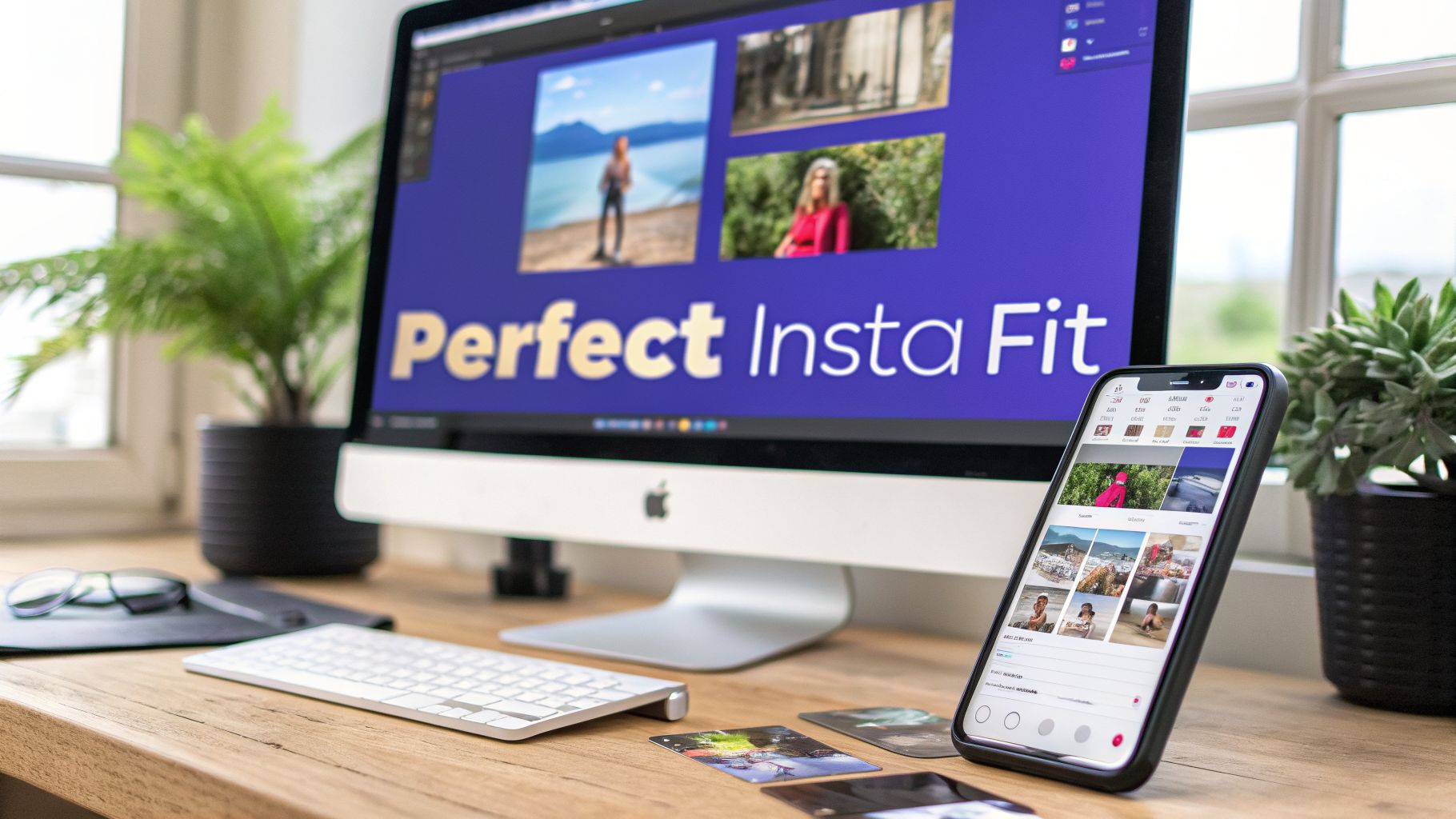
The image above nails the core problem: the issue isn't your photo, it's the mismatched shape (aspect ratio). The fix is to add space around your image (padding) instead of letting Instagram chop off the edges.
The Great Grid Shakeup
For years, we all knew the profile grid was a perfect mosaic of squares. Then, in early 2025, Instagram threw a curveball and started testing a taller 3:4 aspect ratio (1080 x 1440 px) for the grid. The collective groan from creators was audible. Our carefully crafted 4:5 posts were suddenly getting their sides clipped off in the profile view.
After a lot of feedback (and frustration), the platform officially began supporting native 3:4 uploads by mid-2026. This wasn't just a cosmetic change; it had real impact. A 2026 report from Metricool showed that posts using the new 3:4 specs saw an 18% jump in engagement.
Pro Tip: When you're creating a 4:5 post, always keep your most important elements—like text or a person's face—away from the far left and right edges. Think of it as a "safe zone." This ensures that when Instagram shows a 3:4 preview on your profile grid, nothing critical gets lopped off.
Stories and Reels: The Vertical Frontier
Thankfully, things are much more straightforward for Stories and Reels. The rule is simple but non-negotiable: you have to go vertical.
The only aspect ratio that matters here is 9:16 (1080 x 1920 pixels). This is the full-screen, immersive format that’s designed to command 100% of a viewer's attention. If you upload anything else, Instagram will zoom in, crop it awkwardly, or slap on some distracting, auto-generated background. It just looks unprofessional.
To keep your brand looking sharp, always create or resize your content specifically for that 9:16 canvas. You can stay on top of any changes by checking our guide on all the current Instagram Story specs.
Your Desktop Workflow for Perfect Instagram Images
When you need absolute precision and flawless quality, nothing beats getting the job done on a desktop. Mobile apps are fantastic for quick edits on the go, but professional software like Adobe Photoshop or its powerful free alternative, GIMP, gives you granular control over every single pixel. This is where the real magic happens.
The secret here isn't to resize your image—it's to resize the canvas.
Think of it like this: your photo is the painting, and the canvas is the background it's mounted on. Instead of shrinking your beautiful painting to fit a standard frame, you're simply getting a bigger frame that perfectly fits Instagram’s 4:5 or 1:1 aspect ratio. This adds clean padding or borders around your image, making sure not a single detail you worked so hard to capture gets cut off.
Using The Canvas Size Tool In Photoshop
There's a reason Photoshop is the industry standard—it makes complex tasks feel incredibly simple. The Canvas Size tool is a perfect example. Let’s imagine you have a stunning wide landscape photo that Instagram is just itching to crop into oblivion. We're not going to let that happen.
First, pop your image open in Photoshop. We need a target to aim for. For a vertical "portrait" post that eats up the most screen real estate, we’re going for a 4:5 aspect ratio. That translates to 1080 pixels wide by 1350 pixels tall.
From there, it's just a few clicks:
- Head up to the top menu and select Image > Canvas Size.
- In the pop-up box, switch the measurement units to Pixels.
- Punch in 1080 for the Width and 1350 for the Height.
- This next part is crucial: make sure the Relative checkbox is unchecked.
- See that Anchor grid? Click the middle square. This tells Photoshop to center your photo, adding equal borders to the top and bottom.
- Finally, pick your Canvas extension color. Classic white or black always works, but feel free to get creative.
Hit OK, and just like that, Photoshop builds out a new, perfectly-sized canvas with your original landscape photo sitting pretty in the middle. It's now ready to export.

This level of control is exactly why a desktop workflow is my go-to for images I really care about. You can dial in the final dimensions without sacrificing one bit of quality.
The GIMP Method For A Free Alternative
Don't have a Creative Cloud subscription? No worries at all. GIMP (GNU Image Manipulation Program) is a ridiculously powerful, open-source tool that gets you the exact same result, completely free. The menu names are a little different, but the core idea is identical.
Here’s how you get it done in GIMP:
- Open your image and navigate to Image > Canvas Size.
- Just like in Photoshop, make sure your units are set to Pixels.
- Type in your target dimensions. If you're going for a square post, that would be 1080 x 1080.
- Hit the Center button to automatically position your image in the middle of the new canvas.
- Under Resize layers, choose how you want to fill the new space. Selecting Fill with: Background color is the most straightforward option.
Pro Tip: Want to get a little fancier than a solid color? Try a blurred background. Just duplicate your image layer, stick the copy underneath the original, and stretch it to fill the new canvas. Apply a Gaussian Blur filter to that background layer, and you’ve got a slick, professional look that really makes your subject pop.
Both of these workflows give you a final image that plays by Instagram’s rules while keeping your original photo completely intact.
And if you want to take your profile's visual game to the next level, you can plan how all these perfectly resized images will look together using an Instagram grid maker.
The Best Mobile Apps for No-Crop Resizing
Desktop software offers incredible precision, but let's be realistic—most of our content creation happens on the fly. When you need to get a photo ready for Instagram in seconds, right from your phone, a dedicated mobile app is your best friend.
These tools are specifically designed to solve the cropping problem with just a few taps. They work on the same principle as the desktop methods: adding padding to force your image into a compliant aspect ratio. The difference is pure speed and convenience.

Canva: The All-In-One Mobile Editor
Canva has become a powerhouse for social media content, and its mobile app is no exception. It's more than just a simple resizing tool; it's a full-fledged design studio in your pocket. Its biggest strength is the massive library of pre-made templates already optimized for Instagram.
Getting your image resized is a breeze:
- Open the Canva app and tap Create a design.
- Select the Instagram Post (Portrait) template, which is already set to the perfect 4:5 ratio (1080 x 1350 pixels).
- Upload your photo and drop it onto the blank canvas. Canva will automatically center it, adding clean white borders to fill the space.
My Personal Tip: Don't just stick with a plain white background. Tap the canvas, select "Color," and use the eyedropper tool to pull a subtle, complementary color directly from your photo. This creates a much more cohesive and professional look than a stark white or black border.
Dedicated No-Crop Apps
While Canva is great, sometimes you just want an app that does one thing and does it exceptionally well. This is where dedicated "no-crop" or "square fit" apps really shine. They strip away all the extra design features to give you the fastest path from a non-compliant photo to a ready-to-post image.
These apps typically offer a few core features that make the process incredibly quick:
- Automatic Fit: They instantly detect your photo’s orientation and add the necessary borders to make it fit a 1:1 or 4:5 frame.
- Background Options: You can choose from solid colors, gradients, patterns, or even a blurred version of the original image for the background.
- Simple Interface: The user experience is focused entirely on resizing, often with a clear "save" or "share to Instagram" button right on the main screen.
Popular choices like "No Crop & Square for Instagram" or "Square Fit" are absolute lifesavers for social media managers who need to post consistently without getting bogged down in a complex editing process. They deliver a clean result in under a minute.
Whether you choose an all-in-one tool like Canva or a specialized no-crop app, the mobile workflow empowers you to maintain your visual aesthetic from anywhere. For those planning a whole series of posts, it helps to see the bigger picture. You can visualize how your newly resized images will look together by using an Instagram feed planner to ensure your grid remains flawless.
You’ve done the hard work of resizing your image to fit Instagram perfectly without a crop. Now comes the final, crucial step: making sure it looks just as good on the feed as it does on your screen.
Anyone who’s been on the platform for a while knows Instagram's compression can be brutal. It has a nasty habit of turning a crisp, detailed photo into a pixelated mess. The secret to fighting back is all in your export settings.
Getting this right is what separates an amateur-looking post from a professional one. It's not just about the photo itself, either. Having a solid foundation in photography, like knowing how to photograph clothes for crisp, pro-level shots, gives you a massive head start on quality before you even get to the export stage.

Export Settings That Beat the Algorithm
Before you hit that "save" button, you need to pay close attention to three things: file format, color space, and compression level. These settings work together to either preserve your image quality or let Instagram’s algorithm tear it apart.
First up, the file format. While PNG files are fantastic for graphics with sharp lines, text, or transparent backgrounds, JPEG is almost always the right call for actual photographs. Instagram converts everything to JPEG on its end anyway, so you might as well start with a high-quality one you have full control over. The sweet spot is exporting a JPEG at 85-95% quality. This keeps the file size down without a noticeable drop in detail.
Next is color space, and this is non-negotiable: always, always export using the sRGB color profile. Instagram's entire system is built for sRGB. If you upload a photo in a different profile, like Adobe RGB, the colors will look dull and washed out—nothing like what you saw in your editing software.
Key Takeaway: The magic formula for Instagram is simple: export your images as JPEGs, set the quality between 85-95%, and make sure the color space is sRGB. This combination gives the platform's compression algorithm less to crunch, keeping your photo sharp and vibrant.
Don't Forget the Captions and Hashtags
A great-looking photo is only half the battle. Your picture is what stops the scroll, but your caption and hashtags are what build a connection and drive people to engage.
Don’t just describe what’s in the photo. Use the caption to ask a question or tell a quick story. This simple shift invites comments and makes your post feel like the start of a conversation. Instead of writing "A beautiful sunset," try something like, "Caught this incredible sunset tonight. What’s the most beautiful one you’ve ever seen?"
When it comes to hashtags, think strategy, not just volume. A smart mix of broad, niche, and branded hashtags works best.
- Broad tags: (like
#landscapephotography) help you reach a massive audience. - Niche tags: (like
#californiasunsetlovers) connect you with a passionate, specific community. - Branded tags: (like
#PostSyncerAdventures) help you build a library of your own content.
This balanced approach gives your perfectly resized and exported image the visibility and engagement it deserves.
Got Questions? We’ve Got Answers.
Even when you feel like you've mastered the process, Instagram can still throw a curveball. Let’s tackle some of the most common headaches people run into when trying to get their photos posted without that dreaded automatic crop.
Why Do My Images Look Blurry After I Upload Them?
This is the classic, number-one frustration, and it almost always boils down to two culprits: aggressive compression or starting with a low-resolution image. Instagram has to compress every single photo to save space on its servers. If your image is already a bit small or was saved at a lower quality, Instagram’s extra compression will absolutely demolish it, leaving you with a pixelated mess.
The fix? Always, always start with the highest-resolution version of your photo. When you're adding those borders or expanding the canvas, make sure the final image width is exactly 1080 pixels. For a portrait, that’s 1080x1350 px. For a square, it's 1080x1080 px. Handing Instagram a file at its preferred width means its algorithm does less guesswork and compression, which is your best defense against blurriness.
How Do I Post a Panorama Without It Looking Tiny?
You took an incredible wide shot, and you want to share its full glory. But posting a panorama directly just turns it into a skinny, unreadable sliver in the feed. The best way around this is to slice it up and post it as a carousel.
This creates a really cool, immersive swiping experience for anyone who sees your post.
- First, you'll need to split your panoramic image into a series of perfectly connected tiles. You can do this with a mobile app like "Panorama Crop" or use a pre-made template in Photoshop.
- Aim for either square (1080x1080 px) or portrait (1080x1350 px) tiles for the best results.
- Next, upload them as a multi-image (carousel) post, triple-checking that they’re in the correct order.
When you're done, your followers can swipe left to seamlessly reveal the full, epic scale of your original shot.
What's the Best Free App for No-Crop Posts?
For a free tool that's both powerful and easy to pick up, it’s hard to beat Canva. While it’s not just a no-crop app, its functionality is perfect for the job. You can fire up a new "Instagram Post (Portrait)" project, and it gives you a flawless 1080x1350 pixel canvas to work with. Drop your photo in, center it, and you're good to go.
If you're looking for a tool that does one thing and does it lightning-fast, dedicated apps like "Square Fit" or "No Crop & Square" are fantastic. They're built specifically to resize an image for Instagram without cropping by instantly adding borders. It’s a no-fuss, get-it-done solution.
Ultimately, your choice comes down to workflow. Canva gives you more creative freedom to play with backgrounds and text. The dedicated apps give you pure speed. Both get the job done right.
Ready to stop wrestling with aspect ratios and start publishing stunning content effortlessly? PostSyncer provides a complete suite of tools, including an AI Content Agent, to help you create and schedule perfectly formatted posts across all your social networks from a single dashboard. Start your free trial and see how easy it can be.