


Creating brand guidelines is all about bottling your brand's magic. You're defining its core identity, building out the visual elements like logos and colors, and capturing its unique voice. The end goal is a practical, easy-to-use resource that keeps everyone on the same page, ensuring consistency across everything you do.
Why Most Brand Guidelines Gather Dust
Let’s be real for a second. The typical brand guide is a PDF that gets a company-wide email blast and then promptly vanishes into a forgotten shared folder. It only sees the light of day when a new hire asks, "Hey, where can I find the logo?"

This happens because most guides are designed as restrictive rulebooks, not as genuinely helpful toolkits. They’re often way too complex, a pain to access, and feel totally disconnected from the actual creative work your team does every day.
When a guide feels like a long list of "don'ts" instead of a springboard for ideas, people are naturally going to ignore it. That's when the slow, quiet erosion of your brand's consistency begins.
The Hidden Cost of Inconsistency
Sloppy, inconsistent branding isn't just a design pet peeve; it's a real business problem. When your social media feed has a completely different vibe from your website, which feels disconnected from your sales decks, you're creating a choppy, confusing experience for your customers. That confusion chips away at trust and can hit your bottom line.
The numbers don't lie. While a whopping 95% of companies claim to have brand guidelines, only about 25% actually enforce them consistently. That's a massive gap, especially when you learn that consistent brand presentation can boost revenue by 10-20%.
A great brand guide doesn't exist to stifle creativity—it exists to focus it. It hands your team the foundational DNA of your brand so they can build, innovate, and communicate with total confidence.
This guide is designed to shift that entire mindset. We're not just creating another document to be forgotten. We're building a living, breathing resource that actually empowers your team, from the marketing crew to the sales reps on the front lines. Taking a moment to understand your digital marketing team structure can pinpoint who will be using these guidelines the most, making sure the final product is built for them.
From Rulebook to Toolkit
A truly great brand guide is the single source of truth that makes everyone’s job easier, sparking creativity rather than shutting it down.
Before we dive into building each piece, let's look at what a truly usable guide contains. Think of these as the core pillars that turn a dusty PDF into an indispensable resource for your entire team.
The Anatomy of a Usable Brand Guide
A quick look at the core pillars we'll build in this guide to create a practical and effective resource.
| Component | What It Defines | Why It Matters for Your Team |
|---|---|---|
| Brand Foundation | Core mission, values, and personality traits. | Gives everyone a "North Star" to guide their decisions and communications. |
| Logo Usage | Rules for clear space, minimum size, and incorrect uses. | Protects your most recognizable asset from being distorted or misused. |
| Color Palette | Primary, secondary, and neutral colors with specific codes. | Ensures visual consistency and helps evoke the right emotions in your audience. |
| Typography | Specific fonts for headlines, body text, and calls to action. | Creates a cohesive and readable experience across all written materials. |
| Voice & Tone | How your brand sounds—its personality, vocabulary, and style. | Helps writers and marketers create content that feels authentically you. |
| Imagery & Media | Guidelines for photography, illustration, and video style. | Ensures all visuals align with your brand's look and feel. |
| Practical Templates | Pre-designed assets like slide decks and social posts. | Saves time and makes it incredibly easy for anyone to create on-brand materials. |
By focusing on these practical components, you’re not just outlining rules; you’re providing solutions. You're building a resource that people will be genuinely excited to use because it makes their work better and easier.
Defining Your Brand’s Core Identity
Before you even think about picking a Pantone color or a headline font, we need to get to the heart of it all. You have to answer one simple, yet profound, question: Who is your brand?
This isn't about slapping together a vague mission statement. This is about defining the very soul of your business—crafting something tangible and authentic that will act as a strategic compass for every single creative decision you make from here on out.
Skip this step, and you risk creating brand guidelines that are just a collection of pretty but totally disconnected elements. A strong core identity is what separates the memorable brands from everyone else. Just look at Mailchimp—their vibe is expertly crafted to be "expert but not exclusive." That personality informs everything from their quirky illustrations to their encouraging, user-friendly copy. That's the level of clarity we're aiming for.
Start with Stakeholder Workshops
First things first: get your key players in a room. And I don’t just mean the marketing team. You absolutely need perspectives from leadership, sales, product development, and customer service. Each department sees your brand and your customers from a different angle, and those insights are pure gold.
A stakeholder workshop is your best bet for achieving consensus on the big-picture questions. The goal here is to guide a structured conversation that takes broad, abstract ideas and boils them down into something actionable. To get the ball rolling, come prepared with a few open-ended questions.
Here are a few I’ve found to be incredibly effective:
- If our brand were a person, what three words would describe their personality?
- What is the one thing we want our customers to feel when they interact with us?
- What problem do we solve for our customers better than anyone else?
- What are the non-negotiable beliefs that drive our business decisions?
This process is invaluable for uncovering the true essence of your brand and building a shared understanding—which is the bedrock of consistency.
The infographic below really nails the logical flow from gathering these insights to articulating your brand's unique story.
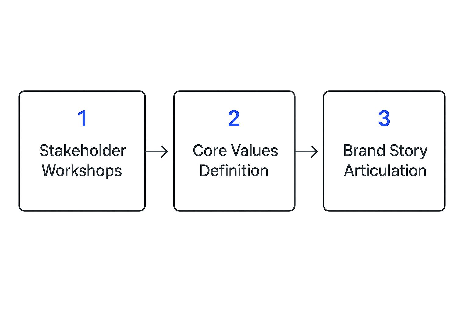
As you can see, a powerful brand story doesn't just appear out of thin air. It’s the direct result of collaborative input and clearly defined values.
Pinpoint Your Core Values
With all those stakeholder insights in hand, your next move is to translate those ideas into a set of core values. And let's be clear: these aren't just feel-good words to stick on a motivational poster. They are the guiding principles for your company’s behavior, both internally and externally. Your values dictate how you hire, how you handle customer support, and how you build products.
My advice? Aim for three to five powerful values that are genuinely unique to your organization. Try to steer clear of generic terms like "integrity" or "innovation" unless you can define them in a way that is specific and meaningful to your brand.
Key Takeaway: Your brand values should be active, not passive. For each value, write a short sentence explaining what it looks like in practice. For example, instead of just "Simplicity," you might write, "We create intuitive tools that make complex tasks feel effortless."
This simple act transforms an abstract concept into a practical, measurable standard for your team, not just another corporate platitude.
Articulate a Compelling Brand Story
Alright, you’ve defined your personality and established your values. Now it’s time to weave them together into a compelling brand story. This isn't a historical timeline of your company's founding. It’s a narrative that explains why you exist, who you serve, and where you're going. A great brand story forges an emotional connection with your audience.
Your story needs to feel authentic and be easy for anyone to grasp. It should resonate with both your employees and your customers, giving them something to believe in. This narrative becomes a central pillar of your brand guidelines, providing crucial context for your voice, messaging, and visual choices.
Ultimately, a well-crafted story provides the "why" behind everything you do. It’s the difference between a company that just sells a product and a brand that stands for something meaningful. This is the emotional heart of your guidelines, ensuring every piece of communication feels connected to a larger purpose.
Building Your Visual Identity Toolkit
Okay, you’ve nailed down your brand's core identity—the mission, the values, the personality. Now for the fun part: bringing it to life. This is where we translate all that strategic thinking into a tangible, visual system that people can actually see and feel.
This toolkit is what ensures your brand looks like your brand, every single time. It's the difference between being instantly recognizable on a social media ad and getting lost in the noise.

Think of this less as a collection of pretty assets and more as a practical field guide. It empowers everyone, from your new marketing hire to a freelance designer, to represent your brand with absolute consistency. And consistency isn't just a buzzword; it's how you build familiarity and, ultimately, trust.
Establishing Clear Logo Guidelines
Your logo is the most concentrated shot of your brand's essence. It's the first hello and the last thing people remember, so you have to protect its integrity fiercely. Just tossing a PNG file into a shared drive and hoping for the best is a recipe for disaster. I've seen it happen too many times.
To stop well-meaning colleagues from stretching, squashing, or recoloring your logo into oblivion, your guidelines have to be airtight. There can be no room for guessing. If you're still in the design phase, make sure you understand the key principles for strong branding to create a logo that will stand the test of time.
Your logo guidelines must cover these non-negotiables:
- Clear Space: This is the logo's personal bubble. Mandate a minimum amount of empty space around it, often measured by a part of the logo itself (like the height of a letter). This "breathing room" keeps it from feeling suffocated by other design elements.
- Minimum Size: Define the absolute smallest your logo can be, both for digital screens and for print. This is critical for ensuring it's still legible on a tiny mobile banner or the corner of a business card.
- Incorrect Usage: This is just as important as showing the right way. Provide clear visual examples of what not to do. Show the logo being stretched, with its colors changed, with a weird drop shadow added, or slapped on a busy background that makes it impossible to read.
By setting these rules, you're not being difficult—you're equipping your team to use your most valuable visual asset with confidence and precision.
Building a Versatile Color Palette
Color is pure emotion. It sets the mood for your entire brand before a single word is read. A well-crafted color palette creates visual harmony and constantly reinforces your brand's personality across every touchpoint.
Your guidelines need to make it incredibly easy for anyone to grab the right color, every time. A truly functional palette is usually broken down like this:
- Primary Colors: These are your headliners. The one or two main colors that scream "you." They should be used most often to build that strong brand recognition.
- Secondary Colors: Think of these as the supporting cast. This set of two to four colors complements your primary hues and is perfect for accents, icons, and subheadings.
- Neutral Colors: These are the workhorses—shades of gray, black, or even an off-white. They are absolutely essential for things like body text and backgrounds, providing the balance that makes everything else pop.
Pro Tip: Never, ever just show a color swatch and call it a day. For every single color in your palette, you must provide the exact value codes for different uses. This is the secret to perfect consistency.
Your guide has to list these codes for every color:
| Code Type | Use Case | Example |
|---|---|---|
| HEX | For web design and all things digital. | #1A2B3C |
| RGB | For anything on a screen (monitors, phones). | R:26, G:43, B:60 |
| CMYK | For printed materials like brochures or flyers. | C:89, M:78, Y:59, K:50 |
| PMS | For professional printing (Pantone Matching System). | Pantone 2161 C |
This level of detail is what guarantees the blue on your website is the exact same blue on your printed posters. No guesswork allowed.
Defining Your Brand Typography
Typography is your brand's voice, visualized. The fonts you choose say a lot about your personality before anyone reads a word. A fun, techy startup might go for a clean, rounded sans-serif, while a high-end financial firm would likely lean into a classic, elegant serif. Your font choices must echo the personality you worked so hard to define.
It's not enough to just name the fonts. You have to create a clear hierarchy that guides the reader's eye and makes your content look intentional and professional.
Here’s a simple way to structure your typography rules:
- Primary Typeface (Headlines): This is your main heading font (H1, H2). It should be distinct and grab attention. Specify the font family, the exact weight (e.g., Bold, Black), and recommended sizes.
- Secondary Typeface (Body Copy): This is for your paragraphs and longer blocks of text. The #1 priority here is readability. Choose a clean font and specify its family, weight (e.g., Regular), size, and line height to make reading a breeze.
- Accent Typeface (Optional): Some brands use a third font sparingly for things like pull quotes or call-to-action buttons. It can add a nice touch of visual contrast, but don't overdo it.
For each typeface, give some guidance on tracking (the space between letters) and leading (the space between lines). This is the kind of meticulous detail that separates an amateur design from a polished, professional brand experience.
Crafting a Memorable Brand Voice and Tone
If your visual identity is your brand’s face, then its voice is its soul. The way your brand communicates in writing is just as critical as your logo or color palette when it comes to building a recognizable identity people can trust. This is where you get to turn abstract ideas like "brand personality" into real, practical writing guidelines for your team.

Without a clearly defined voice, your messaging will feel all over the place. One marketing email might sound buttoned-up and corporate, while a social media post comes across as quirky and casual. This kind of inconsistency doesn't just confuse your audience—it actively weakens your brand. A strong voice ensures every single piece of copy, from a website headline to a customer support chat, sounds like it came from the same source.
Voice vs. Tone: Getting the Distinction Right
So many people use "voice" and "tone" as if they're the same thing, but they’re not. Nailing this distinction is the secret to creating communication that is both consistent and emotionally intelligent.
- Brand Voice: Think of this as your brand’s core personality. It’s consistent and doesn't change because it’s rooted in your mission and values. If your brand were a person, this is simply how it would always speak. Is it an authoritative expert? A witty friend? An empathetic guide?
- Brand Tone: This is the emotional color you add to your voice for different situations. Just like you, your brand’s personality (voice) stays the same, but its tone adapts to the context. You speak to your best friend differently than you do to your boss, but you're still you.
For example, a brand with a helpful voice will communicate differently in a celebratory tweet than it will in a technical support article. The underlying helpfulness is always there, but the tone shifts from excited and punchy to patient and clear. Defining both means you’re never "off-brand," just situationally aware.
How to Define Your Core Brand Voice
To make your brand voice something your team can actually use, you need to go beyond single adjectives. The real goal is to create a framework that anyone—from a seasoned copywriter to a product manager writing a tiny bit of UI text—can pick up and apply instantly.
One of the most effective tools I've seen for this is the "We Sound Like This, Not That" chart. It's a beautifully simple way to provide clarity through direct comparison, leaving very little room for someone to get it wrong. It draws a clear line in the sand.
Here’s what that looks like for a fictional project management software company whose voice is Empowering, Clear, and Friendly:
| We Are... | We Sound Like This... | We Don't Sound Like That... |
|---|---|---|
| Empowering | "Take control of your workflow with smarter tools." | "Our software will do the work for you." |
| Clear | "Connect your calendar in three simple steps." | "Utilize our synergistic integration protocol." |
| Friendly | "Hey, glad to have you on the team!" | "Dear Valued Customer," |
This chart becomes a quick-reference guide. It makes it incredibly easy for anyone on the team to gut-check their writing and stay on track.
Documenting the Nuts and Bolts: Grammar and Style
Consistency isn't just about personality; it's also about the nitty-gritty details of writing. Your brand guidelines should become your company's own mini style guide, settling those common debates before they even start. Deciding on these small rules upfront saves countless hours and prevents maddening inconsistencies later.
These little rules make your copy feel polished and professional, no matter who wrote it.
Your style guide should cover things like:
- Punctuation: Do we use the Oxford comma? How do we handle em dashes versus hyphens?
- Capitalization: Are blog post headlines in Title Case or sentence case?
- Formatting: When do we use bullet points? What about numbered lists? When is it okay to use bold or italics?
- Terminology: Is it "e-commerce," "ecommerce," or "eCommerce"? Lock down your preferred terms for industry jargon and your own product names.
- Acronyms: Do we spell them out on the first use? (e.g., "Key Performance Indicator (KPI)").
A well-defined voice and tone guide is your brand's verbal identity. It ensures that every word you publish reinforces who you are, builds trust with your audience, and helps you stand out in a crowded market.
These guidelines are especially vital for social media, where voice and tone are front and center. For a deeper look at that, our guide on creating brand social media guidelines can help you apply these principles directly to your channels. When you codify these rules, you empower your entire team to communicate with a single, unified voice, strengthening your brand with every word.
Making Your Brand Guidelines Accessible
So you’ve done the hard work. You've pinpointed your brand’s soul, assembled a killer visual toolkit, and nailed down a voice that’s uniquely yours. But here’s the thing: even the most brilliant brand guide is completely useless if it’s buried in a forgotten folder or a pain for your team to use.
A great guide is only as good as its accessibility.
This final step is all about documentation and distribution. It’s where you transform your guidelines from a static document into a living, breathing resource that actually empowers people. The goal is to create a single, undeniable source of truth for every logo, color code, and template, so there’s never any confusion.
Choosing the Right Format For Your Team
Let's be honest, the days of the one-and-done PDF brand book are fading fast. Sure, a PDF is easy to create and email out, but it gets stale almost immediately. Every tiny update means creating and redistributing a new version, which inevitably leads to mass confusion about which file is the right one.
Modern teams need something more dynamic. Using digital tools to host and manage your brand guidelines is a total game-changer. Instead of a clunky document, you get a dynamic brand hub on a centralized platform. This means real-time updates, simple version control, and easy access for everyone—from internal teams to outside vendors—making sure you're all singing from the same hymn sheet.
Let’s quickly compare the most common formats:
| Format | Pros | Cons |
|---|---|---|
| Static PDF | Easy to create and share initially. Works okay for very simple, stable brands. | Becomes outdated fast. A nightmare to update. Assets are not integrated. |
| Shared Drive (e.g., Google Drive) | A step up from a PDF. Lets you store assets and offers some version control. | Can get messy quickly. Not visually engaging. Lacks interactive features. |
| Internal Wiki (e.g., Notion, Confluence) | Highly customizable. Can be woven into other company knowledge. Great for collaboration. | Requires manual setup and ongoing maintenance. Can look less polished. |
| Digital Brand Hub (e.g., Frontify) | The gold standard. A single source of truth. Interactive and always current. Built-in asset library. | Often requires a subscription. Can be more complex to set up at first. |
For most growing businesses, a dedicated digital hub or a really well-organized internal wiki is the way to go. It keeps your guidelines alive and kicking.
Launching Your Guidelines Internally
Just sending a company-wide email with a link and hoping for the best is a recipe for disaster. A successful launch is about building excitement, giving people context, and showing them why this matters. You need to frame the guidelines as a tool that makes their jobs easier, not harder.
Your internal launch should be a multi-step plan designed to get everyone on board. A huge piece of this puzzle is making sure all your assets are neatly organized and easy to find from day one. Our article on digital asset management best practices is a fantastic starting point for getting that system in place.
Here’s a practical checklist to guide your rollout:
- Host a Launch Presentation: Get everyone together for a company-wide meeting (or record a video) to unveil the new guidelines. Don't just read the rules—explain the why behind them. Tie it all back to your brand's mission and what you’re trying to achieve together.
- Create Quick-Reference "Cheat Sheets": No one is going to read a 50-page document to find a hex code. Create simple, one-page summaries tailored to different departments. A designer’s cheat sheet would focus on color codes and logo clear space, while a writer’s would have the "This, Not That" voice chart front and center.
- Hold Department-Specific Training: A one-size-fits-all session just doesn't work. Schedule short, focused workshops with marketing, sales, and product teams to walk them through the parts of the guide most relevant to their day-to-day work.
- Appoint Brand Champions: Pick one person in each key department to be a "brand champion." This person becomes the go-to resource for questions and can help encourage adoption from within their own team. It makes a huge difference.
Key Takeaway: The goal of your launch isn't enforcement; it's empowerment. When your team understands the strategy and has easy-to-use tools at their fingertips, they will naturally become your brand’s strongest advocates.
Common Questions About Brand Guidelines
Even with the best game plan, a few questions are bound to pop up when you're creating brand guidelines. That’s perfectly normal. Getting ahead of these common hurdles is the key to building a guide that your team will actually use and that makes a real impact on your business. Let’s tackle some of the most frequent ones I hear.
How Often Should We Update Brand Guidelines?
Your brand guidelines should be a living, breathing document, not something carved in stone. Think of it this way: a massive overhaul is usually only needed every few years, often when a major rebrand is on the table.
But for the day-to-day, you should be planning for small tweaks and refinements at least once a year. Your business doesn't stand still, and neither should its brand book. You might need to add rules for a new social media channel, update your photography style to feel more current, or adjust your messaging to connect with a new audience.
The most effective brand guidelines are dynamic. They grow and adapt with your business, ensuring they remain relevant and useful. Stagnant guides are the ones that get ignored.
This is where a digital brand hub is a game-changer compared to a static PDF. It makes these little updates easy to manage and guarantees everyone is always looking at the latest version. No more digging through old emails for an outdated file.
Style Guide vs. Brand Guidelines: What Is the Difference?
You’ll hear these terms thrown around interchangeably, but there's a crucial difference that really clarifies the scope of your project.
A "style guide" is typically much narrower. It’s almost entirely focused on the visual design elements—the what and how of your look.
A style guide usually covers things like:
- Logo usage and placement
- Color palette codes
- Typography rules
On the other hand, "brand guidelines" is the whole enchilada. It includes everything from the style guide but layers on the critical strategic elements that define who you are. This is where you get into your mission, values, personality, and, most importantly, your voice and tone. If you want a resource that empowers your entire company, from marketing to sales to support, you should always aim to build comprehensive brand guidelines.
How Do We Get Our Team to Actually Follow the Guidelines?
Getting your team to adopt the guidelines is all about empowerment, not enforcement. You have to make them want to use it. From my experience, this boils down to a few key moves.
First, pull key people from different departments into the creation process. When someone has a hand in building the thing, they develop a sense of ownership. They become champions for it. For a deeper look at this, you might explore this comprehensive guide on how to create brand guidelines which also has some great points on building team buy-in.
Next, when you launch the guidelines, don't just email a file. Hold a presentation. Walk them through the "why" behind the rules and connect it all back to the company's bigger goals. And finally, make the guide ridiculously easy to find and use. A central, digital hub always wins against a file someone has to hunt for on a shared drive.
Can a Small Business Create Effective Guidelines?
Absolutely. In fact, it’s one of the smartest, highest-impact things a small business or startup can do to set itself up for success.
You don't need a hundred-page encyclopedia to be effective. Consistency is just as critical for a small brand as it is for a corporate giant. Start small with a simple, one-page guide that covers the non-negotiables. This ensures that as you grow and start bringing on freelancers or new team members, your brand looks and feels the same from day one.
A starter guide should have:
- A one-sentence mission statement
- Basic logo rules (like clear space and minimum size)
- A simple 2-3 color palette with HEX codes
- One or two primary brand fonts
- A few sentences describing your brand's voice
This simple document is your foundation. You can easily build on it and add more detail over time as your brand matures.
Ready to keep your brand consistent across every social media channel? PostSyncer provides a centralized platform to manage your content, scheduling, and analytics, ensuring your voice and visuals are always on point. Start your free 7-day trial today and see how easy brand consistency can be.