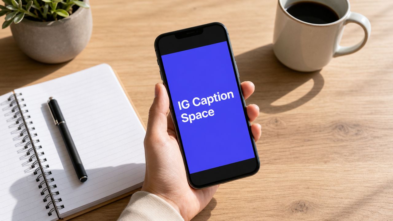


You format your Instagram caption in Notes. The hook sits on its own line. The story breathes. The call to action is easy to spot. Then you paste it into Instagram, hit publish, and the whole thing collapses into a cramped block.
That's the moment individuals start blaming themselves. They assume they missed a step, used the wrong app, or forgot some secret trick. Usually, the problem isn't effort. It's that Instagram caption formatting has never been fully straightforward, especially if you care about consistency across phones, desktop, and scheduling tools.
IG caption space isn't just a cosmetic detail. It affects readability, scanability, and how much of your message survives the first glance. It also eats into a fixed text budget, so every blank line has a cost. If you manage content for a brand, a client, or your own business, the primary challenge isn't learning one line break hack. It's building a workflow that keeps working.
Why Your Perfect Caption Looks Like a Mess
Anyone who's managed Instagram long enough has lived through this: the exact same caption looks fine in one draft, broken in another, and completely different after a quick edit in the app.
That's not random. Instagram caption spacing has historically been a workaround problem, not a clean built-in formatting feature. As one walkthrough on Instagram caption spacing workarounds shows, creators have spent years drafting in Notes, Google Docs, and spacer tools because Instagram's native editor didn't make advanced spacing easy. The whole ecosystem around caption formatting grew because users had to invent repeatable hacks.
Practical reality: If you care how a caption looks after publishing, you're not being picky. You're dealing with a platform quirk that creators have been working around for years.
The frustration gets worse because the failure isn't always obvious before posting. You can draft a clean caption with tidy paragraph breaks, hashtags tucked away, and a clear CTA, then watch the app flatten part of it during paste, during scheduling, or after a later edit.
Why this keeps happening
Instagram doesn't treat caption spacing the way a word processor does. It's closer to plain text with inconsistent handling around whitespace and pasted formatting. That's why one line break survives while another disappears.
A few patterns show up over and over:
- You pasted from a rich-text source: Extra formatting comes along for the ride.
- You edited after publishing: The app can change how your spacing is rendered.
- You used a method that only works on one device: What survives on iPhone may not survive elsewhere.
For social media managers, mastering ig caption space becomes less about aesthetics and more about operational control. If a caption is part of the creative, its structure has to survive the publishing process. Otherwise, you're approving one version and shipping another.
The Rules of the Instagram Caption Game
Before you fix spacing, you need to know what Instagram is doing to your text.
The biggest constraint is the 2,200-character limit for captions, which includes your words, hashtags, emojis, and spacing characters, according to this Instagram line break guide. That matters because blank lines aren't free. Every extra bit of formatting uses part of the same fixed text budget.

What Instagram treats as expendable
Instagram often cleans up whitespace it sees as unnecessary. That's the root of most caption-spacing failures. If the platform decides a line is effectively empty, it may collapse it.
That leads to three practical rules:
| Constraint | What it means in practice |
|---|---|
| Character cap | Long storytelling, CTA copy, hashtags, and spacing compete for the same limited space. |
| Whitespace cleanup | Empty-looking lines may be compressed during paste or edit. |
| Rendering quirks | Emojis and copied text can shift how a line behaves after publishing. |
Why simple spacing fails
Typing a caption directly into Instagram feels convenient, but it leaves more room for formatting surprises. Manual returns can look fine in the draft view and still behave differently after posting.
Dense captions aren't automatically bad. Over-spaced captions aren't automatically better either. But if you want intentional formatting, you have to accept the platform's rules first:
- Every visible break has a cost
- Empty space may be stripped
- Copied text isn't always neutral
The cleaner your source text is before it reaches Instagram, the more predictable your result will be.
Once you understand that, the weird behavior starts making sense. Instagram isn't sabotaging your caption. It's just unforgiving about how text gets entered and preserved.
Manual Methods to Create IG Caption Space
You format a caption in your notes app, paste it into Instagram, and it looks clean. Then one edit later, the blank lines collapse and the whole post turns into a wall of text. That is the frustration manual spacing creates. It can work well, but only if the draft stays clean from the first line to the final paste.
The most dependable no-scheduler workflow starts outside Instagram. Draft in a notes app or plain text editor, keep each line tight, then paste the full caption into Instagram once. Jenn's Trends points out one of the easiest mistakes to miss in its guide on formatting Instagram captions. A trailing space at the end of a line can break the line break.

The notes app workflow that wastes the least time
For single posts, this is the manual process I trust most:
- Write the full caption in Apple Notes, Google Keep, or a plain text editor.
- End each line on the last visible character.
- Press return once for a new line, or twice for a paragraph break.
- Copy the entire caption.
- Paste it into Instagram in one pass.
- Avoid editing the spacing inside Instagram unless you have to.
That last step saves time. Every extra round of tapping, deleting, and reformatting inside the Instagram app raises the odds that your spacing changes.
If you want to speed up cleanup before posting, an Instagram line breaker tool helps format the caption before it reaches Instagram.
When invisible characters help
Normal blank lines are fine until they are not. Some devices, keyboards, repost tools, and edit flows strip them out. Invisible Unicode spacer characters help because they make the line technically non-empty, even though it still looks blank to the reader.
That is useful when standard paragraph breaks keep disappearing after paste, after a caption edit, or when content passes through more than one app. The trade-off is simple. This method is more reliable than plain blank lines, but it is also less intuitive if someone else on your team opens the draft later and does not know the spacer is there.
Use invisible characters when you need:
- Stable separation between sections: Helpful for CTA blocks, disclaimers, or hashtags.
- A repeatable workflow across devices: Useful if you draft on desktop and publish on mobile.
- Less rework after paste: Good for creators and managers who are tired of rebuilding spacing by hand.
A short walkthrough is helpful if you haven't used this trick before:
What not to rely on
Some spacing tricks still get shared because they worked once on one phone. They are not reliable enough for a repeatable workflow.
- Periods as fake blank lines: They stay visible and make the caption look forced.
- Random symbols between paragraphs: They create clutter instead of clean spacing.
- Reformatting after paste: It often introduces the same problem you were trying to fix.
- Over-spacing every caption: More white space does not automatically make the caption easier to read.
Dense captions can perform perfectly well if the writing is strong. Spacing should support readability, not become the whole strategy.
Manual methods are still useful. For quick posts, they are often enough. For consistent results, the winning habit is simple: draft in clean text, paste once, and avoid touching the spacing afterward.
The Professional Method Using a Scheduler
A caption that looks clean in Notes can still publish as a block of text after it passes through approvals, copy-paste steps, and a mobile edit. That is a primary reason schedulers matter. They do not just save time. They reduce the number of places where formatting can break.
For teams, agencies, and creators with a posting calendar, the reliable setup is simple. Draft once in plain text, review the exact caption inside your publishing tool, then publish without touching the spacing again on your phone. An Instagram scheduler helps keep that process consistent because the approved version is the same version that goes out.

Why schedulers are more consistent
The main benefit is control.
Instagram caption spacing often breaks because the text gets handled too many times. A writer drafts it in one app. Someone else edits it in email or a doc. Then a social manager pastes it into a scheduler or straight into Instagram, spots a typo, and makes one last mobile change. Every extra handoff increases the chance that line breaks get stripped, spaces get added where they should not, or the final version no longer matches the approved draft.
A scheduler cuts down those failure points by keeping the caption in one workflow. That matters more than any single spacing trick.
In practice, a scheduler helps with three things:
- One working version: The draft, review copy, and published caption stay aligned.
- Fewer last-minute edits on mobile: That is where formatting often gets mangled.
- More predictable team output: Everyone follows the same publishing process instead of using personal hacks.
This does not mean schedulers are magic. Some still handle pasted text better than others, and Instagram can behave differently across app versions. The advantage is consistency, not perfection. You are building a process with fewer weak spots.
When this approach makes sense
If you post casually from one account, a manual method is usually faster. If you manage recurring campaigns, client approvals, or multiple brands, the time savings come from fewer fixes after publish.
Use a scheduler when the cost of one broken caption is higher than the cost of a structured workflow.
| Situation | Better approach |
|---|---|
| Posting in real time from one account | Manual draft and paste |
| Managing repeat content across accounts | Scheduler workflow |
| Working with approvals or teammates | Scheduler workflow |
| Needing exact caption formatting repeatedly | Scheduler workflow |
One trade-off is worth stating clearly. More spacing is not always better writing. I have seen dense captions outperform neatly spaced ones because the hook was stronger and the copy got to the point faster. Use a scheduler to make formatting dependable, not to force every caption into the same airy layout.
The professional method is less about aesthetics and more about repeatability. When the workflow is stable, caption spacing stops being a recurring production problem.
Troubleshooting Why Your Line Breaks Vanished
When spacing breaks even though you followed the usual advice, the fix is rarely “try harder.” You need to identify where the caption changed. Most formatting issues happen at one of three moments: during drafting, during paste, or after a later edit.
A practical summary from Evergreen Feed on Instagram line break issues points to a problem most tutorials skip: reliability varies across devices, app versions, and third-party workflows. That's why one method can look stable on iOS and fail after scheduling or desktop editing.

Common causes and direct fixes
Start with the boring issues first. They're often the actual culprit.
Trailing space at the end of a line
This is one of the most common formatting killers. Delete the space after the last character, then add the line break again from a plain text draft.Pasting from a rich-text editor
Word processors and formatted docs can carry hidden styling or characters. Paste from Notes or another plain text source instead.Emoji at the edge of a line
Some captions behave oddly when an emoji sits at the end of a line or near a break. Move the emoji to the next line or place text after it and test again.
The edit trap
A caption can publish correctly and still break later when someone opens the Instagram app and “just fixes one word.” That small edit can change the spacing behavior because the app reprocesses the text.
If a published caption needs revision, use this order of operations:
- Save the current caption to a plain text note first.
- Rebuild the intended spacing in that clean draft.
- Replace the full caption in one paste instead of patch-editing sections.
Re-editing line by line inside Instagram is where a lot of good formatting goes to die.
Device differences are real
People often assume a spacing method is universal once it works once. It isn't. Mobile app behavior, desktop publishing flows, and third-party schedulers can all handle pasted text differently.
Use this checklist if your ig caption space still won't stick:
- Test the draft source: Is it plain text or copied from somewhere styled?
- Check the endpoint: Did you publish from mobile, desktop, or a scheduler?
- Review post-publish edits: Did anyone touch the caption afterward?
- Inspect hidden clutter: Extra spaces, symbols, and odd line endings cause trouble.
When troubleshooting, don't change five things at once. Remove one variable, test again, and keep the process boring. Reliable formatting usually comes from fewer moving parts, not more tricks.
Best Practices for Smart Caption Spacing
Good spacing should help the reader move through the caption. It shouldn't exist just because Instagram lets you fake paragraph breaks.
That strategic question matters more now because many users scan quickly and captions are often truncated. As discussed in this video on whether caption spacing still matters, most advice focuses on how to add spacing, not whether spaced captions improve comprehension enough to justify using more of the visible caption area for blank lines.
Use spacing where it changes behavior
Spacing earns its place when it does one of these jobs:
- Improves scanability: Break up dense explanation into readable chunks.
- Highlights the CTA: Give the final action its own line or block.
- Separates hashtags from the main message: Keep utility text from overwhelming the caption.
If you need help cleaning up layout before publishing, an Instagram post formatter can make the caption easier to structure.
Don't over-format short captions
If the post only needs a punchy hook and a short CTA, too much spacing can hurt more than help. It pushes useful text downward and can make the visible preview feel empty.
A simple rule works well:
Leave space where the reader needs a pause. Don't add space where you only want decoration.
For most brands, the strongest caption structure is usually modest. A sharp opening. One or two readable body blocks. A clear CTA. Clean hashtag placement if needed. That's enough to make ig caption space work as a strategic tool instead of a formatting obsession.
If you want a cleaner publishing workflow, PostSyncer gives you one place to draft, format, schedule, and manage Instagram captions without relying on fragile copy-paste habits.