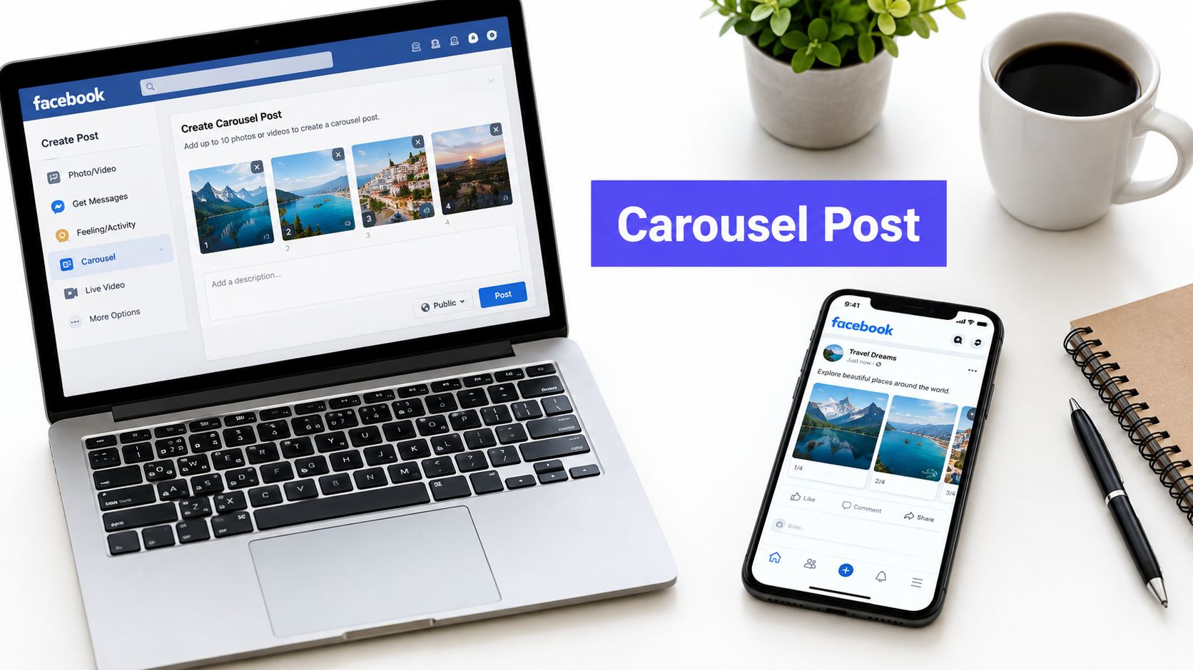












Instagram carousels can still pull serious attention in a crowded feed, even as overall Instagram organic engagement has softened. That matters because each swipe gives the same post another chance to earn attention, which makes the format feel less like a single image and more like a sequence built around one clear goal.
The question is not how to make a carousel look polished. It is whether the post should work like a mini-landing page, a slide-by-slide explainer, or a panoramic story. That choice depends on what you want the audience to do, and choosing the wrong format wastes slides on the wrong kind of attention.
Understanding Instagram Carousel Posts
An Instagram carousel post is a single feed post built from multiple photos or videos that people swipe through. Instagram now allows up to 20 slides per carousel, which makes the format a major milestone for native storytelling on the platform (Sprout Social). That's a big shift from the old mindset of “post a few images together and move on.”
Think of a carousel like a digital slideshow booklet. Each page carries part of the message, but the sequence only works if the pages fit together cleanly. If the first slide doesn't earn the swipe, the rest of the story never gets read.
Why the first and last slides matter so much
The first slide works like a window display. It has to stop the scroll, set a clear promise, and make the next swipe feel worthwhile. The last slide is where the sequence lands, and that's where the call to action belongs, whether that means saving the post, visiting a product page, or reading more.
That structure is what separates carousels from single-image posts. A single image asks people to absorb everything at once. A carousel lets you pace the message, which is useful when the topic needs explanation, proof, or buildup.
A format with three possible jobs
The confusion usually starts when teams try to make every carousel do the same thing. Some posts should behave like a landing page, where each slide moves the viewer toward one decision. Others should behave like a tutorial, where each slide delivers one step. Others work better as a story, where the reveal matters more than the amount of information.
Practical rule: choose the carousel role before you design the slides. If you want conversion, build for clarity. If you want education, build for sequence. If you want attention, build for suspense.
Technical Specs and Upload Requirements
The starting point for an Instagram carousel post is 1080 × 1350 px at a 4:5 aspect ratio. That vertical format uses more of the phone screen than square or horizontal layouts, so the slides feel easier to read on mobile. A carousel often works like a mini-landing page, and the layout needs enough room for a headline, proof, and next step without crowding the frame. For a broader reference on sizing choices across platforms, the guide to perfect aspect ratios is useful when you are planning assets for more than one network.
Text and visuals need breathing room near the edges. Keep important elements away from the outer margins and stay under 30 MB per image so compression has less chance to soften type or blur layered graphics. That matters most on slides with small labels, product details, or tightly arranged design elements, where a little loss in clarity can make the whole sequence harder to scan. For export planning and sizing details, this complete guide to Instagram image sizes can help standardize how creative files are prepared before upload.
Instagram supports up to 20 slides in the app, while some third-party scheduling tools still limit carousels to 10 slides. That difference matters when your carousel is meant to behave like a slide-by-slide explainer or a panoramic story with more room for pacing. A longer sequence can carry more detail, but the publishing route affects how far you can take that structure.
| Specification | Value |
|---|---|
| Carousel format | Single feed post with multiple swipeable slides |
| Native slide limit | Up to 20 slides |
| Recommended size | 1080 × 1350 px |
| Aspect ratio | 4:5 |
| File size guidance | Under 30 MB per image |
| Scheduler caveat | Some third-party tools cap at 10 slides |
What this means for design teams
A carousel is more than multiple images bundled together. It has to survive upload, compression, and mobile viewing without losing its shape, which is why the platform constraints should guide the layout before styling choices do. Teams that plan with the format first usually avoid crowded slides, broken hierarchy, and text that looks fine in a mockup but feels cramped once it is live.
Marketing Benefits and Use Cases
Carousel posts often earn more attention than single-image posts because they give people more than one reason to stop and interact. SocialInsider reports carousel engagement levels ranging from 0.55% to 10.15%, with some examples showing up to 3.1 times more engagement than single-image posts and 22% to 23% more saves. The practical lesson is straightforward. A swipeable sequence creates extra chances for a viewer to pause, come back, and take action.
A carousel works like a short guided path. The first slide opens the door, the middle slides carry the explanation, and the final slide points the reader toward a decision. That structure gives marketers room to choose between storytelling and information density based on the goal of the post.
Where the format fits best
Use carousels when the message has layers. A product launch can place the hook on the first slide, features in the middle, and the next step at the end. A tutorial can split a process into clear steps, so readers do not have to sort through everything in one frame.
They also work well for proof-based content. Testimonials, before-and-after reveals, and event recaps all benefit from a format that lets the audience move through evidence in order. That pacing usually feels more credible than crowding every claim into a single image, because each slide can carry one piece of the case.
Three practical use cases
- Educational sequences: A software brand can turn one topic into a compact lesson. The audience gets context first, then detail, then a final prompt to act.
- Product demonstrations: A retail brand can show one item from several angles. The viewer does not have to guess how it works or what changes after use.
- Trust-building galleries: A service brand can line up customer quotes, screenshots, or results in a clean sequence. The viewer can read, compare, and decide without feeling rushed.
Carousels can also support repurposing. If your team publishes audio clips or spoken highlights from social posts, a tool like extract audio from Instagram posts can help turn that material into other formats without rebuilding the message from scratch.
A carousel earns its place when each slide does one job well. Understanding, proof, and action are the main jobs. If a slide does none of them, it is usually only taking up space.
Creating and Scheduling Carousel Posts with PostSyncer

A carousel is easier to manage when the sequence is planned before the caption. The slides carry the main argument, while the caption adds context, a prompt, or a final instruction. That split matters because a carousel can work like a mini-landing page, a slide-by-slide explainer, or a panoramic story, and each version asks for a different balance between storytelling and information density.
Start by arranging the slides in order. The first frame should earn attention, the middle frames should carry the logic, and the last frame should close the loop. If the order feels uncertain, the post will feel uncertain too.
A scheduling tool such as PostSyncer's Instagram scheduler fits into a calendar-based workflow. For teams planning across channels, that keeps the carousel tied to the wider publishing plan instead of treating it as a one-off asset.
A simple build sequence
- Upload your slides. Keep the sequence intentional. The opening slide should set the hook, and the remaining slides should develop the idea in a way that feels natural.
- Add the caption. Use it for context, supporting detail, or a clear next step. The caption should not repeat the same work the slides already do.
- Choose timing. Publish when your audience is likely to see the post as a complete sequence, not as scattered fragments.
- Select channels. Instagram is the core target here, but the same creative plan often needs to fit different network rules as well.
- Review and schedule. Check slide order, text readability, and CTA placement before the post goes live.
A common practical issue encountered is slide length. Instagram natively supports up to 20 slides, but some third-party tools still cap posts at 10 slides (SocialRails). A brand planning a longer educational sequence may need to adjust the concept, trim the sequence, or choose a tool that supports the full build.
Why this matters in day-to-day publishing
Approval workflows help because one weak slide can disrupt the whole carousel. A typo in slide four, a weak CTA, or a poorly exported image can break the rhythm the audience has been following. Think of the post like a row of dominoes. If one piece is off, the sequence loses force.
Multi-platform calendars also make it easier to compare the carousel with other content before it goes out. That helps prevent a strong sequence from being buried under a post that deserves less attention on the same day.
Creative Templates and Real-World Examples

The fastest way to improve a carousel is to stop inventing a new format every time. A reusable template gives you structure, and structure makes the story easier to follow. This is similar to choosing the right container before you cook the meal.
Five useful carousel templates
Educational mini-course. This format works like a short lesson plan. Each slide covers one concept, so the audience can follow the logic without rereading the whole post. It fits brands that teach, especially when the goal is saves.
Product reveal. Use the first slide as a tease, then move into detail and payoff. This works when anticipation matters more than explanation, because the reveal becomes part of the value.
Testimonial gallery. Line up quotes, screenshots, or customer notes. The design should stay consistent so the viewer compares proof instead of getting distracted by style changes.
Tutorial step-by-step. One action per slide keeps the process manageable. This is the right choice when the audience needs clarity more than inspiration.
Panoramic storyboard. This one spreads a scene across slides, almost like a long strip of film. It's strongest when visual flow matters and the message benefits from motion across the sequence.
You can also see how sequence-driven storytelling gets discussed in practice through this embedded walkthrough.
The most useful rule is to match the template to the job. Educational content needs more spacing and stronger hierarchy. Product reveals need tighter pacing. Testimonials need repetition in the layout so the proof feels organized rather than scattered.
What to standardize
Keep your colors, fonts, and image treatment consistent across slides. That consistency helps the viewer understand the sequence faster, which matters more than elaborate decoration. If you want a downloadable outline, build one master slide for the hook, one for the body, and one for the close, then remix those three parts across campaigns.
Measuring Performance and Optimization Strategies

The simplest mistake in carousel reporting is judging success by likes alone. That misses the behavior that makes the format different. A carousel is a sequence, so you need metrics that show where people stay, where they leave, and where they act.
The metrics that matter most
Track swipe rate, completion rate, saves, shares, and click-throughs. Instagram Insights gives you native post data, and a unified dashboard in tools such as PostSyncer's social media analytics guide can help you compare performance across posts and channels. If you want to know who liked a post and how that interacts with broader engagement tracking, according to HarvestMyData's research there are additional ways to inspect audience behavior beyond a surface-level metric count.
A useful reading pattern is this. If the first slide gets attention but the rest of the slides don't hold it, the hook is strong and the sequence is weak. If completion is high but clicks are low, the story may be useful but the CTA is buried or too vague.
How to improve without guessing
- Test the first slide: Change the hook, not the whole deck, so you can isolate what improves the swipe.
- Vary the slide count: Some topics need more room, others perform better when the message is tighter.
- Move the CTA earlier or later: The placement can change whether the post feels like a lesson or a pitch.
- Keep the visual system stable: If the audience has to decode new layouts on every slide, the message gets harder to finish.
Most guidance still points to 8 to 10 slides as a common best-practice range, but the stronger lesson is that format quality and CTA placement matter more than slide count alone (PostPlanify). That means the right answer depends on the objective. Use longer sequences when the goal is education or saved value. Use shorter sequences when you need faster completion or a cleaner conversion path.
If a carousel is meant to sell, compress the argument. If it's meant to teach, spread the logic out. The slide count should serve the job, not define it.
Conclusion and Next Steps
Instagram carousel posts work because they let you control pacing, proof, and action in one native format. The technical baseline is clear, the creative choices are clearer, and the key strategic decision is whether you need a story, a lesson, or a conversion path. Start with one objective, choose one template, design for mobile, schedule it cleanly, and review the metrics that show how people moved through the sequence.
Define the goal, build the right slide flow, follow the specs, publish through a structured workflow, then measure what the audience did. That's how a carousel stops being just another feed post and starts doing real marketing work.
A CTA for PostSyncer.