











Monday morning starts with fourteen browser tabs, three analytics logins, a leadership email asking for “last week's numbers,” and a Slack message requesting one more cut of the data. You can find the figures, but assembling them into a trustworthy answer takes longer than it should.
That's the practical problem behind the question what is performance reporting. It isn't opening a dashboard or exporting a spreadsheet. It's a repeatable way to connect results with goals, explain changes over time, and decide what the team should do next. The strongest reporting systems reduce scattered metrics into a shared operating view, so marketers, managers, and executives can discuss the same evidence.
Why Performance Reporting Feels Harder Than It Should
The social media manager in that Monday-morning situation isn't struggling because the numbers are difficult to read. Reach is in one platform, clicks are in another, comments are buried in an inbox, and campaign context may live in a planning document. Each tool answers a narrow question, while leadership usually wants a broader one: What happened, why did it happen, and what should we change?
The friction grows when different stakeholders ask for different versions of the same performance story. A content lead may want results by post type, a paid media manager may need campaign-level efficiency, and a chief executive may only need progress against a business objective. Pulling each view manually creates duplicated work and increases the chance that two reports use different date ranges, filters, or definitions.

The hidden cost is interpretation
A dashboard can show that engagement fell. It may not show whether the decline followed a change in content mix, a campaign ending, a publishing gap, or a shift in audience behavior. Someone still has to assemble the evidence and turn it into an explanation.
That's why reporting should be treated as a shared decision habit, not an administrative task. A useful report gives everyone the same time period, definitions, targets, and next actions. It compresses a scattered workflow into an answer that can be reviewed, challenged, and reused.
Practical rule: If producing the same report requires rebuilding the logic each time, you don't have a reporting process yet. You have a recurring data rescue operation.
The goal isn't to eliminate every dashboard. It's to give dashboards a job inside a larger workflow, where data collection, comparison, interpretation, and action happen in a consistent sequence.
What Is Performance Reporting, Really
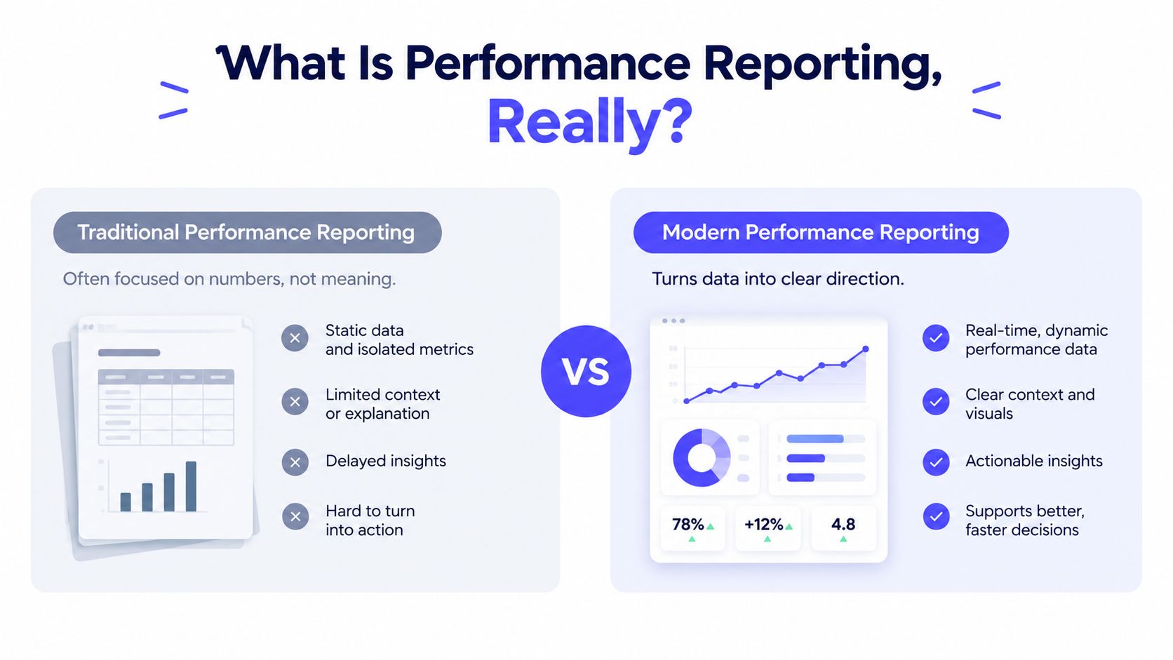
Performance reporting is a structured decision system that collects, organizes, analyzes, and presents performance data against goals. It connects activity with an objective, a defined period, a comparison point, and a next action. A dashboard may display the current result. Reporting explains what that result means and what the team should examine or change.
A car dashboard offers a useful comparison. The speedometer shows the present reading, while the trip computer adds distance, fuel use, and journey context. Performance reporting does the same with business data: it combines the current value with historical movement, planned targets, and the route ahead. One number shows where you are. A report helps you judge whether the direction is right.
From snapshots to direction
A snapshot can show today's impressions or this week's clicks. A time-based report shows how those values change across recurring periods. Enterprise reporting may organize data by day, week, month, quarter, or year, then calculate counts, averages, sums, minimums, or maximums across those periods, as described in Attio's guide to historical values reports.
The timeline changes the interpretation. A high result could reflect sustained improvement, a temporary campaign lift, or one unusual event. A lower result could indicate a problem or a deliberate strategic change. Without comparable periods, the reader must guess which explanation fits.
Reporting windows also shape the questions a team can answer. Google Search Console can expose up to 16 months of search data, while Power BI's built-in usage metrics report covers the last 90 days by default, according to this performance report guide. The windows serve different purposes. Both show why performance analysis needs comparison, not isolated totals.
Reporting is a workflow, not a chart
A chart is only the display layer. The reporting workflow should help a team:
- Measure progress: Show whether results are approaching a defined goal.
- Explain causes: Connect changes with campaigns, content, timing, audience, or operational events.
- Choose the next move: Identify what to continue, stop, test, or investigate.
Paid media makes the distinction clear. A chart can display daily clicks, while a decision-ready report adds the target, variance, trend, and recommended adjustment. Marketers seeking a channel-specific structure can consult best practices for PPC reporting as a practical reference. A social reporting tool such as PostSyncer brings collection, comparison, interpretation, and action into one workflow, reducing the need to assemble each answer across separate tools.
The Five Building Blocks of Every Report
A strong report answers five questions in sequence: What happened? What did we expect? How far away are we? Is the movement changing? Are we progressing toward the larger outcome?
Consider a social awareness program. The current period produced 142,000 in reach against a target of 150,000, creating a variance of minus 5.3 percent. The headline alone says the team missed its target. The trend line adds context by showing two weeks of decline after a viral spike, while cumulative progress toward the quarterly awareness goal sits at 58 percent.
Those figures illustrate how the building blocks work together. The actual tells you the observed result. The target establishes the intended result. The variance quantifies the gap. The trend shows whether the gap is widening or narrowing. Progress toward goal places the current period inside the broader plan.
| Building Block | Definition | Social Metrics Example |
|---|---|---|
| Actuals | The result recorded during the selected period | Reach of 142,000 |
| Targets | The planned or expected result | Reach target of 150,000 |
| Variance | The difference between actual performance and target | Minus 5.3 percent versus target |
| Trend | The direction of movement across earlier periods | Two weeks of decline after a viral spike |
| Progress toward goal | Cumulative movement toward the intended outcome | 58 percent of the quarterly awareness goal |
Each quantitative example in this table comes from the scenario provided in the brief. In a live report, the calculation method and comparison period should be visible so readers can reproduce the result rather than accept an unexplained label.
Why one missing block weakens the report
Remove the target, and the reader can't tell whether 142,000 is good. Remove the variance, and the reader must calculate the gap. Remove the trend, and a temporary dip can look like a structural decline. Remove progress toward goal, and a single strong week can distract from a weak quarter.
This structure applies beyond social media. A LinkedIn report, paid search review, product usage dashboard, or customer support scorecard can use the same logic. The metric changes, but the decision questions stay stable.
For a practical template that translates these components into a social workflow, see this social media analytics report template.
Choosing the KPIs That Actually Drive Decisions
A KPI earns its place when it helps someone choose an action. Start with the business goal, then select metrics that reveal progress toward that goal. Don't begin by copying every available field from a platform export.
| Business Goal | Example KPIs | Question It Answers |
|---|---|---|
| Awareness | Reach, impressions, brand mentions | Are more relevant people seeing or discussing the brand? |
| Engagement | Comments, shares, saves | Does the content prompt meaningful audience response? |
| Conversion | Link clicks, conversion rate, leads | Is social activity moving people toward a desired action? |
| Retention | Returning engagement, repeat interactions, response activity | Are existing audiences continuing to interact with the brand? |
| Advocacy | Positive mentions, customer shares, referrals | Are customers voluntarily extending the brand's reach? |
These categories aren't interchangeable. Reach can support an awareness objective, but it won't explain whether a campaign generated qualified demand. Follower count may indicate audience accumulation, yet click-through rate can produce a sharper decision if the team is deciding which content should receive more budget or creative attention.
Use a decision filter
List every metric in your current report. For each one, ask two questions:
- Decision impact: Could this metric change a budget, a creative direction, a publishing choice, or a channel mix within the next reporting cycle?
- Data cost: How much effort does it take to collect, clean, define, and explain consistently?
Keep the small group that performs well on both tests. A short KPI list reduces cognitive load and makes ownership clearer. A long dashboard may look thorough, but it can bury the signal under measurements that no one uses.
If a metric doesn't change a decision, it shouldn't automatically earn space on the first page.
A practical starting point is to select three to five decision-critical KPIs, then place supporting metrics in a secondary view. The main report should help a reader understand the current position quickly. The appendix or drill-down can preserve detail for analysts who need to investigate.
For more examples of metrics organized around social outcomes, use these social media KPI examples as a reference. The important principle is still yours to apply: define the decision first, then choose the evidence.
Building a Repeatable Reporting Process
Reporting becomes easier to manage when every cycle follows the same path. A repeatable process separates mechanical work from judgment, so analysts spend less time copying figures and more time deciding what those figures require next.
Start with the reader
Before opening a dashboard, write two sentences:
- Audience prompt: “This report is for ___.”
- Decision prompt: “After reading it, this person must decide ___.”
An executive may need a concise view of progress, risk, and resource allocation. A content team may need post-level evidence for its next publishing choice. Both groups can use the same dataset, but they need different views because their decisions differ.
Choose the cadence
Set the reporting frequency according to how quickly the decision changes:
- Daily pulse: urgent monitoring or active launches.
- Weekly review: adjustments to content, timing, and near-term priorities.
- Monthly business review: channel contribution and recurring patterns.
- Quarterly strategy review: goals, investment, and positioning.
Using more than one cadence lets a team monitor immediate movement while reviewing longer-term direction. The trade-off is clarity. Frequent updates can create noise when no one has authority to act on small changes. A cadence should therefore match both decision speed and available ownership.
Lock the template
Keep each report in a stable order:
- Executive summary
- KPI table
- Variance from target
- Narrative insights
- Next actions
A consistent template teaches readers where to look and exposes gaps. If the variance section is empty, the team has a clear issue to resolve rather than a vague sense that the report feels incomplete.
Automate the mechanical work
Use scheduled exports, API connections, or a reporting platform to refresh data. Reporting automation workflows can handle collection and synchronization, while people validate definitions, investigate anomalies, and explain what changed.
This division matters because automation improves repeatability, not judgment. A tool can move numbers into a report, but it cannot decide whether a spike reflects a campaign, a tracking change, or an error.
Human judgment belongs after data preparation, not in repetitive copying.
Review the report itself
Treat the report as a product that should improve after each cycle. Ask:
- Did the last report change a decision?
- Which section did readers ignore?
- Did anyone question a metric definition?
- What required the most manual effort?
- What should be removed or automated next time?
A weekly checklist keeps the process dependable:
- Refresh connected data.
- Check date ranges and filters.
- Flag material variances.
- Investigate unusual movement.
- Draft the three most important insights.
- Assign next actions and owners.
- Distribute the report on the agreed day.
- Record questions for the next review.
The checklist protects the workflow, while the review questions protect its usefulness. If a section never affects a decision, remove it or move it to a secondary view. That keeps performance reporting focused on the next action, rather than preserving every available measurement.
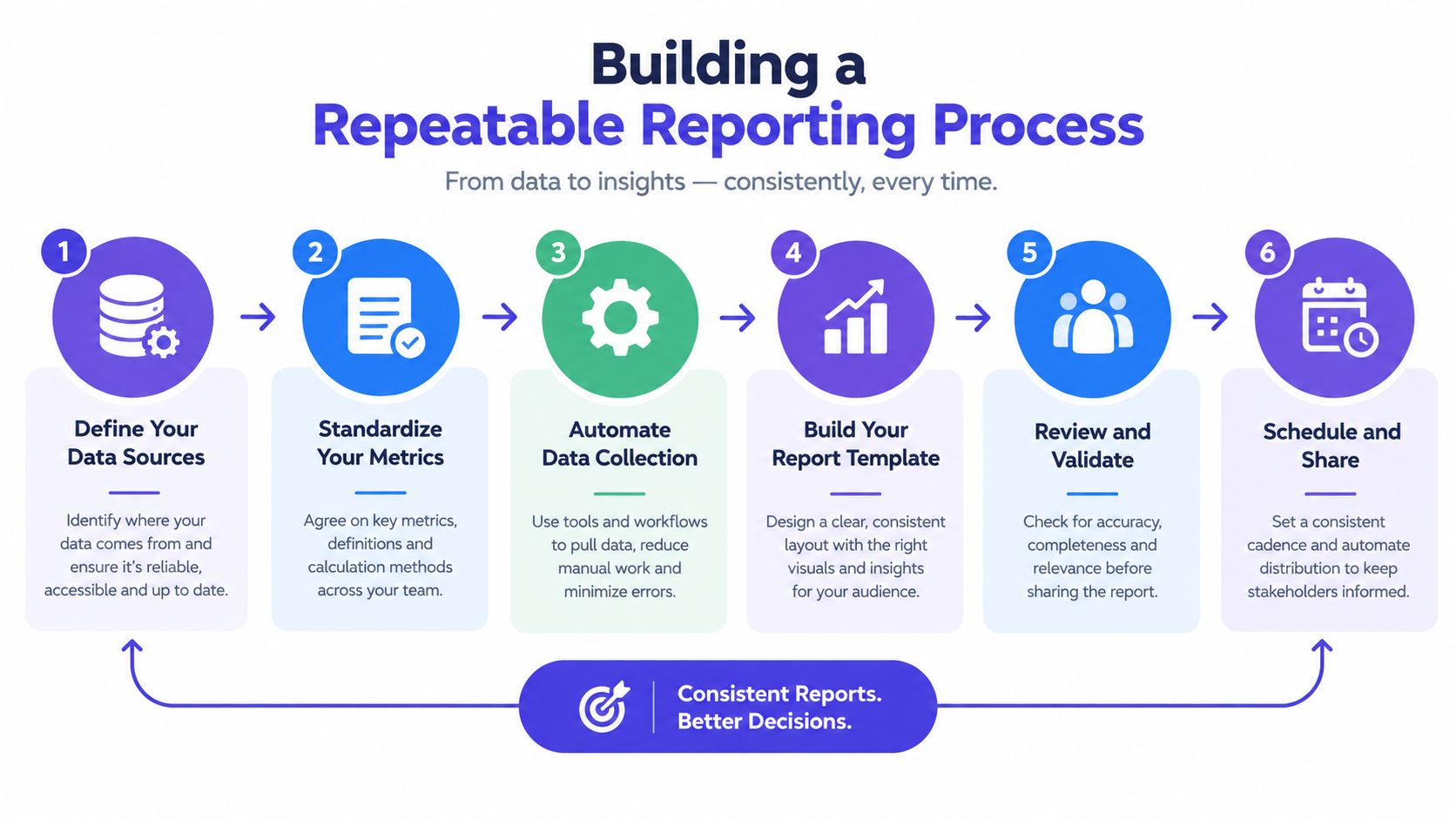
A visual process makes ownership easier to discuss when several people contribute data, interpretation, and distribution.
Common Pitfalls and How to Avoid Them
A report can be accurate and still produce poor decisions. The usual failures come from weak selection, weak comparison, weak explanation, or weak delivery discipline.
Vanity metrics
A metric may be easy to collect and still have little decision value. Follower count, total impressions, or likes can provide context, but they shouldn't dominate the report unless they connect to the current objective.
Fix: Apply the decision-impact test before adding a metric. If the result won't influence a budget, creative, channel, or action, move it out of the primary view.
Bad baselines
Comparing this month with last month can mislead when seasons shift, campaigns begin or end, or platform algorithms change. The baseline should represent a fair comparison, not merely the most convenient previous period.
The performance reporting guidance from AccountingTools emphasizes the importance of comparing performance with a reasonable baseline. When targets change, seasons shift, or the dataset is incomplete, document the baseline choice and explain its limits instead of presenting the variance as unquestionable.
Fix: Use a consistent historical comparison where possible, tag major events, and separate ordinary movement from campaign-driven movement.
No narrative
A table gives readers evidence, but it doesn't give them meaning. Stakeholders shouldn't have to infer why a result changed or what they're expected to do.
Fix: Add three sentences beneath each important KPI block: what happened, why it happened, and what happens next.
Inconsistent cadence
A report that arrives on a different day every cycle becomes difficult to plan around. Readers may stop trusting the process, even when the numbers are correct.
Fix: Publish a shared reporting calendar and protect the delivery date. Treat the report like an operational product with an owner, release schedule, and review loop.
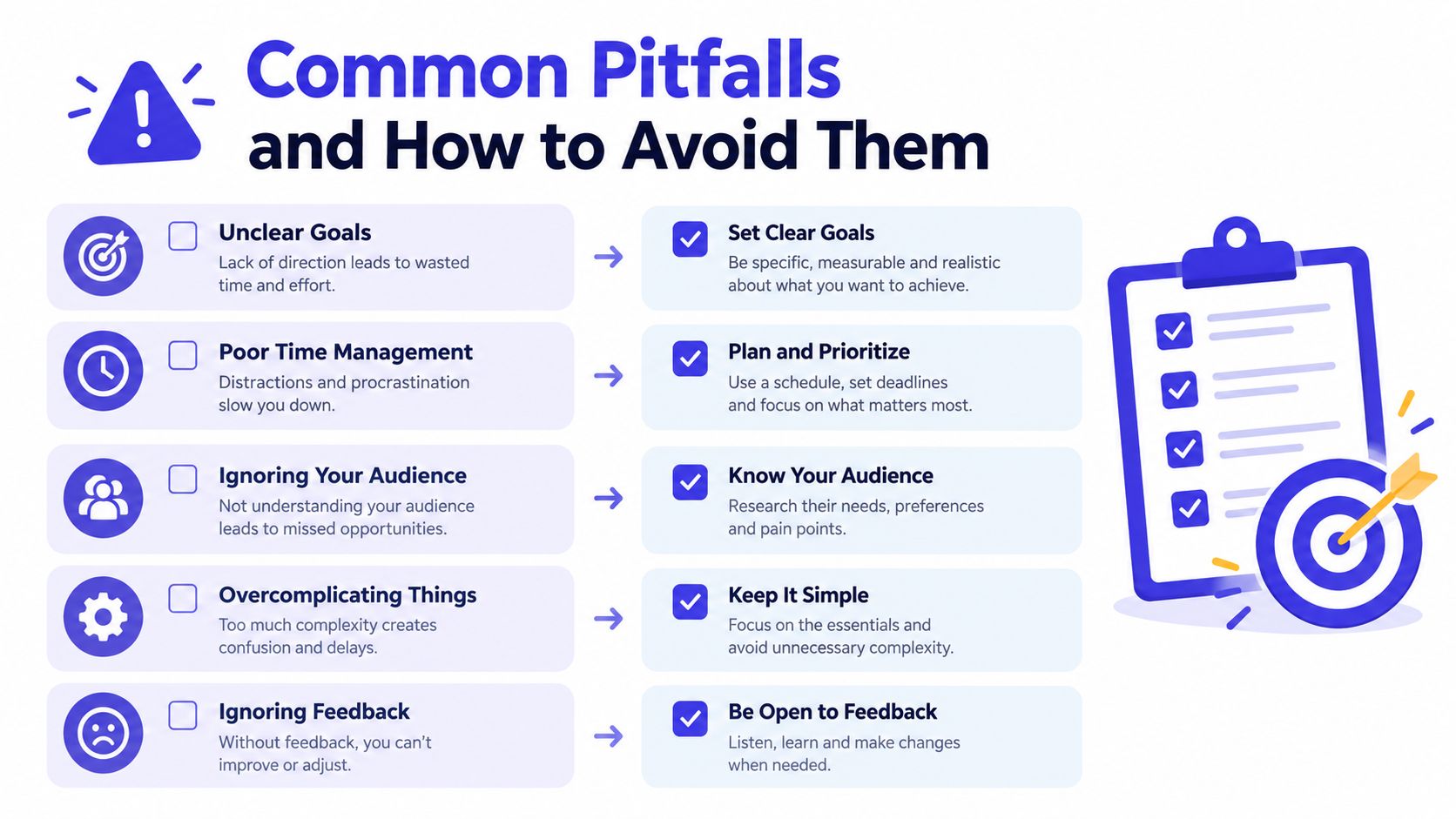
Run a quick diagnostic today. Score each pitfall from zero, meaning it is unmanaged, to two, meaning it is handled consistently. Your lowest score identifies the first improvement to make. Fixing the weakest link usually creates more value than adding another dashboard.
How PostSyncer Simplifies Social Performance Reporting
Social reporting often breaks in four places: data is fragmented, collection is manual, the narrative lacks context, and the final brief arrives too slowly. PostSyncer brings scheduling, AI-assisted content drafting, a unified engagement inbox, and real-time analytics into one workspace, so the reporting layer can stay connected to the publishing workflow.
A marketer can schedule content, attach labels or campaign context, review comments in the unified inbox, and inspect results by platform, content type, timing, or individual post. That sequence matters because the metrics remain connected to the content that produced them, rather than appearing only as anonymous channel totals.
The workflow is straightforward:
- Plan and schedule the posts.
- Publish across the selected social networks.
- Review engagement context in one inbox.
- Refresh analytics before the reporting cycle.
- Turn the results into a weekly brief with variances, insights, and actions.
AI drafting can reduce the manual work involved in developing captions and repurposing source material, while the analytics view gives the marketer a place to investigate what happened. The tool doesn't replace baseline choices, KPI selection, or human interpretation. It concentrates the inputs those decisions depend on.
The forward-looking opportunity is more important than a prettier dashboard. As predictive analytics develops, reporting workflows can begin flagging content that may underperform before publication, giving teams a chance to revise the hook, format, timing, or distribution plan. That turns performance reporting from a forensic review into a preventive discipline.
PostSyncer gives creators, teams, and agencies one workspace to schedule social content, manage engagement, and analyze performance across major networks. Visit PostSyncer to connect publishing with repeatable reporting and start building a clearer weekly decision workflow.