











Your Monday reporting meeting starts with six tabs open, three spreadsheet exports, and a Slack thread full of screenshots. Instagram says one thing, TikTok uses a different definition for engagement, and the website report still reflects an earlier date range. Everyone has data, but nobody can answer the useful question: what should we do next?
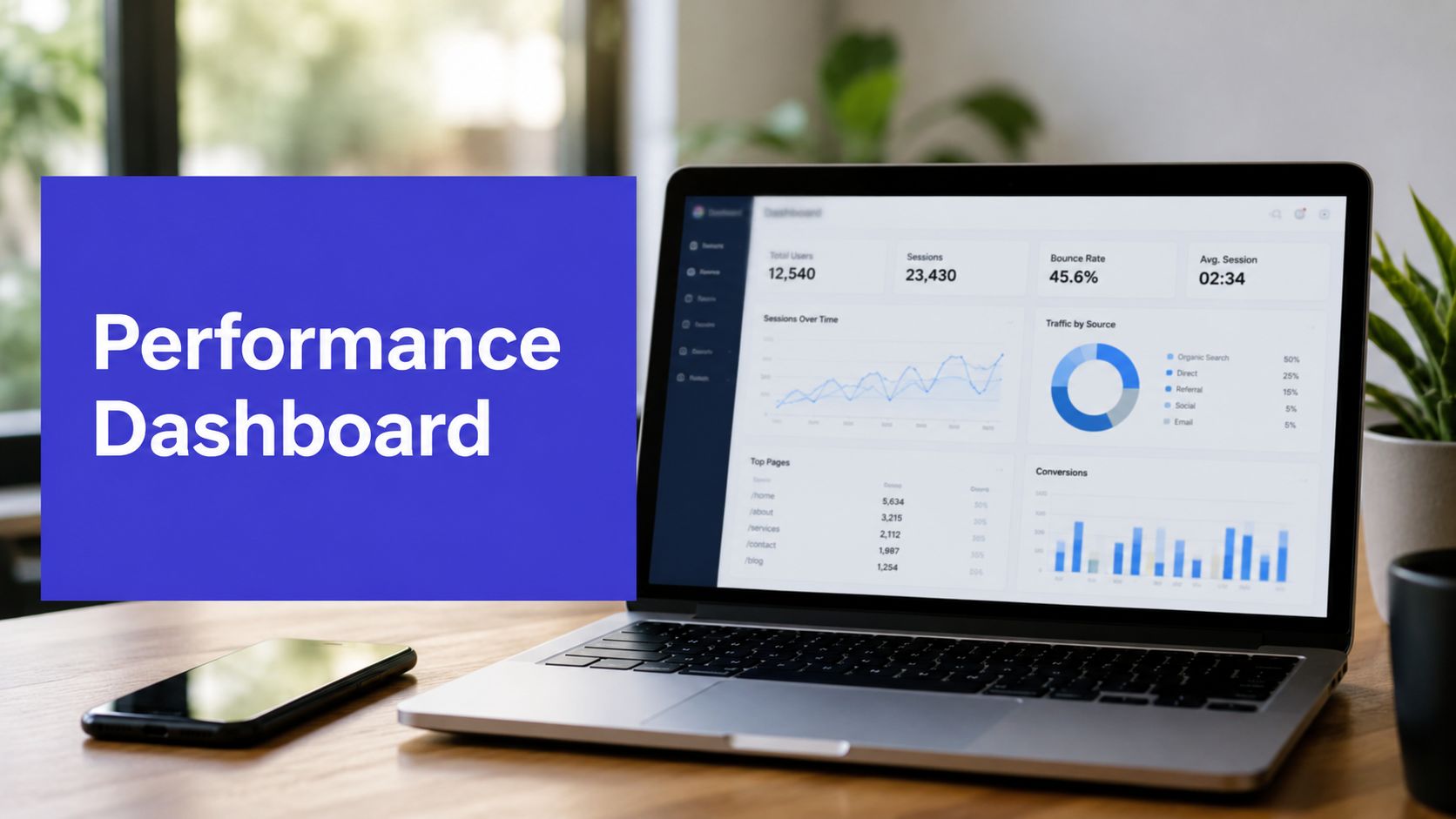
A performance dashboard gives teams a shared operating view. It brings selected signals together, adds context, and helps people move from noticing a result to explaining it and acting on it. For an agency, that may mean comparing content across client accounts. For an in-house team, it may mean connecting social activity with site behavior and conversions. For a creator, it may mean finding which format, platform, or publishing time deserves another test.
The key shift is to stop treating a dashboard as a collection of charts. A useful dashboard is a decision system. It helps you monitor health, investigate drivers, and create a repeatable path from evidence to action.
Introduction Why Teams Need a Performance Dashboard Now
A campaign can look successful in a weekly report and still be difficult to manage. One person exports reach from Instagram, another copies video views from TikTok, and a third checks conversions in an analytics platform. By the time the team meets, the numbers may cover different periods, use different filters, or describe different stages of the customer journey.
That creates a familiar failure pattern. The team spends the meeting reconciling figures instead of evaluating creative, audience response, or business impact. A high engagement rate gets praised without asking whether the activity produced meaningful visits. A strong post gets repeated without checking whether its success came from the content, the timing, the audience, or an unusual distribution effect.
A well-built performance dashboard makes those questions easier to ask in the same place. It can show platform-level results, content patterns, timing, and outcome signals without forcing every stakeholder to rebuild the report manually. The dashboard doesn't replace judgment. It gives judgment a cleaner starting point.
The people a dashboard should serve
Agencies need a reliable client view that separates account health from campaign detail. They also need filters that prevent one brand's results from being confused with another's.
In-house marketing teams need to connect channel activity with broader goals. A social result matters differently when the priority is awareness, lead generation, product adoption, or retention.
Creators and small businesses often need a simpler view. They may not need dozens of tiles. They need to know which content earned attention, which action followed, and what deserves another test.
The most useful dashboard answers a limited set of recurring questions:
- What changed? Identify movement in important metrics.
- Why did it change? Compare channels, formats, audiences, and dates.
- What should we do next? Turn the finding into a publishing, budget, creative, or workflow decision.
By the end of this guide, you'll have a practical way to choose metrics, design a trusted view, compare dashboard templates, and build interpretation habits that go beyond reporting. You'll also know when charts are enough and when your team needs anomaly detection, narrative insight, or workflow automation on top.
What a Performance Dashboard Really Is and How It Works
Think about the dashboard in a car. The speedometer, fuel gauge, and warning lights don't tell you the entire story of the journey. They do give you a compact view of current conditions and signal when you need to investigate or change course.
A performance dashboard does the same for a business process. It displays selected measures, trends, comparisons, and alerts so people can assess performance without assembling the evidence from separate systems. A report usually records or presents information for review. A dashboard is designed for recurring observation and interaction.

The three jobs of a dashboard
A practical dashboard performs three connected jobs.
- Monitor health. A top-level view shows whether important measures are stable, improving, or moving in the wrong direction.
- Diagnose drivers. Filters, historical comparisons, and breakdowns help users investigate what caused the movement.
- Trigger action. The view should make the next decision obvious, such as reviewing a creative, adjusting a publishing plan, or escalating a data-quality issue.
A spreadsheet can support any of these jobs, but it often requires manual interpretation. A static report may explain what happened at a particular point in time, yet it can become outdated as soon as new data arrives. A dashboard earns its name when it supports repeated use, consistent definitions, and a path from summary to detail.
What happens behind the screen
Most dashboards depend on several layers:
- Data sources provide information from social platforms, websites, advertising systems, CRMs, or operational tools.
- Transformations standardize names, dates, currencies, campaign labels, and platform definitions.
- Queries calculate totals, rates, comparisons, and distributions.
- Visualizations present the results through scorecards, charts, tables, filters, and alerts.
That structure explains why a polished interface can still produce poor decisions. If a source is incomplete, a transformation changes the meaning of a metric, or a query mixes incompatible time periods, the chart may look precise while describing the wrong thing.
Microsoft's SQL Server Performance Dashboard is a useful historical example of this maturity. Its documented reports surface historical information, waits, latches, I/O statistics, and expensive queries, turning the dashboard into a practical diagnostic layer for database administrators (Microsoft's SQL Server Performance Dashboard guidance). The lesson applies to marketing: current status is useful, but correlated history helps explain causes.
A dashboard is enough when the user knows the question, the data is trustworthy, and the next action follows naturally from a visible pattern. You need an insight layer when the team must interpret complex causes, detect unusual behavior automatically, produce a narrative explanation, or move a finding into a workflow. A chart can show that performance changed. It won't always explain why or assign the next task.
Key Metrics Every Performance Dashboard Should Track
Metric selection starts with the decision, not the platform. A social manager may ask which content deserves another version. A growth lead may ask which channel creates qualified demand. An executive may ask whether marketing activity supports strategic progress. Each question needs a different view.
A useful dashboard groups metrics by the role they play in the decision. The categories below create a balanced system without forcing every team to track every available field.

Reach and awareness
Reach-oriented measures show whether content or campaigns are getting distribution and attracting attention. Depending on the channel, that may include impressions, reach, video starts, follower movement, brand search activity, or visits from a discovery source.
Treat these as leading indicators, not proof of business success. A post can reach a large audience without creating meaningful engagement or action. Use them to evaluate distribution, audience expansion, and creative visibility, then connect them to deeper signals where the data allows.
Engagement quality
Engagement becomes more useful when you distinguish passive exposure from active interest. Click-through rate, saves, shares, comments, watch behavior, time on page, and bounce behavior can reveal whether people did something meaningful after seeing the content.
Platform definitions matter. TikTok and YouTube are video-first environments, while Instagram may require separate views for Reels, carousels, Stories, and feed posts. LinkedIn performance may depend heavily on professional audience relevance and discussion quality. Don't compare raw values across platforms as if each network measures attention in the same way.
For a practical guide to collecting social data and evaluating channel results, use this guide to tracking social media analytics. It can help your team document platform-specific definitions before combining them in one view.
Conversion and business impact
Conversion measures connect marketing activity to an outcome. Depending on your funnel, these might include landing-page actions, sign-ups, qualified leads, purchases, conversion rate, cost per acquisition, or customer lifetime value.
A dashboard should make the connection visible without implying causation that the data can't support. Use campaign names, tracking parameters, landing-page paths, and CRM stages consistently. If social platforms report attributed conversions while your analytics system reports assisted or last-touch activity, display those definitions separately rather than blending them into one impressive-looking total.
For a concise explanation of how key performance indicators fit into a structured measurement system, see what a KPI dashboard is.
Operational health
A dashboard can be analytically correct and still fail operationally. Track data freshness, which describes how old the newest available data is, separately from query latency, which describes how long the dashboard takes to render. A dashboard can load in under a second while displaying yesterday's data, so speed doesn't prove recency (the difference between data freshness and dashboard latency).
Measurement rule: Track freshness and render speed as separate operational signals. A fast screen with stale data is still a problem.
For interactive dashboard queries, monitor p50, p95, and p99 latency rather than relying only on an average. A practical benchmark pattern targets p95 response times around 1.5 seconds, while recognizing that end-to-end delay can come from pipeline processing, transformations, query execution, and caching, not only the front end (guidance on benchmarking data platform performance).
Design and Data Best Practices That Keep Dashboards Trusted
A dashboard earns trust when users can understand it quickly and verify what they're seeing. Good design reduces interpretation effort. Good data discipline prevents the interface from giving confident answers to poorly defined questions.
Start with the first screen. Put the few measures that determine the immediate decision at the top, then place trends, breakdowns, and diagnostic detail below. If a stakeholder has to scroll through a dozen charts before finding the main result, the layout is asking the user to perform the analysis mentally.
Make the visual hierarchy do the work
Use simple visual forms for common questions. Scorecards suit current values and comparisons. Line charts show movement over time. Bar charts help compare platforms or content groups. Tables work when users need exact values or want to sort a list of posts.
Keep color meaningful. A consistent positive, negative, and neutral treatment helps users scan the view, while excessive color makes every change look urgent. Give filters clear labels, preserve the selected date range across connected charts, and show whether a value is complete, estimated, or still processing.
Break a large dashboard into focused areas such as overview, content analysis, channel comparison, and data quality. A compact layout often serves more people than a dense wall of visualizations.
Treat data definitions as product documentation
Write down what each metric means, which platforms contribute to it, and how the calculation handles missing values. Define whether “engagement” includes video views, whether follower growth is net or gross, and whether a conversion uses platform attribution or a site event.
Permissions deserve the same care. Agencies should separate client workspaces and restrict access to sensitive campaign, customer, or revenue data. Teams sharing reports externally should remove personal information and confirm that exports comply with their privacy obligations, including GDPR requirements where applicable.
Adoption is another trust signal. Gartner-related summaries report BI and analytics adoption at about 30% of employees, while other analyses place active usage closer to 25%, with some cited ranges between 24% and 32% (the analysis of the BI dashboard adoption gap). One cited benchmark reports around 29% active usage over seven years, despite 87% of organizations reporting increased analytics adoption, which illustrates that deployment alone doesn't create a habit.
Practical test: Measure recurring use and whether decisions can be traced to dashboard outputs. Licensed access matters less if nobody changes a plan after viewing the data.
For social teams, social media analytics dashboards offer a useful reference point for organizing platform data, filters, and recurring review around the work people already do.
Performance Dashboard Examples and Templates for Real Teams
The right template depends on the decision owner. A social manager and a chief executive may use the same source data, but they shouldn't receive the same page. One needs content-level detail. The other needs a compact view of strategic movement and business outcomes.

Social media performance dashboard
Audience: social managers, creators, and content leads.
Primary questions: Which posts worked? Which formats created useful engagement? Are results changing by platform or publishing time?
Use a top row for current account health and a lower section for post-level analysis. The detail view should let users filter by platform, content type, campaign, label, and date. For TikTok and YouTube, include video-specific behavior. For Instagram, separate formats rather than averaging Reels, Stories, carousels, and feed posts into one score. For LinkedIn, preserve enough context to review comments and professional audience response.
Cross-channel marketing dashboard
Audience: growth teams and campaign managers.
Primary questions: How do SEO, paid media, email, social, and website activity work together? Where does the journey lose momentum?
Begin with a campaign overview, then show channel contribution and landing-page or conversion outcomes. Keep platform-native metrics in a diagnostic area. The main view should use shared campaign naming and outcome definitions so users can compare roles without pretending that an impression and a purchase are equivalent units.
For a small business, this template may stay lightweight. An e-commerce team may add product, audience, and revenue dimensions. A larger organization may need separate views for acquisition, retention, and creative performance.
Executive KPI dashboard
Audience: leadership and budget owners.
Primary questions: Is marketing supporting the business plan? Which areas require attention? What decision needs executive support?
Use a limited set of outcome indicators, trend context, and concise explanations of material changes. Avoid filling the page with platform-native details that leadership can't act on. Link each KPI to an owner and review cadence.
Agency client reporting dashboard
Audience: account teams and clients.
Primary questions: What was delivered? What changed? What did the team learn? What happens next?
Separate results from interpretation. A client can see the agreed metrics first, then a short insight panel that connects patterns to recommended actions. Multi-workspace controls, approval status, labels, and export options help agencies maintain consistency across brands.
A reusable social media analytics report template can provide the starting structure, but the final view should reflect the client's goals and reporting language. PostSyncer can serve as one plug-in layer for teams that need analytics organized by platform, content type, timing, publishing activity, and workspaces rather than repeated manual exports.
How to Implement and Interpret Your Performance Dashboard with Confidence
Implementation works best as a controlled sequence. Start with one decision, not an inventory of every available metric. “Which content should we produce more often?” is a usable starting question. “Show me everything” is not.
Build a dependable first version
Connect approved sources through secure OAuth or the relevant supported integration. Then validate a small sample against the source platforms. Check date ranges, time zones, attribution windows, deleted content, account permissions, and platform-specific definitions before adding more charts.
Create a minimum viable dashboard with:
- A health view for the selected outcome and its supporting signals.
- A driver view that breaks results down by channel, format, campaign, audience, or timing.
- An action view that identifies the content, campaign, or data issue requiring attention.
Set a review with the people who'll use it. Ask them which chart they would remove, which filter they need, and what decision the dashboard should support. Then revise the view before expanding its scope.
Teams that need external data from sources without a clean native connector can review ScrapeCreators' API insights while evaluating collection methods, access requirements, and maintenance needs. The important principle is to document provenance, not just add another feed.
Turn viewing into a working rhythm
A daily check should focus on health and obvious anomalies. A weekly review should examine drivers, compare content groups, and select actions. A monthly strategy review should question whether the chosen metrics still represent the business priority.
When a metric moves, follow a simple chain:
- Confirm the movement: Check date range, freshness, filters, and source completeness.
- Find the driver: Segment by platform, format, campaign, timing, or audience.
- Test the explanation: Compare with related signals instead of relying on one chart.
- Record the decision: Note what the team will change and when it will review the result.
PostSyncer can fit into this operating model as a social publishing and analytics workspace, with scheduling, approvals, labeling, multi-workspace management, and analytics that helps teams review performance by platform, content type, and timing. Those workflow links matter because a dashboard becomes more useful when a finding can move directly into a content or campaign decision.
The adoption gap makes habit design essential. Put the dashboard in the meeting where decisions already happen, assign an owner for definitions, and record decisions influenced by the data. If people only open the dashboard when someone asks for a report, it remains a reporting artifact rather than a management tool.
Bringing It All Together Your Next Steps with Performance Dashboards
A performance dashboard should answer a recurring business question, not display every available metric. Choose a small set of measures that connects audience attention, content or channel behavior, and business outcomes. Add operational checks so users know whether the data is current and the interface is responsive.
Start with one question and select the template that matches its owner. Connect trustworthy sources, validate definitions, and build a focused first version. Then establish a review rhythm that turns changes into explanations, decisions, and recorded follow-up.
Charts are enough when the pattern is clear and the action is obvious. Add anomaly detection when unusual movement is easy to miss, narrative insights when interpretation consumes too much time, and workflow automation when recommendations need to become assigned work.
Your first move today is simple: choose one decision your team currently debates with scattered reports, then design the smallest dashboard that can support it.
PostSyncer brings social scheduling, approvals, labeling, multi-workspace collaboration, and analytics into one workspace so teams can connect performance findings with publishing decisions. Visit PostSyncer to explore a practical way to organize cross-platform content and turn dashboard insights into consistent action.