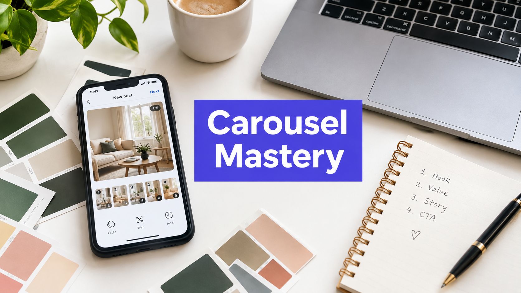












Carousels average a 0.50% engagement rate, compared with 0.33% for single images, making an Instagram carousel maker worth adding to any serious publishing workflow. The advantage doesn't come from adding more slides alone, it comes from giving each swipe a clear reason to continue.
A carousel is a small editorial product inside the feed. The first slide earns attention, the middle slides build trust, and the final slide converts that attention into a save, share, comment, profile visit, or next action. Templates can speed up production, but they can't rescue a weak sequence.
The most effective workflows treat design, copy, pacing, media selection, and publishing as one system. That means choosing a format for the job, writing slide by slide, checking the technical setup before designing, and reviewing performance signals that show whether people found the post useful rather than merely visible.
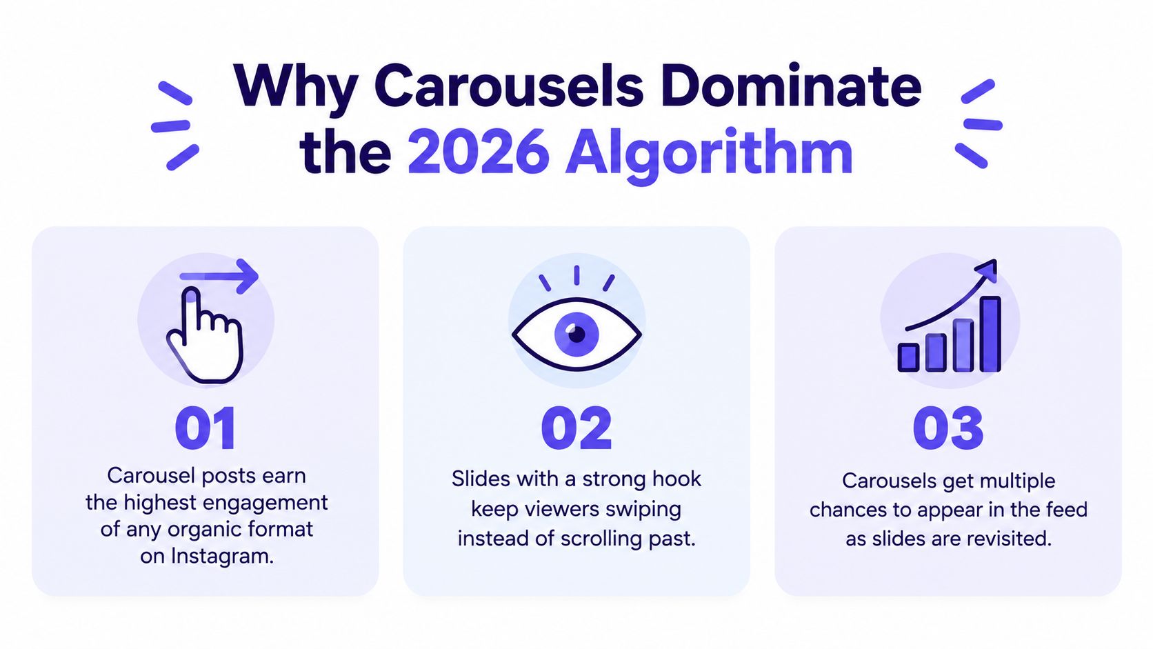
Why Carousels Dominate the 2026 Algorithm
The engagement gap is clear. Socialinsider's 2026 benchmark reports 0.50% engagement for Instagram carousels in Q2 2026, compared with 0.33% for image posts (Socialinsider's Instagram benchmark data). A separate benchmark set reports median carousel saves of 37, compared with 10 for images, while carousels recorded 3 shares versus 1 for images in that comparison.
Those signals matter because likes are only one form of response. A save says the viewer expects future value. A share says the idea is useful or relevant to someone else. A comment can signal that the post created a question, disagreement, or reason to participate. A good carousel gives Instagram more meaningful interactions to interpret than a single visual with one caption.
Why the format creates more opportunities
Instagram introduced carousels in February 2017, allowing up to 10 images or videos in one swipeable post. In August 2024, the limit expanded to 20 items, changing the format from a simple multi-photo post into a larger publishing unit (the documented history of Instagram carousels).
That extra capacity doesn't mean every post should use the maximum. It means a creator can choose a richer structure when the subject needs it. A tutorial can separate each action. A product post can move from problem to demonstration to use case. A case narrative can show context, evidence, process, and conclusion without cramming everything into one graphic.
Carousels also create a stronger retention loop than a static post. The first slide can earn the initial pause, while the next slide must answer the question created by the hook. If the sequence works, the viewer keeps making small decisions, swipe after swipe. Each decision is more valuable than hoping a single image communicates the entire argument immediately.
Practical rule: Design for the next swipe before you design for the final slide.
What the numbers don't mean
The benchmark advantage doesn't make every carousel effective. A badly structured carousel can underperform because the opening promise is vague, the text is difficult to read, or the middle slides repeat the same point. The format creates more chances to retain attention, but it also creates more places to lose it.
An earlier large-scale analysis found that carousels using all 10 slides achieved the highest engagement in that dataset, while mixed-media carousels combining images and video reached a 2.33% engagement rate (the carousel analysis and format breakdown). Treat that as evidence for deliberate sequencing, not as a command to pad every post. A short, complete argument is stronger than a long sequence with filler.
The right question isn't, “How many slides can this tool produce?” Ask, “What does the viewer need to understand, believe, or do next?” A dedicated Instagram carousel maker helps with consistency and speed, but the strategic work remains human. You still need to choose the promise, remove weak slides, and make every transition earn its place.
Mastering Dimensions and File Types
Technical mistakes are expensive because viewers notice them before they read the copy. A cropped headline, inconsistent framing, soft image, or incompatible video can make a polished idea look careless. Set the document configuration before writing or designing, then keep every slide inside the same project.
Choose one orientation for the whole post
Instagram carousel posts work best when every slide shares one canvas shape. Choose the format based on the content:
- Portrait: Use a tall feed layout when the post depends on readable text, screenshots, step-by-step instructions, or product detail.
- Square: Choose a balanced canvas for illustrations, quotes, diagrams, and layouts that need equal space on every side.
- Landscape: Reserve a wide layout for source material that genuinely depends on horizontal composition, such as a chart, wide photograph, or presentation frame.
The practical issue isn't only the first slide. Instagram displays the carousel as one post, so an inconsistent orientation can force awkward cropping or reduce the visual continuity between swipes. Most professional Instagram carousel maker tools offer presets, but verify the final export rather than trusting the project label.
For a current reference on Instagram image specifications and format handling, use this Instagram image size guide before setting up your file.
Keep images and videos predictable
Use a high-quality image format for static slides and a platform-compatible video export for motion slides. Don't repeatedly download and re-upload the same asset, because every additional compression step can soften small type, gradients, and screenshots. Export text-heavy graphics at the highest quality available in the tool, then inspect them on a phone before scheduling.
Video slides need special attention. Check that the opening frame communicates without relying on a delayed animation, that captions remain readable, and that the clip still makes sense when the viewer swipes away quickly. A video inserted only because the tool supports it is usually weaker than a still image with a clear visual job.
Run a pre-export check
Before publishing, review the post as a viewer rather than as the designer:
- Read the first slide at normal phone size.
- Swipe through without stopping and look for abrupt changes in alignment or scale.
- Check every text block for cropping, contrast, and legibility.
- Confirm that the media order matches the intended narrative.
- Open the exported files on a separate device.
The exact preset can change as Instagram updates its publishing requirements, so build a habit of checking the platform's current options inside your scheduler or design tool. A technically valid file is only the starting point. The finished post must also feel coherent in the feed.
Designing Slide Sequences That Retain Viewers
A carousel shouldn't feel like a brochure broken into pages. It should feel like a controlled exchange of information, where each slide creates enough clarity or curiosity to justify the next swipe.
The sequence below works because it assigns a different psychological job to each position. Adapt the number of slides to the subject, but don't combine multiple jobs into one crowded frame.
Start with a promise, not a label
The first slide is a stopping device. “Instagram Carousel Tips” labels the subject, but it doesn't give the viewer a reason to care. A stronger hook identifies a problem, tension, outcome, or surprising contrast.
Examples of useful hook patterns include:
- “Your carousel loses readers before the second swipe.”
- “The product photo isn't the problem. The sequence is.”
- “Three signs your tutorial is too difficult to save.”
- “Before and after, the slide structure changed everything.”
The hook should be specific enough to attract the right audience and open enough to make the next slide necessary. Don't put the entire conclusion on the cover. Give the viewer a clear promise, then make the first interior slide deliver on it quickly.

Give every middle slide one job
The middle of the carousel carries the proof and instruction, and many creators lose retention by placing a paragraph on every slide and changing only the background color. Instead, map the sequence before opening your Instagram carousel maker.
A practical structure looks like this:
- Slide one, tension: Name the problem or outcome.
- Slide two, context: Explain why the issue matters.
- Slide three, diagnosis: Show the mistake, obstacle, or misconception.
- Slide four, method: Introduce the process or framework.
- Slide five, example: Make the method concrete with a visual or scenario.
- Slide six, contrast: Show what weak execution looks like beside the stronger version.
- Slide seven, application: Tell the viewer how to use the idea.
- Final slide, action: Ask for one specific next step.
Not every subject needs all of these roles. A product carousel may use the middle slides to show features in use. A founder story may use them to build chronology. An educational post needs enough explanation to make the advice usable, not just quotable.
Build visual rhythm into the sequence
Retention depends on more than copy. A viewer should feel movement even when the post is static. Alternate dense and light slides, change the focal point, use a screenshot after an abstract explanation, or introduce a short video when motion demonstrates the point better than a still image.
A continuous design system still matters. Keep the type hierarchy, color logic, margins, and recurring brand elements stable. Vary the composition inside that system so the viewer doesn't experience every slide as the same screen repeated.
A useful test is to hide the text and inspect the thumbnails. Can you tell where the argument changes? If every slide has the same visual weight, the sequence probably needs stronger pacing. If one slide contains every important idea, redistribute the information so the viewer has a reason to continue.
End with a single action
The final slide should not ask the viewer to save, share, comment, follow, visit a website, join a list, and buy at the same time. Choose the action that matches the post's purpose. A reference tutorial can ask for a save. A debate-oriented post can invite a comment. A product sequence can direct the viewer to a specific page.
The call to action should complete the promise made on slide one. If the hook promised a practical method, the ending can ask the viewer to save the framework. If the hook challenged a common assumption, invite the audience to share their experience. Clear alignment beats louder wording.
Leveraging AI for Rapid Content Batching
AI is most useful before design begins. It can help turn a source idea into alternative hooks, organize a long explanation into slide-sized units, and identify where an argument needs an example. It shouldn't decide what your audience needs without editorial direction.
Start with a source that has substance, such as a customer question, internal guide, webinar transcript, product page, or article. Ask the AI to extract the central claim, supporting points, objections, examples, and possible calls to action. Then choose the strongest angle yourself. This prevents the common failure mode where a tool produces a fluent carousel with no meaningful point of view.
Use a controlled batching workflow
Create several inputs at once, but keep the editorial guardrails tight:
- Ask for multiple hook directions, including a problem-led option, a contrast-led option, and a practical outcome.
- Select one hook and request a slide-by-slide outline.
- Limit each slide to one idea, then rewrite jargon in the language your audience uses.
- Add a specific example, visual reference, or proof point to the slides that feel abstract.
- Generate caption variations only after the carousel sequence works.
- Review every claim, adjective, and call to action before design.
This process separates ideation from approval. AI can produce volume quickly, but volume isn't the same as variety. If every output follows the same “problem, three tips, CTA” pattern, your audience will recognize the template and stop expecting a fresh experience.
For creators turning articles, transcripts, and other source material into social assets, this guide to AI content repurposing offers a useful workflow reference. If the source includes spoken content, an AI video production tool can help create supporting motion assets that you later place into a mixed-media sequence.
Keep the human review visible
The strongest AI-assisted carousels usually contain human decisions that the model couldn't infer from a generic prompt. Add a customer objection you hear repeatedly. Replace a broad example with a real situation from your category. Remove a polished phrase that sounds unlike your brand. Change the order when the emotional logic demands it.
AI also tends to overfill slides. Ask it to shorten copy, but don't accept compression that removes the explanation. A short slide isn't automatically clear. The viewer needs enough context to understand the point without opening a second tab.
A good Instagram carousel maker can accelerate layout and formatting, yet the editor remains responsible for the sequence. Batch the mechanical work, not the judgment. That distinction lets a team publish more consistently without turning every post into an interchangeable AI artifact.
Publishing and Scheduling Your Carousels
The handoff from design to publishing deserves its own checklist. A carousel can be visually correct in the editor and still fail operationally because the slides are out of order, the caption is missing, the approval is incomplete, or the post lands on the wrong account.
Start by creating one asset folder or project for each post. Keep the final slides in sequence, store the caption beside them, and include the intended first comment or reply prompt if your workflow uses one. Use clear filenames so another team member can verify the order without opening every file.
Move from finished assets to a scheduled post
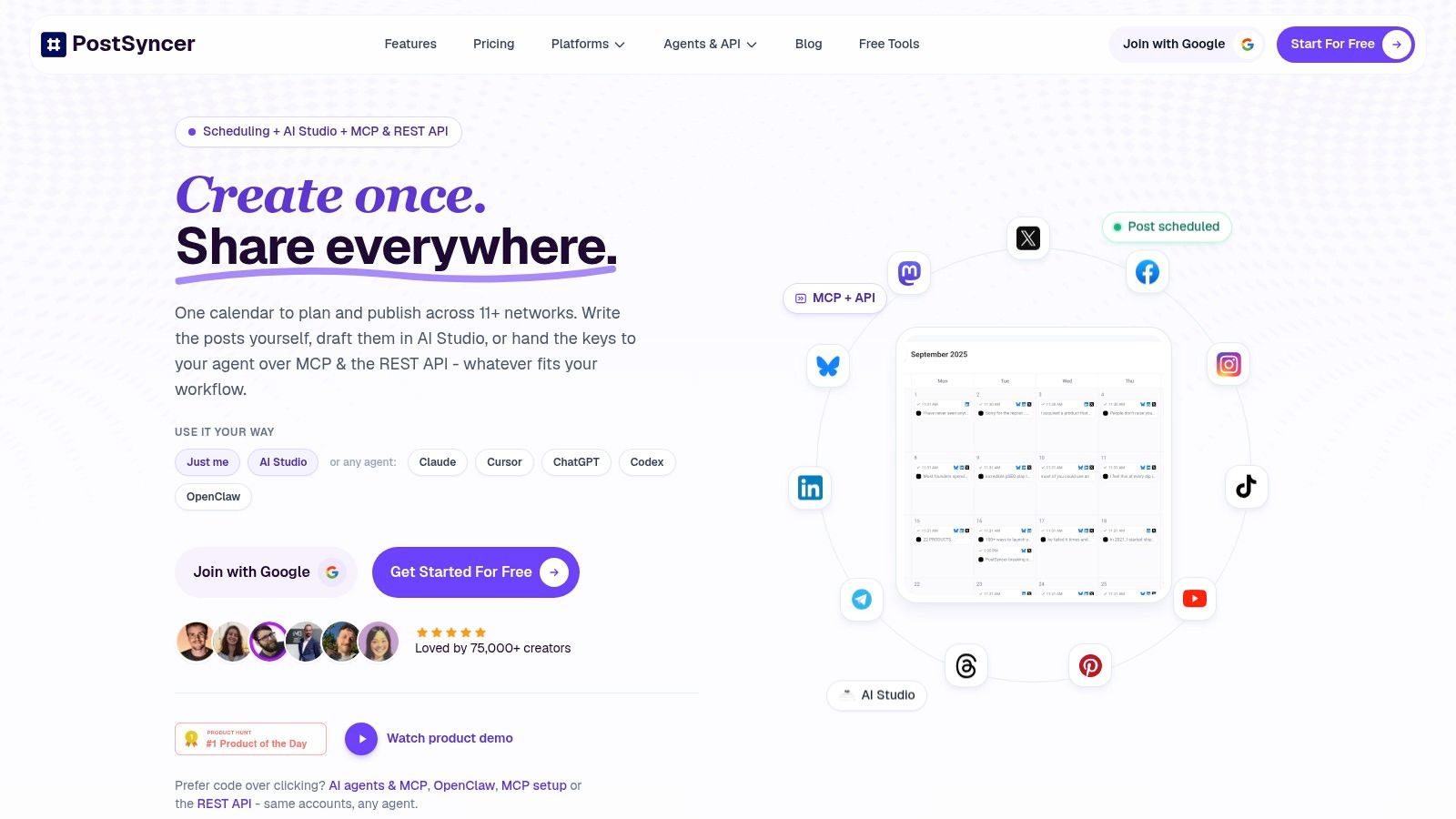
A unified scheduler such as PostSyncer can be used to organize Instagram carousel assets, arrange the slide order, add the caption, and place the post on a visual calendar. The operational benefit is straightforward: the creator doesn't have to repeat the same upload and account-selection process for every post.
Before approving the schedule, check four items:
- Account: Confirm the correct Instagram profile and workspace.
- Order: Open the carousel preview and verify the first, middle, and final slides.
- Copy: Review the caption, mentions, hashtags, links, and call to action.
- Timing: Compare the planned slot with the audience activity patterns visible in your own analytics.
Use this Instagram scheduling workflow as a reference for moving from preparation to publication. The exact best time belongs to your audience, not to a universal posting chart. A scheduler should make testing easier, while your reporting tells you which timing and content combinations deserve another attempt.
A short walkthrough can also help teams standardize the handoff:
Create an approval gate
Small teams often lose quality because no one owns the final check. Assign one person to approve the message and another, where possible, to verify the publishing details. The second review doesn't need to redesign the post. It should catch a missing slide, a wrong product name, an unreadable label, or an instruction that no longer matches the caption.
After publication, record the post's purpose and format in your content calendar. Label it as a tutorial, comparison, product explanation, customer story, or another useful category. Later, compare saves, shares, comments, and profile actions within the same category instead of treating every carousel as interchangeable.
Scheduling removes repetitive manual work, but it doesn't remove accountability. The post still needs a clear owner, a final preview, and a review process that protects the viewer's experience.
Avoiding Common Design Mistakes That Kill Reach
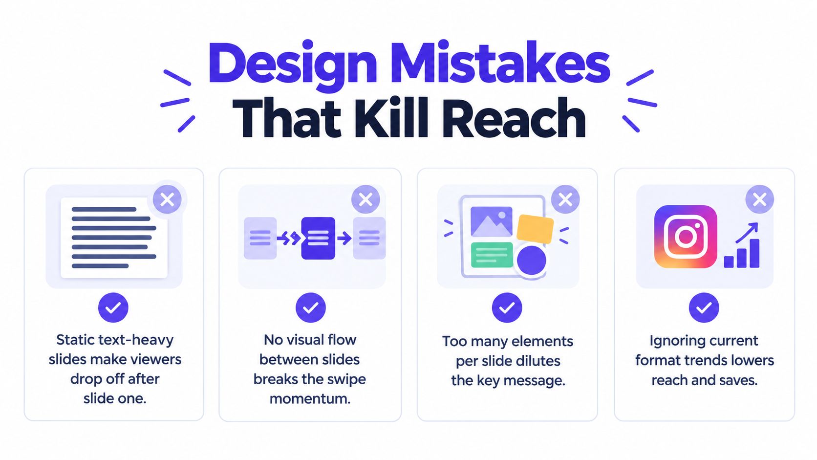
Many weak carousels don't fail because the creator lacks a refined tool. They fail because the design makes the viewer work too hard. A text wall, a vague first slide, or a sequence with no visual change can stop the swipe before the useful material appears.
Mistake one, treating every slide like a presentation page
Presentation logic often rewards completeness on each page. Feed logic rewards momentum between pages. A slide can be visually attractive and still fail if it contains too much text, too many qualifiers, or a heading that takes effort to decode.
Cut the slide to its essential claim, then move supporting detail to the next frame. Use screenshots, diagrams, product views, and short clips when they explain the idea faster than prose. If a slide needs a long caption to become understandable, the sequence probably needs restructuring.
Mistake two, confusing consistency with repetition
Brand consistency means the viewer recognizes the source. It doesn't mean every slide has the same layout. Repeat the visual rules, but change the composition when the content changes.
Current trend coverage points to more experiential hybrid formats, including contrast carousels, map or route structures, connected slides, scrapbook layouts, browser-like interfaces, torn-paper treatments, and vlog-style swipeable storytelling (the 2026 carousel format trend coverage). These formats are useful because they give the viewer a reason to explore the sequence rather than scan a stack of identical cards.
Choose the format according to the message:
- Contrast layouts: Use them when the argument depends on a clear before-and-after or wrong-versus-right distinction.
- Connected slides: Use them when a continuous visual path, timeline, map, or process improves comprehension.
- Scrapbook or mixed-media layouts: Use them for personal stories, behind-the-scenes content, and subjects where texture adds context.
- Browser-like or interface layouts: Use them to demonstrate digital products, workflows, or online behavior.
- Vlog-style sequences: Use them when personality and progression matter more than polished instructional structure.
A tool such as a POD mockup generator can help product-led brands place designs into believable physical contexts for a slide, provided the mockup supports the story rather than replacing the product evidence.
Mistake three, optimizing for vanity metrics
A large number of likes can look encouraging, but it doesn't tell you whether the post solved a problem. Review saves and shares alongside comments, profile actions, and the drop-off points you can observe through your platform analytics. A post with a quieter reaction may still be more valuable if people keep it for reference or send it to a colleague.
Mistake four, ending without a destination
Don't let the final slide become an afterthought. A sequence that teaches a useful method should tell the viewer how to apply it. A product sequence should clarify the next step. A story should leave the audience with a question worth answering.
Build the CTA into the outline before designing. That single decision prevents the familiar ending where the creator adds “follow for more” because no stronger action was planned.
PostSyncer lets creators and teams plan, schedule, and publish Instagram carousels alongside other social content from one workspace, with slide ordering, a visual calendar, approvals, and analytics for reviewing what works. Visit PostSyncer to organize your next carousel from finished assets through scheduled publication.